FabCon is coming to Atlanta
Join us at FabCon Atlanta from March 16 - 20, 2026, for the ultimate Fabric, Power BI, AI and SQL community-led event. Save $200 with code FABCOMM.
Register now!- Power BI forums
- Get Help with Power BI
- Desktop
- Service
- Report Server
- Power Query
- Mobile Apps
- Developer
- DAX Commands and Tips
- Custom Visuals Development Discussion
- Health and Life Sciences
- Power BI Spanish forums
- Translated Spanish Desktop
- Training and Consulting
- Instructor Led Training
- Dashboard in a Day for Women, by Women
- Galleries
- Data Stories Gallery
- Themes Gallery
- Contests Gallery
- Quick Measures Gallery
- Notebook Gallery
- Translytical Task Flow Gallery
- TMDL Gallery
- R Script Showcase
- Webinars and Video Gallery
- Ideas
- Custom Visuals Ideas (read-only)
- Issues
- Issues
- Events
- Upcoming Events
To celebrate FabCon Vienna, we are offering 50% off select exams. Ends October 3rd. Request your discount now.
- Power BI forums
- Forums
- Get Help with Power BI
- Desktop
- Line Chart Y Axis Range not scaling when a value e...
- Subscribe to RSS Feed
- Mark Topic as New
- Mark Topic as Read
- Float this Topic for Current User
- Bookmark
- Subscribe
- Printer Friendly Page
- Mark as New
- Bookmark
- Subscribe
- Mute
- Subscribe to RSS Feed
- Permalink
- Report Inappropriate Content
Line Chart Y Axis Range not scaling when a value exceeds an increment value
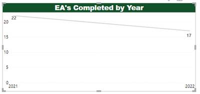
The Y axis seems to have a limitation on that if the data value exceeds the set(?) increment level line (see below it's 5 - not sure how that's determined either). I would expect that if the data value reaches the threshold the Y axis values would increase another 5. Or, whatever it's set at. Would someone be able to explain this to me and if I can make that automatically increment when the data value exceeds the 'limit' on the Y axis?
Solved! Go to Solution.
- Mark as New
- Bookmark
- Subscribe
- Mute
- Subscribe to RSS Feed
- Permalink
- Report Inappropriate Content
Hi @NotMyJob ,
Please try below steps:
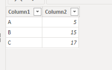
1. below is my test table
Table:
2. create a mesure with below dax formula
Measure =
MAXX ( 'Table', [Column2] ) + 5
3. add a line chart with fields, apply measure to Y-axis Maximum
Please refer the attached .pbix file.
Best regards,
Community Support Team_Binbin Yu
If this post helps, then please consider Accept it as the solution to help the other members find it more quickly.
- Mark as New
- Bookmark
- Subscribe
- Mute
- Subscribe to RSS Feed
- Permalink
- Report Inappropriate Content
Hi.
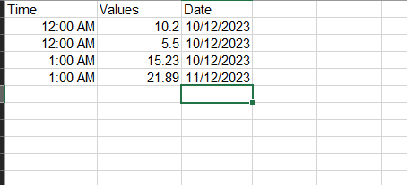
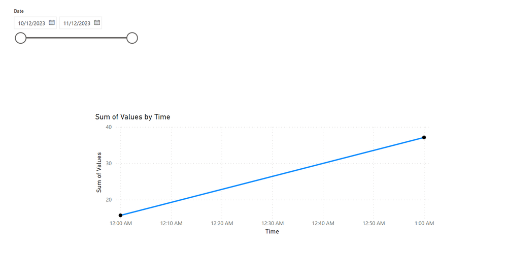
Above solution is properly working for whole number. But It does not work for the decimal number.
If use the decimal number in the "coloumn 2" it sum the value and did not plot the all three values.
It summarize the values on the coloum "Time" and plot in the line chart.
Could you give me a solution for plotting all the points in "12:00 am" in the line chart with summarize those instead assume it a values.
Thanks.
- Mark as New
- Bookmark
- Subscribe
- Mute
- Subscribe to RSS Feed
- Permalink
- Report Inappropriate Content
Hi,
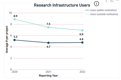
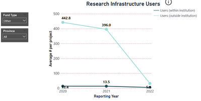
I figured out how to increase the max y-axis value for my line chart so that the max data point would always be positioned below the top of the y-axis (even with data slicer criteria applied). For each of the two lines in my visual, the y-axis data points were based on three differenet measures that calculated average values based on a data column (filtered by year). I initially used a MAXX function to identify the largest value across all six measures presented in the visual and then added a value of 1 (and incorporated the function into the y-axis max conditional formatting) but the y-axis max wasn't shifting. When I updated the DAX formula to result in the MAXX value with 20% of that value added to it the y-axis shifted correctly even when the values changed significantly after data slicers were applied. See below.
This was the formula I used to create the MAXX value that I then incoporated into y-axis max conditional formatting:
Y-axis max measure
