FabCon is coming to Atlanta
Join us at FabCon Atlanta from March 16 - 20, 2026, for the ultimate Fabric, Power BI, AI and SQL community-led event. Save $200 with code FABCOMM.
Register now!- Power BI forums
- Get Help with Power BI
- Desktop
- Service
- Report Server
- Power Query
- Mobile Apps
- Developer
- DAX Commands and Tips
- Custom Visuals Development Discussion
- Health and Life Sciences
- Power BI Spanish forums
- Translated Spanish Desktop
- Training and Consulting
- Instructor Led Training
- Dashboard in a Day for Women, by Women
- Galleries
- Data Stories Gallery
- Themes Gallery
- Contests Gallery
- QuickViz Gallery
- Quick Measures Gallery
- Visual Calculations Gallery
- Notebook Gallery
- Translytical Task Flow Gallery
- TMDL Gallery
- R Script Showcase
- Webinars and Video Gallery
- Ideas
- Custom Visuals Ideas (read-only)
- Issues
- Issues
- Events
- Upcoming Events
The Power BI Data Visualization World Championships is back! Get ahead of the game and start preparing now! Learn more
- Power BI forums
- Forums
- Get Help with Power BI
- Desktop
- Line Chart X Axis (Date) showing "Blank"
- Subscribe to RSS Feed
- Mark Topic as New
- Mark Topic as Read
- Float this Topic for Current User
- Bookmark
- Subscribe
- Printer Friendly Page
- Mark as New
- Bookmark
- Subscribe
- Mute
- Subscribe to RSS Feed
- Permalink
- Report Inappropriate Content
Line Chart X Axis (Date) showing "Blank"
I have a set of data where issues/calls are logged into a spreadsheet. I want to show a line graph over the entire time span of the data which is approx 3 years. My go-to method for something like this is to create a Date Table using the following steps, inspiration for this was taken from here: https://community.powerbi.com/t5/Desktop/How-to-show-2-years-on-x-axis-of-bar-chart-when-displaying/... and has worked well for me for 18 months now:
1) DateTable = CALENDAR(DATE(2018,1,1),DATE(2030,12,31))
2) YearMonthNumber = (Year(DateTable[Date])) * 12 + Month( DateTable[Date])
3) MonthYear = Format(DateTable[Date],"mmm") & "-" & Format(DateTable[Date],"yyyy")
4) Sort MonthYear by YearMonthNumber
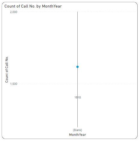
Then I link a column from the data which is a Date type, in this case "Issue Logged On" to DateTable[Date], then I would insert a line graph, put DateTable[MonthYear] on the X-Axis and a column from the Data in this case "Call No." as the Y-Axis set to "Count of".
This time though the line graph simply shows on the X Axis "Blank" and the Y-Axis just displays the total number of issues.
I've done this hundreds of times before with similar data with no issues but cannot fathom why the X-Axis is showing "Blank".
Thanks
Solved! Go to Solution.
- Mark as New
- Bookmark
- Subscribe
- Mute
- Subscribe to RSS Feed
- Permalink
- Report Inappropriate Content
Looks like the relationship is not working.
Maybe "Issue Logged On" has a time portion in it which prevents matching with the date table?
You can test this by removing DateTable[MonthYear] from the x-axis and putting "Issue Logged On" there instead. Do you get a reasonable-looking chart?
If so, remove "Issue Logged On" from x-axis and put the DateTable[Date] there. Does it look the same?
Helpful resources

Power BI Dataviz World Championships
The Power BI Data Visualization World Championships is back! Get ahead of the game and start preparing now!

| User | Count |
|---|---|
| 40 | |
| 38 | |
| 36 | |
| 29 | |
| 28 |
| User | Count |
|---|---|
| 126 | |
| 88 | |
| 78 | |
| 66 | |
| 65 |


