FabCon is coming to Atlanta
Join us at FabCon Atlanta from March 16 - 20, 2026, for the ultimate Fabric, Power BI, AI and SQL community-led event. Save $200 with code FABCOMM.
Register now!- Power BI forums
- Get Help with Power BI
- Desktop
- Service
- Report Server
- Power Query
- Mobile Apps
- Developer
- DAX Commands and Tips
- Custom Visuals Development Discussion
- Health and Life Sciences
- Power BI Spanish forums
- Translated Spanish Desktop
- Training and Consulting
- Instructor Led Training
- Dashboard in a Day for Women, by Women
- Galleries
- Data Stories Gallery
- Themes Gallery
- Contests Gallery
- Quick Measures Gallery
- Visual Calculations Gallery
- Notebook Gallery
- Translytical Task Flow Gallery
- TMDL Gallery
- R Script Showcase
- Webinars and Video Gallery
- Ideas
- Custom Visuals Ideas (read-only)
- Issues
- Issues
- Events
- Upcoming Events
Calling all Data Engineers! Fabric Data Engineer (Exam DP-700) live sessions are back! Starting October 16th. Sign up.
- Power BI forums
- Forums
- Get Help with Power BI
- Desktop
- Line Chart Visualization of multi-column tables
- Subscribe to RSS Feed
- Mark Topic as New
- Mark Topic as Read
- Float this Topic for Current User
- Bookmark
- Subscribe
- Printer Friendly Page
- Mark as New
- Bookmark
- Subscribe
- Mute
- Subscribe to RSS Feed
- Permalink
- Report Inappropriate Content
Line Chart Visualization of multi-column tables
Hi Team,
I am facing one issue for visualizing the data in Line chart from a table. Consider the table as example.
| JAN | FEB | MARCH | APRL | MAY | JUNE | JULY | AUGUST | SEPTEMBER | OCTOBER | NOVEMBER | DECEMBER | FY | Type |
| 100 | 400 | 87 | 200 | 100 | 180 | 700 | 121 | 686 | 112 | 155 | 325 | FY19 | Giver |
| 200 | 100 | 180 | 150 | 0 | 110 | 300 | 435 | 89 | 441 | 515 | 164 | FY19 | Reciever |
| 150 | 0 | 110 | 300 | 110 | 150 | 290 | 424 | 657 | 151 | 57 | 151 | FY20 | Giver |
| 0 | 0 | 90 | 290 | 90 | 0 | 560 | 232 | 345 | 13 | 686 | 636 | FY20 | Giver |
| 700 | 180 | 200 | 0 | 110 | 100 | 180 | 535 | 58 | 515 | 414 | 164 | FY20 | Reciever |
| 300 | 110 | 150 | 0 | 90 | 300 | 110 | 434 | 65 | 112 | 154 | 735 | FY19 | Reciever |
| 290 | 90 | 0 | 100 | 180 | 290 | 90 | 142 | 377 | 51 | 579 | 235 | FY18 | Reciever |
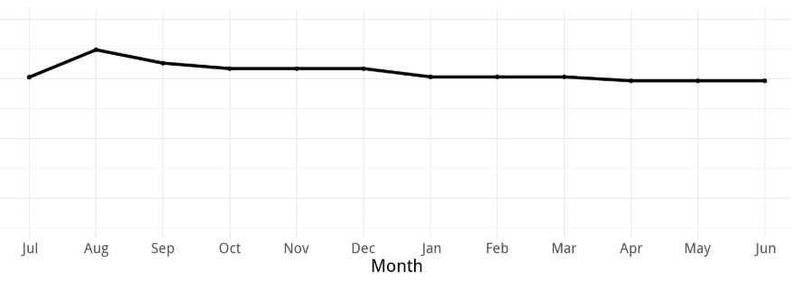
I want to visualize the summation of amount in line chart based on month wise and should be filtered by slicer based on Year "FY" and "Type". Below is the sample line chart image for the required format.
Can any one suggest me how to achieve this if possible using above table rather creating new table and if two table is required then how to set up relation between them.
Solved! Go to Solution.
- Mark as New
- Bookmark
- Subscribe
- Mute
- Subscribe to RSS Feed
- Permalink
- Report Inappropriate Content
Hi @VinayakKarne ,
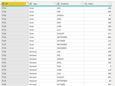
Open query editor and select the "FY" and "Type" column, then click "Unpivot other columns". You will get a table like the following image.
Now you could use it to get your visual(Attibute as x-axis and Value as values).
If this post helps, then please consider Accept it as the solution to help the other members find it.
Helpful resources

FabCon Global Hackathon
Join the Fabric FabCon Global Hackathon—running virtually through Nov 3. Open to all skill levels. $10,000 in prizes!

Power BI Monthly Update - October 2025
Check out the October 2025 Power BI update to learn about new features.


