Get Fabric certified for FREE!
Don't miss your chance to take the Fabric Data Engineer (DP-600) exam for FREE! Find out how by watching the DP-600 session on-demand now through April 28th.
Learn more- Power BI forums
- Get Help with Power BI
- Desktop
- Service
- Report Server
- Power Query
- Mobile Apps
- Developer
- DAX Commands and Tips
- Custom Visuals Development Discussion
- Health and Life Sciences
- Power BI Spanish forums
- Translated Spanish Desktop
- Training and Consulting
- Instructor Led Training
- Dashboard in a Day for Women, by Women
- Galleries
- Data Stories Gallery
- Themes Gallery
- Contests Gallery
- QuickViz Gallery
- Quick Measures Gallery
- Visual Calculations Gallery
- Notebook Gallery
- Translytical Task Flow Gallery
- TMDL Gallery
- R Script Showcase
- Webinars and Video Gallery
- Ideas
- Custom Visuals Ideas (read-only)
- Issues
- Issues
- Events
- Upcoming Events
Join the FabCon + SQLCon recap series. Up next: Power BI, Real-Time Intelligence, IQ and AI, and Data Factory take center stage. All sessions are available on-demand after the live show. Register now
- Power BI forums
- Forums
- Get Help with Power BI
- Desktop
- Line Chart Visualisation
- Subscribe to RSS Feed
- Mark Topic as New
- Mark Topic as Read
- Float this Topic for Current User
- Bookmark
- Subscribe
- Printer Friendly Page
- Mark as New
- Bookmark
- Subscribe
- Mute
- Subscribe to RSS Feed
- Permalink
- Report Inappropriate Content
Line Chart Visualisation
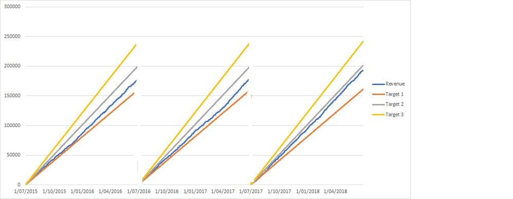
Further to my other post, could I add to this question. Having plotted actual revenue I would like to also plot 2 targets, Target 1 and Target 2.
For year 1, Target 1 lets say is 100,000 and target 2 is 120,000.
For year 2, Target 1 lets say is 105,000 and target 2 is 130,000.
For year 3, Target 1 lets say is 110,000 and target 2 is 140,000.
I would like these to plot in a ray for each fiscal year, ie year 1 Target 1 rises from zero to 100,000 over the year time line etc
Is there a measure that I could write in Power BI to provide the data to populate.
Alternatively the data for my revenue is coming from an excel spreadsheet - I could easily introduce a new worksheet "Target" which has the three year dates populated and either daily or an accumulating total for Target 1 and Target 2.
Hopefully you can assist here. I have tried to do the excel spreadsheet worksheet but it hasn't worked.
Thanking you
I am attaching a number of documents.
Firstly the visualisation that I am hoping to achieve
I am also attaching the spreadsheet with the data that I used to create the aformention chart.
The following link is the file that I used to generate the graph
https://1drv.ms/x/s!ArtOMe8OWNmVgwLWmTLoBrGMJsGu
The following file is the the type of raw data that I will be linking to Power BI and therefore will generate the visualization from there
https://1drv.ms/x/s!ArtOMe8OWNmVgwH0fYylIygfrJU3
{I have shown the target data in either ab accumulative form or in a daily isolated value - it will not be an issue to generate in either manner.}
Please let me know if you need any clarification.
Solved! Go to Solution.
- Mark as New
- Bookmark
- Subscribe
- Mute
- Subscribe to RSS Feed
- Permalink
- Report Inappropriate Content
Hi all,
I have now achieved the outcome I am after.
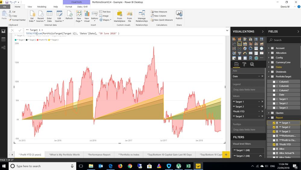
One of the issues I had was I was using a line chart, I have changed this to an area chart and with new measures defined all seems good.
I will look further at this tomorrow with actual data rather than sample data and see whether my expected outcomes have been achieved.
- Mark as New
- Bookmark
- Subscribe
- Mute
- Subscribe to RSS Feed
- Permalink
- Report Inappropriate Content
Hi CNH,
Based on your description, you want to have a visual in power bi which can fit your data automactically, right?
R visual can meet your requirement, please refer to this documentation:
https://docs.microsoft.com/en-us/power-bi/desktop-r-visuals
Regards,
Jimmy Tao
- Mark as New
- Bookmark
- Subscribe
- Mute
- Subscribe to RSS Feed
- Permalink
- Report Inappropriate Content
Hi all,
I have now achieved the outcome I am after.
One of the issues I had was I was using a line chart, I have changed this to an area chart and with new measures defined all seems good.
I will look further at this tomorrow with actual data rather than sample data and see whether my expected outcomes have been achieved.
Helpful resources

Power BI Monthly Update - April 2026
Check out the April 2026 Power BI update to learn about new features.

New to Fabric Survey
If you have recently started exploring Fabric, we'd love to hear how it's going. Your feedback can help with product improvements.

Power BI DataViz World Championships - June 2026
A new Power BI DataViz World Championship is coming this June! Don't miss out on submitting your entry.

| User | Count |
|---|---|
| 43 | |
| 35 | |
| 35 | |
| 21 | |
| 15 |
| User | Count |
|---|---|
| 65 | |
| 58 | |
| 28 | |
| 27 | |
| 25 |


