FabCon is coming to Atlanta
Join us at FabCon Atlanta from March 16 - 20, 2026, for the ultimate Fabric, Power BI, AI and SQL community-led event. Save $200 with code FABCOMM.
Register now!- Power BI forums
- Get Help with Power BI
- Desktop
- Service
- Report Server
- Power Query
- Mobile Apps
- Developer
- DAX Commands and Tips
- Custom Visuals Development Discussion
- Health and Life Sciences
- Power BI Spanish forums
- Translated Spanish Desktop
- Training and Consulting
- Instructor Led Training
- Dashboard in a Day for Women, by Women
- Galleries
- Data Stories Gallery
- Themes Gallery
- Contests Gallery
- QuickViz Gallery
- Quick Measures Gallery
- Visual Calculations Gallery
- Notebook Gallery
- Translytical Task Flow Gallery
- TMDL Gallery
- R Script Showcase
- Webinars and Video Gallery
- Ideas
- Custom Visuals Ideas (read-only)
- Issues
- Issues
- Events
- Upcoming Events
Get Fabric Certified for FREE during Fabric Data Days. Don't miss your chance! Request now
- Power BI forums
- Forums
- Get Help with Power BI
- Desktop
- Line Chart Aggregated Value on X-Axis (Or Multiple...
- Subscribe to RSS Feed
- Mark Topic as New
- Mark Topic as Read
- Float this Topic for Current User
- Bookmark
- Subscribe
- Printer Friendly Page
- Mark as New
- Bookmark
- Subscribe
- Mute
- Subscribe to RSS Feed
- Permalink
- Report Inappropriate Content
Line Chart Aggregated Value on X-Axis (Or Multiple Series on Scatter Chart)
Hello!
I'm hoping that I am overlooking a very simple solution to my problem. I have created a scatter-chart that has a measure for the Y-Axis and the AVERAGE of a column for the X-Axis. This works perfectly, however, I need to show multiple series on the scatter chart. These series will have different filter contexts so I can't just specify a column in the "Shapes" or "Size" wells of the scatter chart.
You can, however, show multiple series on a line chart. But a line chart does not allow you to use an aggregate on the line chart so I cannot use the AVERAGE of my column.
Does anyone know a way that I can show either multiple series for a scatter chart or an aggregated value on the X-Axis of a chart that allows multiple series (i.e. line chart)?
Thanks!
Parker
Solved! Go to Solution.
- Mark as New
- Bookmark
- Subscribe
- Mute
- Subscribe to RSS Feed
- Permalink
- Report Inappropriate Content
Answering my own question as I think I have exhausted all of my options.
Line chart with aggregated value on X-Axis:
-Not possible
Scatter Chart with Multiple Series:
-There is no visual with this functionality. I imported every scatter/bubble/dot plot visual from the store and they all only allow 1 Y-Value
-You can, however, code around this. Here are the steps to accomplish it.
- Duplicate your data and create a column identifier (Your table should have the same data twice, once for each category).
- Create a measure that specifies different calculations depending on the column identifier.
- Add the new measure to the Values well of the scatter plot and add the column identifier as the legend.
Hopefully someone can benefit from this approach as I believe it is the only options as of yet.
-Parker
- Mark as New
- Bookmark
- Subscribe
- Mute
- Subscribe to RSS Feed
- Permalink
- Report Inappropriate Content
Hi @Anonymous,
I made one sample here.
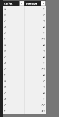
1. Enter the sample data like this.
2. Create a measure using the formula.
Measure = CALCULATE(SUM(Table1[average]),ALLEXCEPT(Table1,Table1[series]))
Then we can get the result as the picture.
For more details, please check the pbix as attached. If it doesn’t meet your requirement, kindly share your sample data and excepted result to me.
https://www.dropbox.com/s/wf2rkouhspfftkv/Line%20chart.pbix?dl=0
Regards,
Frank
If this post helps, then please consider Accept it as the solution to help the others find it more quickly.
- Mark as New
- Bookmark
- Subscribe
- Mute
- Subscribe to RSS Feed
- Permalink
- Report Inappropriate Content
Thank you for the response @v-frfei-msft, however, I don't think this will work as a solution. I see that you are adding "series" to the legend. I need to be able to add multiple measures to the Y-Axis to create multiple series, similar to a line chart.
Thanks you,
Parker
Helpful resources

Power BI Monthly Update - November 2025
Check out the November 2025 Power BI update to learn about new features.

Fabric Data Days
Advance your Data & AI career with 50 days of live learning, contests, hands-on challenges, study groups & certifications and more!


