Become a Certified Power BI Data Analyst!
Join us for an expert-led overview of the tools and concepts you'll need to pass exam PL-300. The first session starts on June 11th. See you there!
Get registered- Power BI forums
- Get Help with Power BI
- Desktop
- Service
- Report Server
- Power Query
- Mobile Apps
- Developer
- DAX Commands and Tips
- Custom Visuals Development Discussion
- Health and Life Sciences
- Power BI Spanish forums
- Translated Spanish Desktop
- Training and Consulting
- Instructor Led Training
- Dashboard in a Day for Women, by Women
- Galleries
- Webinars and Video Gallery
- Data Stories Gallery
- Themes Gallery
- Contests Gallery
- Quick Measures Gallery
- Notebook Gallery
- Translytical Task Flow Gallery
- R Script Showcase
- Ideas
- Custom Visuals Ideas (read-only)
- Issues
- Issues
- Events
- Upcoming Events
Power BI is turning 10! Let’s celebrate together with dataviz contests, interactive sessions, and giveaways. Register now.
- Power BI forums
- Forums
- Get Help with Power BI
- Desktop
- Kanban Style reports
- Subscribe to RSS Feed
- Mark Topic as New
- Mark Topic as Read
- Float this Topic for Current User
- Bookmark
- Subscribe
- Printer Friendly Page
- Mark as New
- Bookmark
- Subscribe
- Mute
- Subscribe to RSS Feed
- Permalink
- Report Inappropriate Content
Kanban Style reports
Hi All,
I have a requirement where client needs Kanban dashboard style reports.ng
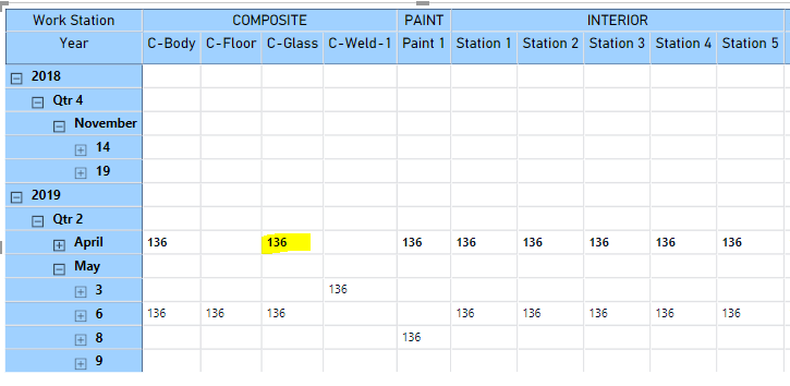
Tried achieveing it through Matirx reports but value section only takes count/avg/sum etc and dont show actual values (In this case list of Kanban ID's). Except for the custom visuals present in gallery/online portal how can I achieve this ?
Solved! Go to Solution.
- Mark as New
- Bookmark
- Subscribe
- Mute
- Subscribe to RSS Feed
- Permalink
- Report Inappropriate Content
@v-yuta-msft Thank you for Response 🙂
By using table, it would be a pain for end user to scroll through ; who is using stick notes on some white board to achieve this.
Some sort of Cards under the matrix table structure can be good option. I am trying to find how I can achieve this
by creating R visual. Exact Pointer links on the same will help.
- Mark as New
- Bookmark
- Subscribe
- Mute
- Subscribe to RSS Feed
- Permalink
- Report Inappropriate Content
In the matrix visual, the aggregated value is grouped by WorkStation and Year. If you want to achieve the original data in visual, you can create a table visual and drag all the columns in it.
Regards,
Jimmy Tao
- Mark as New
- Bookmark
- Subscribe
- Mute
- Subscribe to RSS Feed
- Permalink
- Report Inappropriate Content
@v-yuta-msft Thank you for Response 🙂
By using table, it would be a pain for end user to scroll through ; who is using stick notes on some white board to achieve this.
Some sort of Cards under the matrix table structure can be good option. I am trying to find how I can achieve this
by creating R visual. Exact Pointer links on the same will help.
Helpful resources

Join our Fabric User Panel
This is your chance to engage directly with the engineering team behind Fabric and Power BI. Share your experiences and shape the future.

Power BI Monthly Update - June 2025
Check out the June 2025 Power BI update to learn about new features.

| User | Count |
|---|---|
| 76 | |
| 76 | |
| 56 | |
| 38 | |
| 34 |
| User | Count |
|---|---|
| 99 | |
| 56 | |
| 51 | |
| 44 | |
| 40 |

