Join us at FabCon Vienna from September 15-18, 2025
The ultimate Fabric, Power BI, SQL, and AI community-led learning event. Save €200 with code FABCOMM.
Get registered- Power BI forums
- Get Help with Power BI
- Desktop
- Service
- Report Server
- Power Query
- Mobile Apps
- Developer
- DAX Commands and Tips
- Custom Visuals Development Discussion
- Health and Life Sciences
- Power BI Spanish forums
- Translated Spanish Desktop
- Training and Consulting
- Instructor Led Training
- Dashboard in a Day for Women, by Women
- Galleries
- Data Stories Gallery
- Themes Gallery
- Contests Gallery
- Quick Measures Gallery
- Notebook Gallery
- Translytical Task Flow Gallery
- TMDL Gallery
- R Script Showcase
- Webinars and Video Gallery
- Ideas
- Custom Visuals Ideas (read-only)
- Issues
- Issues
- Events
- Upcoming Events
Enhance your career with this limited time 50% discount on Fabric and Power BI exams. Ends August 31st. Request your voucher.
- Power BI forums
- Forums
- Get Help with Power BI
- Desktop
- Issues with Bar Chart Spacing and X-Axis Labels
- Subscribe to RSS Feed
- Mark Topic as New
- Mark Topic as Read
- Float this Topic for Current User
- Bookmark
- Subscribe
- Printer Friendly Page
- Mark as New
- Bookmark
- Subscribe
- Mute
- Subscribe to RSS Feed
- Permalink
- Report Inappropriate Content
Issues with Bar Chart Spacing and X-Axis Labels
Hello,
I have an issue I hope you can help solve.
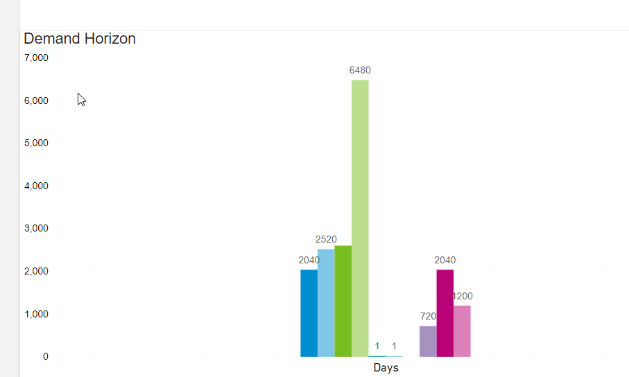
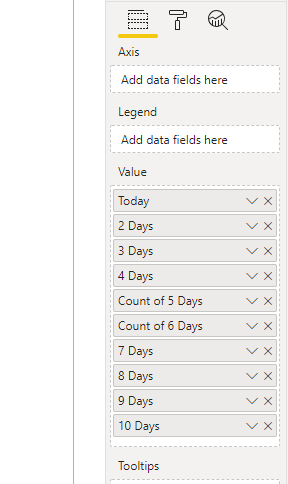
I am creating a tool that shows demand over time in a barchart format. The dates are dynamic so i just have them as "Today" "2 Days" "3 Days" ect...
I want to make a visual showing the demanded amounts over a period of time. When I connect the data and start to make my visual i encounter 2 problems.
1. The graph is using too little space, regardless of how i format the sizing of the bars. I need it to use the whole area i have designated.
2. The X-Axis Labels (the days) won't show up.
Any ideas?
- Mark as New
- Bookmark
- Subscribe
- Mute
- Subscribe to RSS Feed
- Permalink
- Report Inappropriate Content
Hi @Anonymous ,
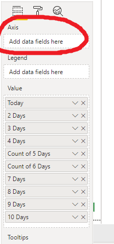
- Since you have not added any data fields into Axis column so the X-Axis Labels won’t show up.
- The clustered chart shows series of column value. For this case, there may be just one series of your data and you have not added fields into Axis column so that the visual just show in the middle of it regardless of how you format the sizing of the bars.
My suggestion is that you can post the output you expected for further discussion or you can change your data model and try other visuals.
Best Regards,
Yingjie Li
If this post helps then please consider Accept it as the solution to help the other members find it more quickly.
- Mark as New
- Bookmark
- Subscribe
- Mute
- Subscribe to RSS Feed
- Permalink
- Report Inappropriate Content
Hi,
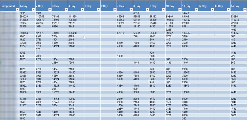
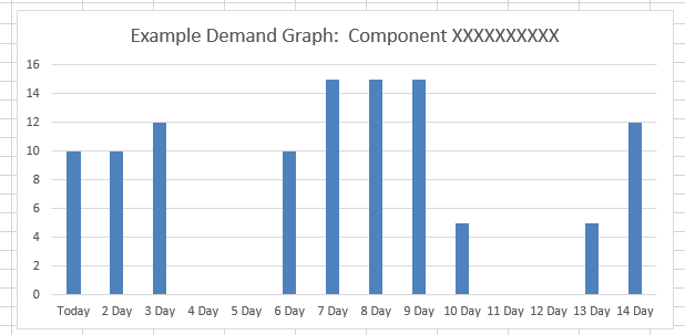
Can i use the same selection for axis and values? Since the column i want as the listed x-axis items (days) contain the value i want shown on the barchart. Example below in pics using Excel and the source data. The point is i want the graph to use all the space in the visual and not be narrowed into the center.
- Mark as New
- Bookmark
- Subscribe
- Mute
- Subscribe to RSS Feed
- Permalink
- Report Inappropriate Content
Hey @Anonymous ,
you have to unpivot all your columns (Today, Day 1, ... Day x) using Power Query, meaning converting many columns into a attribute (Today, Day 1, ...) value pair. Then you can use the attribute column as axis and the value column as value.
This article describes how to do this in great detail:https://radacad.com/pivot-and-unpivot-with-power-bi
Hopefully, this is what you are looking for.
Regards,
Tom
Did I answer your question? Mark my post as a solution, this will help others!
Proud to be a Super User!
I accept Kudos 😉
Hamburg, Germany
- Mark as New
- Bookmark
- Subscribe
- Mute
- Subscribe to RSS Feed
- Permalink
- Report Inappropriate Content
Hi - thanks for this!
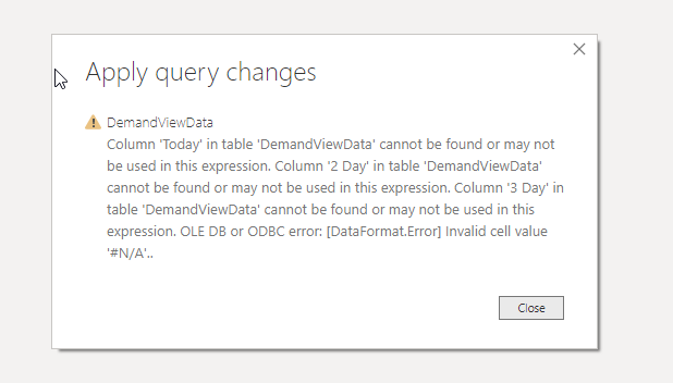
I was really hoping this would solve it. However when i tried to unpivot all columns i got this error when applying query changes.
