Fabric Data Days starts November 4th!
Advance your Data & AI career with 50 days of live learning, dataviz contests, hands-on challenges, study groups & certifications and more!
Get registered- Power BI forums
- Get Help with Power BI
- Desktop
- Service
- Report Server
- Power Query
- Mobile Apps
- Developer
- DAX Commands and Tips
- Custom Visuals Development Discussion
- Health and Life Sciences
- Power BI Spanish forums
- Translated Spanish Desktop
- Training and Consulting
- Instructor Led Training
- Dashboard in a Day for Women, by Women
- Galleries
- Data Stories Gallery
- Themes Gallery
- Contests Gallery
- QuickViz Gallery
- Quick Measures Gallery
- Visual Calculations Gallery
- Notebook Gallery
- Translytical Task Flow Gallery
- TMDL Gallery
- R Script Showcase
- Webinars and Video Gallery
- Ideas
- Custom Visuals Ideas (read-only)
- Issues
- Issues
- Events
- Upcoming Events
Get Fabric Certified for FREE during Fabric Data Days. Don't miss your chance! Request now
- Power BI forums
- Forums
- Get Help with Power BI
- Desktop
- Issue with displaying rolling totals
- Subscribe to RSS Feed
- Mark Topic as New
- Mark Topic as Read
- Float this Topic for Current User
- Bookmark
- Subscribe
- Printer Friendly Page
- Mark as New
- Bookmark
- Subscribe
- Mute
- Subscribe to RSS Feed
- Permalink
- Report Inappropriate Content
Issue with displaying rolling totals
Hi,
I am trying to accomplish the following scenario:
- User selects one date (that is the end date of a selection)
- The beginning of the date range is automatically set to January 1st of the previous year
- The measure contains only +1 oder -1 values that need to be displayed in a graph as rolling totals.
In the workbook that I have uploaded here, I have prepared and drawn an example of how it should look like. I have tried several DAX statements to calculate the rolling total, but most of them either didn't show anything at all, or data from all years.
The dataset is based on the default WideWorldImporters database.
Thank you!
Solved! Go to Solution.
- Mark as New
- Bookmark
- Subscribe
- Mute
- Subscribe to RSS Feed
- Permalink
- Report Inappropriate Content
Hi @erikm
Try If function, I update the measure.
balance RT =
VAR _EndtDay =
    SELECTEDVALUE ( 'Calendar'[Date] )
VAR _StartDay =
    DATE ( SELECTEDVALUE ( 'Calendar'[YEAR] ) - 1, 01, 01 )
RETURN
    IF (
        MAX ( Movements[Year] ) * 100
            + MAX ( Movements[Month] )
            <= SELECTEDVALUE ( 'Calendar'[YEAR] ) * 100
                + SELECTEDVALUE ( 'Calendar'[Month] ),
        CALCULATE (
            SUM ( Movements[balance] ),
            FILTER (
                ALL ( Movements ),
                Movements[MeasureDate] >= _StartDay
                    && Movements[MeasureDate] <= _EndtDay
                    && Movements[Year] = MAX ( Movements[Year] )
                    && Movements[Month] <= MAX ( Movements[Month] )
            )
        ),
        BLANK ()
    )
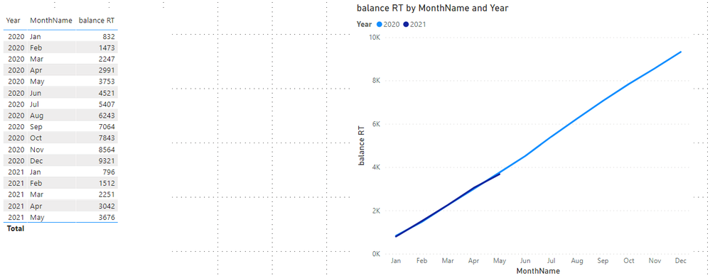
Result is as below.
Best Regards,
Rico Zhou
If this post helps, then please consider Accept it as the solution to help the other members find it more quickly.
- Mark as New
- Bookmark
- Subscribe
- Mute
- Subscribe to RSS Feed
- Permalink
- Report Inappropriate Content
@erikm , Assume you have selected a date in the slicer
Try a measure like
measure =
Var _Min1 = MAXX(allselected('Date'), 'Date'[Date])
Var _Min1 = date(year(min1)-1, 1,1)
Var _Max = MAXX(allselected('Date'), 'Date'[Date])
return CALCULATE(SUM(Table1[Value]), filter(Table1, Table1[date]=_max && Table1[date]=_min))
// or
return CALCULATE(SUM(Table1[Value]), filter(all(Date), Date[date]=_max && Date[date]=_min))
- Mark as New
- Bookmark
- Subscribe
- Mute
- Subscribe to RSS Feed
- Permalink
- Report Inappropriate Content
Hi @amitchandak ,
thank you for your suggestion. It feels like I'm almost there 🙂 The graph is displayed correctly with the months filtered, the only thing is that it displayed the separate monthly values and not a rolling total. I've tried to create an extra measure based on this new one, but then all of a sudden all years are displayed again. Would you have a suggestion for this?
Thank you!
- Mark as New
- Bookmark
- Subscribe
- Mute
- Subscribe to RSS Feed
- Permalink
- Report Inappropriate Content
Hi @erikm
In dax, catching date values from automatic time intelligence hierachy will make your code logic complex and use date in same table to filter value will make result incorrect due to the impactions between columns in same table.
Here I suggest you to turn off automatic time intelligence, and add an unrelated calendar table by dax.
Calendar = ADDCOLUMNS(CALENDARAUTO(),"YEAR",YEAR([Date]),"Month",MONTH([Date]),"Day",DAY([Date]),"MonthName",FORMAT([Date],"MMMM"))
Add Year, Month, MonthName columns into Movements Table by Dax.
Year = YEAR(Movements[MeasureDate]) Month = MONTH(Movements[MeasureDate])MonthName = FORMAT(Movements[MeasureDate],"MMM")
Measure:
balance RT =
VAR _EndtDay = SELECTEDVALUE('Calendar'[Date])
VAR _StartDay = DATE(SELECTEDVALUE('Calendar'[YEAR])-1,01,01)
RETURN
CALCULATE(SUM(Movements[balance]),FILTER(ALL(Movements),Movements[MeasureDate]>=_StartDay&&Movements[MeasureDate]<=_EndtDay&&Movements[Year] = MAX(Movements[Year])&&Movements[Month]<=MAX(Movements[Month])))
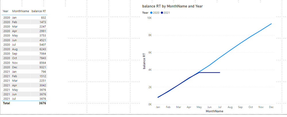
Result is as below.
Best Regards,
Rico Zhou
If this post helps, then please consider Accept it as the solution to help the other members find it more quickly.
- Mark as New
- Bookmark
- Subscribe
- Mute
- Subscribe to RSS Feed
- Permalink
- Report Inappropriate Content
Hi @Anonymous
thank you for the suggestion, that certainly helps me further! One small thing that I still couldn't figure out that you might have a quick solution for. In your above screenshot, you selected a day somwhere in May 2021. How would I hide the line that goes horizontal? In other words, when I select a date in May 2021, I would like the line in the graph to stop after May and not display the same figures for the other months up until today.
Thank you!
Best regards,
Erik
- Mark as New
- Bookmark
- Subscribe
- Mute
- Subscribe to RSS Feed
- Permalink
- Report Inappropriate Content
Hi @erikm
Try If function, I update the measure.
balance RT =
VAR _EndtDay =
    SELECTEDVALUE ( 'Calendar'[Date] )
VAR _StartDay =
    DATE ( SELECTEDVALUE ( 'Calendar'[YEAR] ) - 1, 01, 01 )
RETURN
    IF (
        MAX ( Movements[Year] ) * 100
            + MAX ( Movements[Month] )
            <= SELECTEDVALUE ( 'Calendar'[YEAR] ) * 100
                + SELECTEDVALUE ( 'Calendar'[Month] ),
        CALCULATE (
            SUM ( Movements[balance] ),
            FILTER (
                ALL ( Movements ),
                Movements[MeasureDate] >= _StartDay
                    && Movements[MeasureDate] <= _EndtDay
                    && Movements[Year] = MAX ( Movements[Year] )
                    && Movements[Month] <= MAX ( Movements[Month] )
            )
        ),
        BLANK ()
    )
Result is as below.
Best Regards,
Rico Zhou
If this post helps, then please consider Accept it as the solution to help the other members find it more quickly.
Helpful resources

Power BI Monthly Update - November 2025
Check out the November 2025 Power BI update to learn about new features.

Fabric Data Days
Advance your Data & AI career with 50 days of live learning, contests, hands-on challenges, study groups & certifications and more!

| User | Count |
|---|---|
| 98 | |
| 72 | |
| 50 | |
| 48 | |
| 42 |


