FabCon is coming to Atlanta
Join us at FabCon Atlanta from March 16 - 20, 2026, for the ultimate Fabric, Power BI, AI and SQL community-led event. Save $200 with code FABCOMM.
Register now!- Power BI forums
- Get Help with Power BI
- Desktop
- Service
- Report Server
- Power Query
- Mobile Apps
- Developer
- DAX Commands and Tips
- Custom Visuals Development Discussion
- Health and Life Sciences
- Power BI Spanish forums
- Translated Spanish Desktop
- Training and Consulting
- Instructor Led Training
- Dashboard in a Day for Women, by Women
- Galleries
- Data Stories Gallery
- Themes Gallery
- Contests Gallery
- Quick Measures Gallery
- Notebook Gallery
- Translytical Task Flow Gallery
- TMDL Gallery
- R Script Showcase
- Webinars and Video Gallery
- Ideas
- Custom Visuals Ideas (read-only)
- Issues
- Issues
- Events
- Upcoming Events
Join the Fabric FabCon Global Hackathon—running virtually through Nov 3. Open to all skill levels. $10,000 in prizes! Register now.
- Power BI forums
- Forums
- Get Help with Power BI
- Desktop
- Is there a way I can change the key variable on a ...
- Subscribe to RSS Feed
- Mark Topic as New
- Mark Topic as Read
- Float this Topic for Current User
- Bookmark
- Subscribe
- Printer Friendly Page
- Mark as New
- Bookmark
- Subscribe
- Mute
- Subscribe to RSS Feed
- Permalink
- Report Inappropriate Content
Is there a way I can change the key variable on a dashboard?
Hi,
I am running a dashboard with multiple visualisations looking at revenue. e.g. revenue by state, revenue by territory, revenue by product.
I would also like to run an identical dashboard but against quantity e.g. quantity by state, quantity by territory, quantity by product.
Is there any way I can run them off a single dashboard, using a slicer or table? Or maybe by use of a field with revenue and qty in it which I can use to switch between the two variables?
Regards
darliusk
Solved! Go to Solution.
- Mark as New
- Bookmark
- Subscribe
- Mute
- Subscribe to RSS Feed
- Permalink
- Report Inappropriate Content
Hi @darliusk ,
Please check if this blog could help you: Dynamic EVERYTHING (measures, axis, legend, titles... - Microsoft Power BI Community.
This solution shows layered dynamic DAX measures, i.e. how one chart can show different values, in different time frames, different scale. Report also shows how a slicer can be used to dynamically change axis and legend. Report has dynamic title and switch for chart types.
Best Regards,
Icey
If this post helps, then please consider Accept it as the solution to help the other members find it more quickly.
- Mark as New
- Bookmark
- Subscribe
- Mute
- Subscribe to RSS Feed
- Permalink
- Report Inappropriate Content
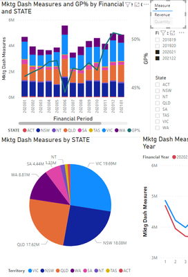
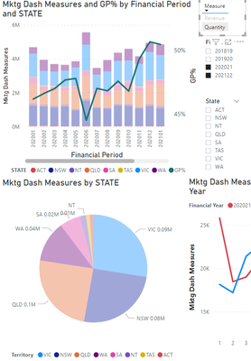
Thanks @amitchandak , it works to a degree, with simple line graph visualisations changing with no issues.
However, when I try to use it on pie graphs, only the values change and with stacked bar charts, nothing happens.
Any follow-up suggestions?
What I saw was the following:
Revenue measure:
By Quantity Measure
- Mark as New
- Bookmark
- Subscribe
- Mute
- Subscribe to RSS Feed
- Permalink
- Report Inappropriate Content
Hi @darliusk ,
Please check if this blog could help you: Dynamic EVERYTHING (measures, axis, legend, titles... - Microsoft Power BI Community.
This solution shows layered dynamic DAX measures, i.e. how one chart can show different values, in different time frames, different scale. Report also shows how a slicer can be used to dynamically change axis and legend. Report has dynamic title and switch for chart types.
Best Regards,
Icey
If this post helps, then please consider Accept it as the solution to help the other members find it more quickly.
- Mark as New
- Bookmark
- Subscribe
- Mute
- Subscribe to RSS Feed
- Permalink
- Report Inappropriate Content
@darliusk , Seem like you are looking for a measure slicer
measure slicer
https://www.youtube.com/watch?v=b9352Vxuj-M
https://community.powerbi.com/t5/Desktop/Slicer-MTD-QTD-YTD-to-filter-dates-using-the-slicer/td-p/50...
https://radacad.com/change-the-column-or-measure-value-in-a-power-bi-visual-by-selection-of-the-slic...


