European Microsoft Fabric Community Conference
The ultimate Microsoft Fabric, Power BI, Azure AI, and SQL learning event! Join us in Stockholm, Sweden from September 24-27, 2024.
2-for-1 sale on June 20 only!
- Power BI forums
- Updates
- News & Announcements
- Get Help with Power BI
- Desktop
- Service
- Report Server
- Power Query
- Mobile Apps
- Developer
- DAX Commands and Tips
- Custom Visuals Development Discussion
- Health and Life Sciences
- Power BI Spanish forums
- Translated Spanish Desktop
- Training and Consulting
- Instructor Led Training
- Dashboard in a Day for Women, by Women
- Galleries
- Community Connections & How-To Videos
- COVID-19 Data Stories Gallery
- Themes Gallery
- Data Stories Gallery
- R Script Showcase
- Webinars and Video Gallery
- Quick Measures Gallery
- 2021 MSBizAppsSummit Gallery
- 2020 MSBizAppsSummit Gallery
- 2019 MSBizAppsSummit Gallery
- Events
- Ideas
- Custom Visuals Ideas
- Issues
- Issues
- Events
- Upcoming Events
- Community Blog
- Power BI Community Blog
- Custom Visuals Community Blog
- Community Support
- Community Accounts & Registration
- Using the Community
- Community Feedback
Find everything you need to get certified on Fabric—skills challenges, live sessions, exam prep, role guidance, and more. Get started
- Power BI forums
- Forums
- Get Help with Power BI
- Desktop
- Re: Is there a visual like a doughnut with picture...
- Subscribe to RSS Feed
- Mark Topic as New
- Mark Topic as Read
- Float this Topic for Current User
- Bookmark
- Subscribe
- Printer Friendly Page
- Mark as New
- Bookmark
- Subscribe
- Mute
- Subscribe to RSS Feed
- Permalink
- Report Inappropriate Content
Is there a visual like a doughnut with picture data labels?
Hello,
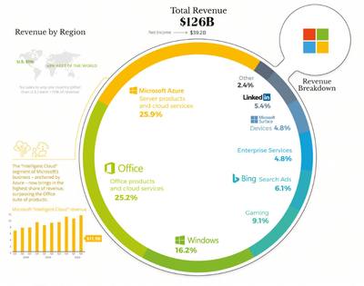
I have a client that saw the article "How Big Tech Makes Their Billions" and would like a chart like that one 😁
Basically is a big donought that has data labels with text & pictures.
I have searched the appsource and can't find some "close enough".
Is there a way to achieve this in Power BI?
Kind Regards,
Lucian
Solved! Go to Solution.
- Mark as New
- Bookmark
- Subscribe
- Mute
- Subscribe to RSS Feed
- Permalink
- Report Inappropriate Content
hi @Lucian
I don't know something "close enough"
I think you need your own visual or try charticulator https://charticulator.com/
- Mark as New
- Bookmark
- Subscribe
- Mute
- Subscribe to RSS Feed
- Permalink
- Report Inappropriate Content
Hi @Lucian ,
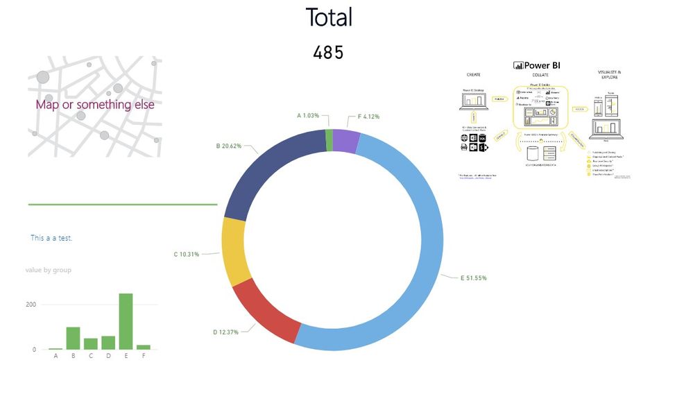
As shown in the following screenshot, the position marked with the number can be achieved, but the custom line segment cannot be realized, such as Curves and rings.
The number 1, you can use a donut chart.
The number2, you can use a map chart.
The number 3, you can insert a Text box.
The number 4, you can use a bar chart.
The number 5, you can use a card and insert a Text box above it.
The number 6, you can insert a picture.
Or you can try the method that @az38 mentioned.
If you have any question, please kindly ask here and we will try to resolve it.
BTW, pbix as attached.
Best regards,
Community Support Team _ zhenbw
If this post helps, then please consider Accept it as the solution to help the other members find it more quickly.
- Mark as New
- Bookmark
- Subscribe
- Mute
- Subscribe to RSS Feed
- Permalink
- Report Inappropriate Content
Hello @v-zhenbw-msft ,
And thank you for the thorough chart breakdown 😁
I am "concerned" only by the "number 1" - the doughnut - because the data labels should have some picture logos besides the values.
It seems that I have to create a "custom visual" and I hope "Charticulator" recommended by @az38would do the job.
Thank you both for recomandations.
Kind Regards,
Lucian
- Mark as New
- Bookmark
- Subscribe
- Mute
- Subscribe to RSS Feed
- Permalink
- Report Inappropriate Content
hi @Lucian
I don't know something "close enough"
I think you need your own visual or try charticulator https://charticulator.com/
Helpful resources

Europe’s largest Microsoft Fabric Community Conference
Join the community in Stockholm for expert Microsoft Fabric learning including a very exciting keynote from Arun Ulag, Corporate Vice President, Azure Data.

Power BI Monthly Update - June 2024
Check out the June 2024 Power BI update to learn about new features.

| User | Count |
|---|---|
| 99 | |
| 90 | |
| 83 | |
| 64 | |
| 58 |
| User | Count |
|---|---|
| 244 | |
| 128 | |
| 118 | |
| 79 | |
| 78 |


