Join us at the 2025 Microsoft Fabric Community Conference
Microsoft Fabric Community Conference 2025, March 31 - April 2, Las Vegas, Nevada. Use code FABINSIDER for a $400 discount.
Register now- Power BI forums
- Get Help with Power BI
- Desktop
- Service
- Report Server
- Power Query
- Mobile Apps
- Developer
- DAX Commands and Tips
- Custom Visuals Development Discussion
- Health and Life Sciences
- Power BI Spanish forums
- Translated Spanish Desktop
- Training and Consulting
- Instructor Led Training
- Dashboard in a Day for Women, by Women
- Galleries
- Webinars and Video Gallery
- Data Stories Gallery
- Themes Gallery
- Power BI DataViz World Championships Gallery
- Quick Measures Gallery
- R Script Showcase
- COVID-19 Data Stories Gallery
- Community Connections & How-To Videos
- 2021 MSBizAppsSummit Gallery
- 2020 MSBizAppsSummit Gallery
- 2019 MSBizAppsSummit Gallery
- Events
- Ideas
- Custom Visuals Ideas (read-only)
- Issues
- Issues
- Events
- Upcoming Events
The Power BI DataViz World Championships are on! With four chances to enter, you could win a spot in the LIVE Grand Finale in Las Vegas. Show off your skills.
- Power BI forums
- Forums
- Get Help with Power BI
- Desktop
- Re: Is it possible to hide the Secondary Y axis fo...
- Subscribe to RSS Feed
- Mark Topic as New
- Mark Topic as Read
- Float this Topic for Current User
- Bookmark
- Subscribe
- Printer Friendly Page
- Mark as New
- Bookmark
- Subscribe
- Mute
- Subscribe to RSS Feed
- Permalink
- Report Inappropriate Content
Is it possible to hide the Secondary Y axis for a line and stacked column bar?
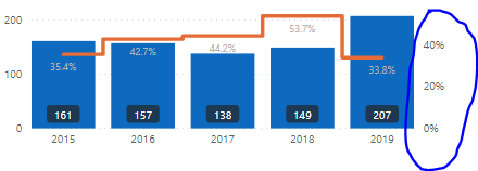
I get the following line and stacked column bar. I would like to hide the secondary Y axis on the right. Is this possible?
Solved! Go to Solution.
- Mark as New
- Bookmark
- Subscribe
- Mute
- Subscribe to RSS Feed
- Permalink
- Report Inappropriate Content
I am using the November 2019 version that just came out but it is available to everyone.
- Mark as New
- Bookmark
- Subscribe
- Mute
- Subscribe to RSS Feed
- Permalink
- Report Inappropriate Content
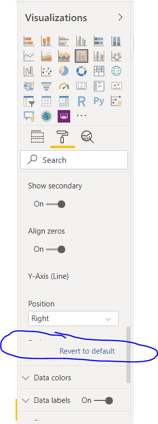
Check labels to none. Should solve it.
- Mark as New
- Bookmark
- Subscribe
- Mute
- Subscribe to RSS Feed
- Permalink
- Report Inappropriate Content
Hi, where exactly can I find these options? I have power BI desktop version from Dec 2024 and don't see it..
- Mark as New
- Bookmark
- Subscribe
- Mute
- Subscribe to RSS Feed
- Permalink
- Report Inappropriate Content
I agree with Pirdim, changing the color to hide the axis is a bandaid not a solution and not really an acceptable solution for the reasons listed above. Please add this simple setting.
- Mark as New
- Bookmark
- Subscribe
- Mute
- Subscribe to RSS Feed
- Permalink
- Report Inappropriate Content
There is an idea submitted for this already but it needs votes in order to make it to production.
https://ideas.powerbi.com/ideas/idea/?ideaid=7ef6c2e4-c4ad-4884-a325-795f014fe15e
- Mark as New
- Bookmark
- Subscribe
- Mute
- Subscribe to RSS Feed
- Permalink
- Report Inappropriate Content
Hi @Anonymous ,
Is this problem solved?
If it is solved, please always accept the replies making sense as solution to your question so that people who may have the same question can get the solution directly.
If not, please let me know.
Best Regards
Icey
- Mark as New
- Bookmark
- Subscribe
- Mute
- Subscribe to RSS Feed
- Permalink
- Report Inappropriate Content
Hi,
This problem is not solved yet. I guess this is a bug for MS Power BI.
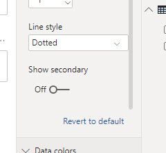
Why can't disable 'Show secondary':
- If disable 'Show secondary', get the following; you can see the orange line (for rate %) goes down to the x-axis and becomes meaningless...
- Mark as New
- Bookmark
- Subscribe
- Mute
- Subscribe to RSS Feed
- Permalink
- Report Inappropriate Content
@Anonymous
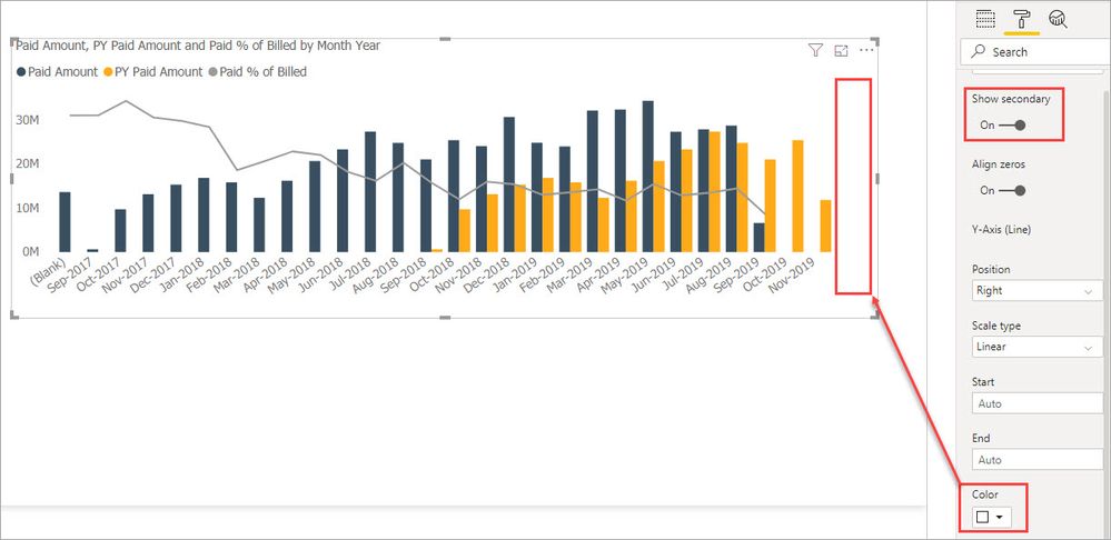
Right you are, sorry. The only thing I can think to do is change the text color on the secondary axis to match the chart background.
- Mark as New
- Bookmark
- Subscribe
- Mute
- Subscribe to RSS Feed
- Permalink
- Report Inappropriate Content
Thank you.
But, I don't have the options that you have. Do you use an upgraded version of MS Power BI?
- Mark as New
- Bookmark
- Subscribe
- Mute
- Subscribe to RSS Feed
- Permalink
- Report Inappropriate Content
I am using the November 2019 version that just came out but it is available to everyone.
- Mark as New
- Bookmark
- Subscribe
- Mute
- Subscribe to RSS Feed
- Permalink
- Report Inappropriate Content
Thank you.
I've updated the desktop to 11/11/2019, and it works.
- Mark as New
- Bookmark
- Subscribe
- Mute
- Subscribe to RSS Feed
- Permalink
- Report Inappropriate Content
Under the Y Axis formatting you can set "Show secondary" to Off
If this solves your issues please mark it as the solution. Kudos 👍 are nice too.
- Mark as New
- Bookmark
- Subscribe
- Mute
- Subscribe to RSS Feed
- Permalink
- Report Inappropriate Content
hi @jdbuchanan71 . this actually doesn't solve the problem and above the @Anonymous pointed that out. When you try to disable secondary axis data will simply become useless as both column and line chart data now will be represented on same axis... As funny as it is - this problem still exist. And some time ago I posted similar issue with secondary axis which was eventually not answered: https://community.powerbi.com/t5/Issues/Secondary-Axis-align-zero-option-is-not-working-properly-Line/idc-p/979763#M54925
- Mark as New
- Bookmark
- Subscribe
- Mute
- Subscribe to RSS Feed
- Permalink
- Report Inappropriate Content
Does setting the secondary axis label text color to white work for you?
- Mark as New
- Bookmark
- Subscribe
- Mute
- Subscribe to RSS Feed
- Permalink
- Report Inappropriate Content
hi @jdbuchanan71 , thanks for your reply. I saw your comment about white color and to be honest I was using same workaround previously. But as all workarounds it is missing smth. It helps to remove annoying numbers but it fails in 2 things: first of all - this secondary axis takes some space (color doesn't change) which is crucial for me. 2nd thing - this color approach doesn't work on mobile version if user has auto change of theme (dark mode). I would just prefer PBI team add simple possibility to hide numbers... that's it
- Mark as New
- Bookmark
- Subscribe
- Mute
- Subscribe to RSS Feed
- Permalink
- Report Inappropriate Content
Another banger . This issue was giving me problems
Helpful resources

Join us at the Microsoft Fabric Community Conference
March 31 - April 2, 2025, in Las Vegas, Nevada. Use code MSCUST for a $150 discount!

Power BI Monthly Update - February 2025
Check out the February 2025 Power BI update to learn about new features.

| User | Count |
|---|---|
| 85 | |
| 79 | |
| 54 | |
| 39 | |
| 35 |
| User | Count |
|---|---|
| 102 | |
| 80 | |
| 48 | |
| 48 | |
| 48 |


