Join us at FabCon Vienna from September 15-18, 2025
The ultimate Fabric, Power BI, SQL, and AI community-led learning event. Save €200 with code FABCOMM.
Get registered- Power BI forums
- Get Help with Power BI
- Desktop
- Service
- Report Server
- Power Query
- Mobile Apps
- Developer
- DAX Commands and Tips
- Custom Visuals Development Discussion
- Health and Life Sciences
- Power BI Spanish forums
- Translated Spanish Desktop
- Training and Consulting
- Instructor Led Training
- Dashboard in a Day for Women, by Women
- Galleries
- Data Stories Gallery
- Themes Gallery
- Contests Gallery
- Quick Measures Gallery
- Notebook Gallery
- Translytical Task Flow Gallery
- TMDL Gallery
- R Script Showcase
- Webinars and Video Gallery
- Ideas
- Custom Visuals Ideas (read-only)
- Issues
- Issues
- Events
- Upcoming Events
Enhance your career with this limited time 50% discount on Fabric and Power BI exams. Ends August 31st. Request your voucher.
- Power BI forums
- Forums
- Get Help with Power BI
- Desktop
- Is it possible to have a 'zoned' line chart (examp...
- Subscribe to RSS Feed
- Mark Topic as New
- Mark Topic as Read
- Float this Topic for Current User
- Bookmark
- Subscribe
- Printer Friendly Page
- Mark as New
- Bookmark
- Subscribe
- Mute
- Subscribe to RSS Feed
- Permalink
- Report Inappropriate Content
Is it possible to have a 'zoned' line chart (example within)
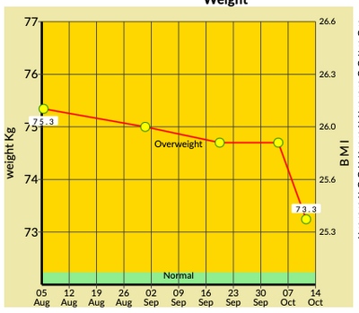
Hi I am looking for a visual that will give me something like this:
I have an individual's height and BMI The chart above is taken from a piece of software that then plots the weight measurements (easy enough), but I would like to have the BMI zones displayed within the chart, like above. Does anyone have any idea how, or if this is possible with PBI?
Thanks
- Mark as New
- Bookmark
- Subscribe
- Mute
- Subscribe to RSS Feed
- Permalink
- Report Inappropriate Content
Hi @Anonymous ,
Currently Power BI only support conditional formatting applies to the values of Table or Matrix visuals, so it is not able to have conditional formatting background color for line chart. You can find the details in this offical documentation. You can raise a new idea and add your comments there to make this feature coming sooner.
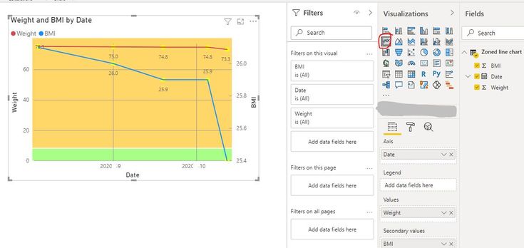
In addition, I create a sample pbix using line chart and shapes to create a similar visual. Please check whether that can be used as an alternative.
Best Regards
Rena
Community Support Team _ Rena Ruan
If this post helps, then please consider Accept it as the solution to help the other members find it more.
- Mark as New
- Bookmark
- Subscribe
- Mute
- Subscribe to RSS Feed
- Permalink
- Report Inappropriate Content
Hi. I have tried to replicate this but cannot get my head round it. Could you please send the .pbix? The link has been removed.
- Mark as New
- Bookmark
- Subscribe
- Mute
- Subscribe to RSS Feed
- Permalink
- Report Inappropriate Content
@Anonymous , you can have a secondary y-axis. But that can not be used unless there is a measure that uses that.


