New Offer! Become a Certified Fabric Data Engineer
Check your eligibility for this 50% exam voucher offer and join us for free live learning sessions to get prepared for Exam DP-700.
Get Started- Power BI forums
- Get Help with Power BI
- Desktop
- Service
- Report Server
- Power Query
- Mobile Apps
- Developer
- DAX Commands and Tips
- Custom Visuals Development Discussion
- Health and Life Sciences
- Power BI Spanish forums
- Translated Spanish Desktop
- Training and Consulting
- Instructor Led Training
- Dashboard in a Day for Women, by Women
- Galleries
- Community Connections & How-To Videos
- COVID-19 Data Stories Gallery
- Themes Gallery
- Data Stories Gallery
- R Script Showcase
- Webinars and Video Gallery
- Quick Measures Gallery
- 2021 MSBizAppsSummit Gallery
- 2020 MSBizAppsSummit Gallery
- 2019 MSBizAppsSummit Gallery
- Events
- Ideas
- Custom Visuals Ideas
- Issues
- Issues
- Events
- Upcoming Events
Don't miss out! 2025 Microsoft Fabric Community Conference, March 31 - April 2, Las Vegas, Nevada. Use code MSCUST for a $150 discount. Prices go up February 11th. Register now.
- Power BI forums
- Forums
- Get Help with Power BI
- Desktop
- Re: Interactive monthly & daily date visuals in th...
- Subscribe to RSS Feed
- Mark Topic as New
- Mark Topic as Read
- Float this Topic for Current User
- Bookmark
- Subscribe
- Printer Friendly Page
- Mark as New
- Bookmark
- Subscribe
- Mute
- Subscribe to RSS Feed
- Permalink
- Report Inappropriate Content
Interactive monthly & daily date visuals in the same dashboard
Hi everyone,
I'm seeking some help regarding this issue on how to have both Monthly & daily visuals in the same dashboard.
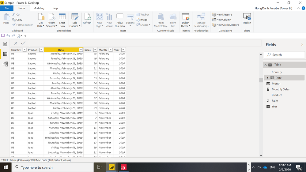
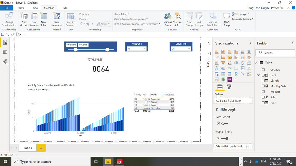
For example i have daily sales data by product, by country (image 1) and i want to have 2 visuals like in image 2.
- 1st visual: is total sales
- 2nd visual: monthly sales trend by product & month
I've created:
- Month column: Month = 'Table'[Date].[Month]
- Year column: Year = 'Table'[Date].[Year]
- Monthly sales measure: Monthly Sales = Calculate(sum('Table'[Sales ]),ALLEXCEPT('Table','Table'[Date],'Table'[Country],'Table'[Product]))
However, i still have 3 issues. I think the column & measure i created is wrong?
- My year is cumulative (in bottom right table)
- Monthly sales is the same across month (botton left chart)
- I cannot display month-year in the axit ie: Jan-2019, Jan-2020
I have PBI file but not sure how to attach here. If this qs is not clear enough please let me know!
.
- Mark as New
- Bookmark
- Subscribe
- Mute
- Subscribe to RSS Feed
- Permalink
- Report Inappropriate Content
Hi @jinny_le ,
Please create a calculated column as below and add it to the x-axis to work on it.
Year Month = FORMAT([Date],"MMM-YYYY")
If it doesn't meet your requirement, kindly share your sample data and excepted result to me if you don't have any Confidential Information. Please upload your files to One Drive and share the link here.
If this post helps, then please consider Accept it as the solution to help the others find it more quickly.
- Mark as New
- Bookmark
- Subscribe
- Mute
- Subscribe to RSS Feed
- Permalink
- Report Inappropriate Content
Thanks you very much for the guidance below. I managed to solve that problem and i can already create Monthly visuals :). However I have 2 other issues i want to ask you as well.
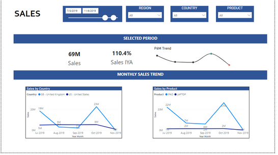
I have a dashboard like below where i have 2 years sale data of 2 products Ipad, Laptop for 2 countries UK US.
There are 2 sets of visual "Selected Period" and "Monthly trend". I have 2 help needed:
1. P6M trend: i would like to see P6M trend ending the last date of selected period. For example for data filter i choose, 1Jan19 to 31Jan19, my P6M visuals will show sales for 6 months Aug18, Sep18, Oct18,Nov18, Dec18, Jan19
2. Monthly sales trend: i would like to see all the historical months until last date of selected period. For examle for data filter i choose 1Jan to 31Jan19, the monthly trend visuals will show monthly sales from Jan18 (latest data available) until Jan19
For now it only covers the selected periods only. Thanks so much for your help!
- Mark as New
- Bookmark
- Subscribe
- Mute
- Subscribe to RSS Feed
- Permalink
- Report Inappropriate Content
Hi @jinny_le ,
I think you can just use Sales in the Value field of the clustered column chart you have there and that should display the sum of sales per month, without the need for a measure.
In order to display your date in "MMM-YYYY" format, you can change the original Date field to that format in the Date Formatting options under the Modelling tab.
- Mark as New
- Bookmark
- Subscribe
- Mute
- Subscribe to RSS Feed
- Permalink
- Report Inappropriate Content
@tkirilov Thanks for your reponse! I tried and it still doesn't work. Even though i change the Date to display as MMM YYYY, i still have multiple Jan 2020 and Feb 2020 data.
Helpful resources

Join us at the Microsoft Fabric Community Conference
March 31 - April 2, 2025, in Las Vegas, Nevada. Use code MSCUST for a $150 discount! Prices go up Feb. 11th.

Power BI Monthly Update - January 2025
Check out the January 2025 Power BI update to learn about new features in Reporting, Modeling, and Data Connectivity.

| User | Count |
|---|---|
| 144 | |
| 85 | |
| 65 | |
| 51 | |
| 45 |
| User | Count |
|---|---|
| 217 | |
| 88 | |
| 81 | |
| 65 | |
| 56 |


