FabCon is coming to Atlanta
Join us at FabCon Atlanta from March 16 - 20, 2026, for the ultimate Fabric, Power BI, AI and SQL community-led event. Save $200 with code FABCOMM.
Register now!- Power BI forums
- Get Help with Power BI
- Desktop
- Service
- Report Server
- Power Query
- Mobile Apps
- Developer
- DAX Commands and Tips
- Custom Visuals Development Discussion
- Health and Life Sciences
- Power BI Spanish forums
- Translated Spanish Desktop
- Training and Consulting
- Instructor Led Training
- Dashboard in a Day for Women, by Women
- Galleries
- Data Stories Gallery
- Themes Gallery
- Contests Gallery
- QuickViz Gallery
- Quick Measures Gallery
- Visual Calculations Gallery
- Notebook Gallery
- Translytical Task Flow Gallery
- TMDL Gallery
- R Script Showcase
- Webinars and Video Gallery
- Ideas
- Custom Visuals Ideas (read-only)
- Issues
- Issues
- Events
- Upcoming Events
The Power BI Data Visualization World Championships is back! Get ahead of the game and start preparing now! Learn more
- Power BI forums
- Forums
- Get Help with Power BI
- Desktop
- I only want one secondary y-axis
- Subscribe to RSS Feed
- Mark Topic as New
- Mark Topic as Read
- Float this Topic for Current User
- Bookmark
- Subscribe
- Printer Friendly Page
- Mark as New
- Bookmark
- Subscribe
- Mute
- Subscribe to RSS Feed
- Permalink
- Report Inappropriate Content
I only want one secondary y-axis
I have an excel chart where I can select which lines have a secondary y axis.
However, in Power Bi, it applies the secondary y axis to both lines.
I need the yellow bar to fall back down like the first image. Is there a way to do this?
Thanks!
- Mark as New
- Bookmark
- Subscribe
- Mute
- Subscribe to RSS Feed
- Permalink
- Report Inappropriate Content
Hi @jwin2424 ,
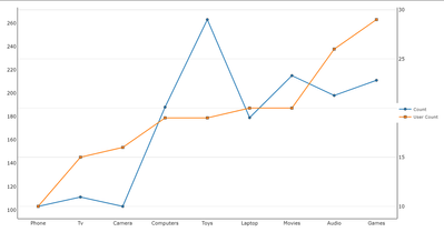
Here is Dual Y axis Line Chart which will help you to choose which value you want on secondary axis or you can also add third axis. You will just need to add a stacked column chart along with it to suit your need. Hope this helps you..


Download link on this page
https://pbivizedit.com/gallery/dual-y-axis-line-chart
This was made with our Custom Visual creator tool PBIVizEdit.com. With this tool,
- anyone, irrespective of technical skills, can create their own visuals
- 15 minutes to create a visual from scratch
- opens up many additional attributes to edit (for e.g. labels, tooltips, legends position, etc)
Give this a shot and let us know if you face any problems/errors.
You can use the editor to modify your visual further (some modifications cannot be done in Power BI window and have to be in the editor).
Thanks,
Team PBIVizEdit
- Mark as New
- Bookmark
- Subscribe
- Mute
- Subscribe to RSS Feed
- Permalink
- Report Inappropriate Content
Actually nevermind, I see what you're saying. I need to create it with a column chart. I am on a company computer, and I cannot download from the internet. Is this the only solution?
- Mark as New
- Bookmark
- Subscribe
- Mute
- Subscribe to RSS Feed
- Permalink
- Report Inappropriate Content
HI @jwin2424,
Here is the custom visual of the dual y-axis column chart, you can try it it helps:
Dual Y Axis Column Chart | PBI VizEdit
Regards,
Xiaoxin Sheng
- Mark as New
- Bookmark
- Subscribe
- Mute
- Subscribe to RSS Feed
- Permalink
- Report Inappropriate Content
Almost what I need. I mispoke in my last message. I said Column Chart when I really meant Stacked Chart (lilke the visual from my original post). I am playing around with the editor though to see if I can adjust the chart myself. I found the bar chart type and switched it to Scattered, but that didn't seem to work.
- Mark as New
- Bookmark
- Subscribe
- Mute
- Subscribe to RSS Feed
- Permalink
- Report Inappropriate Content
Hi @jwin2424,
I don't think the scatter chart can achieve the sample effect you shared. It used different logic than common dual-axis charts to analyze records.
If the above suggestion all not suitable for your requirement, you can also try to use script-based visuals (e.g. R, Python) to manually plot corresponding visual graphs. (they can simply nest different visual effects on the same chart)
Dual Y axis with R and ggplot2 – the R Graph Gallery (r-graph-gallery.com)
Regards,
Xiaoxin Sheng
- Mark as New
- Bookmark
- Subscribe
- Mute
- Subscribe to RSS Feed
- Permalink
- Report Inappropriate Content
Bummer. Thank for the recommendation. I am not familiar with R, so I don't think I will be adding it to my chart. For now, I will just have to think of a different visual display.
- Mark as New
- Bookmark
- Subscribe
- Mute
- Subscribe to RSS Feed
- Permalink
- Report Inappropriate Content
Thank you for this. I did download it via the tool in Power Bi (Get more Apps), but this doesn't have columns as far as I can see. Am I missing something?
- Mark as New
- Bookmark
- Subscribe
- Mute
- Subscribe to RSS Feed
- Permalink
- Report Inappropriate Content
Helpful resources

Power BI Dataviz World Championships
The Power BI Data Visualization World Championships is back! Get ahead of the game and start preparing now!

| User | Count |
|---|---|
| 38 | |
| 36 | |
| 33 | |
| 30 | |
| 28 |
| User | Count |
|---|---|
| 128 | |
| 88 | |
| 79 | |
| 67 | |
| 62 |


