Join us at the 2025 Microsoft Fabric Community Conference
Microsoft Fabric Community Conference 2025, March 31 - April 2, Las Vegas, Nevada. Use code FABINSIDER for a $400 discount.
Register now- Power BI forums
- Get Help with Power BI
- Desktop
- Service
- Report Server
- Power Query
- Mobile Apps
- Developer
- DAX Commands and Tips
- Custom Visuals Development Discussion
- Health and Life Sciences
- Power BI Spanish forums
- Translated Spanish Desktop
- Training and Consulting
- Instructor Led Training
- Dashboard in a Day for Women, by Women
- Galleries
- Webinars and Video Gallery
- Data Stories Gallery
- Themes Gallery
- Power BI DataViz World Championships Gallery
- Quick Measures Gallery
- R Script Showcase
- COVID-19 Data Stories Gallery
- Community Connections & How-To Videos
- 2021 MSBizAppsSummit Gallery
- 2020 MSBizAppsSummit Gallery
- 2019 MSBizAppsSummit Gallery
- Events
- Ideas
- Custom Visuals Ideas
- Issues
- Issues
- Events
- Upcoming Events
The Power BI DataViz World Championships are on! With four chances to enter, you could win a spot in the LIVE Grand Finale in Las Vegas. Show off your skills.
- Power BI forums
- Forums
- Get Help with Power BI
- Desktop
- Re: How to visualize several yes/no questions in o...
- Subscribe to RSS Feed
- Mark Topic as New
- Mark Topic as Read
- Float this Topic for Current User
- Bookmark
- Subscribe
- Printer Friendly Page
- Mark as New
- Bookmark
- Subscribe
- Mute
- Subscribe to RSS Feed
- Permalink
- Report Inappropriate Content
How to visualize several yes/no questions in one diagram
Hey everybody,
I try to visualize the results of a survey. I have five columns, which are all filled with yes or no. Now I want to create a diagram that shows for each of the five colums the amount of the answer "yes". Thus, the diagram should show the amount of yes answers for question 1, question 2, question 3, question 4 and question 5.
Best,
Tobias
Solved! Go to Solution.
- Mark as New
- Bookmark
- Subscribe
- Mute
- Subscribe to RSS Feed
- Permalink
- Report Inappropriate Content
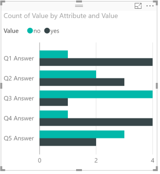
If @bblais is correct, which I imagine he is given your description, go to the query editor and select the responder column. Right click and select "Unpivot Other Columns" (rename Attribute and Value if you want).
Close and apply, then create a visual (bar chart works well here) and add Attribute to axis, Value to legend, and Value to value (changing it to count for the aggregation):
- Mark as New
- Bookmark
- Subscribe
- Mute
- Subscribe to RSS Feed
- Permalink
- Report Inappropriate Content
So your data is something like this?
| Responder | Q1 Answer | Q2 Answer | Q3 Answer | Q4 Answer | Q5 Answer |
| 1 | yes | yes | no | yes | no |
| 2 | yes | no | no | yes | no |
| 3 | no | yes | no | yes | yes |
| 4 | yes | no | yes | yes | no |
| 5 | yes | yes | no | no | yes |
If not, can you please post an example of the data to help make sure we can give you the best solution?
- Mark as New
- Bookmark
- Subscribe
- Mute
- Subscribe to RSS Feed
- Permalink
- Report Inappropriate Content
If @bblais is correct, which I imagine he is given your description, go to the query editor and select the responder column. Right click and select "Unpivot Other Columns" (rename Attribute and Value if you want).
Close and apply, then create a visual (bar chart works well here) and add Attribute to axis, Value to legend, and Value to value (changing it to count for the aggregation):
- Mark as New
- Bookmark
- Subscribe
- Mute
- Subscribe to RSS Feed
- Permalink
- Report Inappropriate Content
Thank you so much. It works!
Helpful resources

Join us at the Microsoft Fabric Community Conference
March 31 - April 2, 2025, in Las Vegas, Nevada. Use code MSCUST for a $150 discount!

Power BI Monthly Update - February 2025
Check out the February 2025 Power BI update to learn about new features.

Join our Community Sticker Challenge 2025
If you love stickers, then you will definitely want to check out our Community Sticker Challenge!

| User | Count |
|---|---|
| 84 | |
| 69 | |
| 68 | |
| 39 | |
| 37 |

