Join us at the 2025 Microsoft Fabric Community Conference
Microsoft Fabric Community Conference 2025, March 31 - April 2, Las Vegas, Nevada. Use code FABINSIDER for a $400 discount.
Register now- Power BI forums
- Get Help with Power BI
- Desktop
- Service
- Report Server
- Power Query
- Mobile Apps
- Developer
- DAX Commands and Tips
- Custom Visuals Development Discussion
- Health and Life Sciences
- Power BI Spanish forums
- Translated Spanish Desktop
- Training and Consulting
- Instructor Led Training
- Dashboard in a Day for Women, by Women
- Galleries
- Webinars and Video Gallery
- Data Stories Gallery
- Themes Gallery
- Power BI DataViz World Championships Gallery
- Quick Measures Gallery
- R Script Showcase
- COVID-19 Data Stories Gallery
- Community Connections & How-To Videos
- 2021 MSBizAppsSummit Gallery
- 2020 MSBizAppsSummit Gallery
- 2019 MSBizAppsSummit Gallery
- Events
- Ideas
- Custom Visuals Ideas (read-only)
- Issues
- Issues
- Events
- Upcoming Events
The Power BI DataViz World Championships are on! With four chances to enter, you could win a spot in the LIVE Grand Finale in Las Vegas. Show off your skills.
- Power BI forums
- Forums
- Get Help with Power BI
- Desktop
- How to use radar chart?
- Subscribe to RSS Feed
- Mark Topic as New
- Mark Topic as Read
- Float this Topic for Current User
- Bookmark
- Subscribe
- Printer Friendly Page
- Mark as New
- Bookmark
- Subscribe
- Mute
- Subscribe to RSS Feed
- Permalink
- Report Inappropriate Content
How to use radar chart?
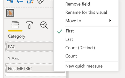
Hi. Is it possible for me to make the PAC as the Y-axis? Because I need the types PAC to be on the legend.
But if I put the PAC on Y-axis, it only possible for me to choose the first or the last PAC only. I want all the PAC to be shown on the chart.
By the way, the KPIs (KPI 1, KPI 2, KPI 3, KPI 4, and KPI 5) are from METRIC Table. I use measures to separate them because it won't work. It will appear like this.
I also tried to group the KPIs and put them in the Category section, and group the Company to put ad Y-axis section, but it's not working.
So back to my question, can I put PAC at the Y-axis, and the Metric at Category?
https://1drv.ms/u/s!AoKh3nlpMpSOgl2STwFiT0JP-mNq?e=4NEvic
- Mark as New
- Bookmark
- Subscribe
- Mute
- Subscribe to RSS Feed
- Permalink
- Report Inappropriate Content
@Anonymous , Y-axis can only be numbers
refer, if needed.
https://www.youtube.com/watch?v=VjPUN9jSDUM
Helpful resources

Join us at the Microsoft Fabric Community Conference
March 31 - April 2, 2025, in Las Vegas, Nevada. Use code MSCUST for a $150 discount!

Power BI Monthly Update - February 2025
Check out the February 2025 Power BI update to learn about new features.

| User | Count |
|---|---|
| 86 | |
| 79 | |
| 54 | |
| 39 | |
| 35 |
| User | Count |
|---|---|
| 102 | |
| 82 | |
| 48 | |
| 48 | |
| 48 |


