Join us at FabCon Vienna from September 15-18, 2025
The ultimate Fabric, Power BI, SQL, and AI community-led learning event. Save €200 with code FABCOMM.
Get registered- Power BI forums
- Get Help with Power BI
- Desktop
- Service
- Report Server
- Power Query
- Mobile Apps
- Developer
- DAX Commands and Tips
- Custom Visuals Development Discussion
- Health and Life Sciences
- Power BI Spanish forums
- Translated Spanish Desktop
- Training and Consulting
- Instructor Led Training
- Dashboard in a Day for Women, by Women
- Galleries
- Data Stories Gallery
- Themes Gallery
- Contests Gallery
- Quick Measures Gallery
- Notebook Gallery
- Translytical Task Flow Gallery
- TMDL Gallery
- R Script Showcase
- Webinars and Video Gallery
- Ideas
- Custom Visuals Ideas (read-only)
- Issues
- Issues
- Events
- Upcoming Events
Enhance your career with this limited time 50% discount on Fabric and Power BI exams. Ends September 15. Request your voucher.
- Power BI forums
- Forums
- Get Help with Power BI
- Desktop
- How to union two measures
- Subscribe to RSS Feed
- Mark Topic as New
- Mark Topic as Read
- Float this Topic for Current User
- Bookmark
- Subscribe
- Printer Friendly Page
- Mark as New
- Bookmark
- Subscribe
- Mute
- Subscribe to RSS Feed
- Permalink
- Report Inappropriate Content
How to union two measures
Hi,
I have two measures.
1.sum of sales(%)
2.Goal(%)
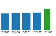
I want to show four months of sales in a bar chart visual along with Goal bar .
Something like this as below
four blue bars are sum of sales and green bar is goal.
I want to show the goal for current period
Please i need help as quick as
- Mark as New
- Bookmark
- Subscribe
- Mute
- Subscribe to RSS Feed
- Permalink
- Report Inappropriate Content
Please help me if anyone know the solution of this problem.
- Mark as New
- Bookmark
- Subscribe
- Mute
- Subscribe to RSS Feed
- Permalink
- Report Inappropriate Content
Hi @Anonymous ,
What is the data type of your x-axis value? It must be text in your sample screenshot.
Best Regards,
Dedmon Dai
- Mark as New
- Bookmark
- Subscribe
- Mute
- Subscribe to RSS Feed
- Permalink
- Report Inappropriate Content
Hi @Anonymous ,
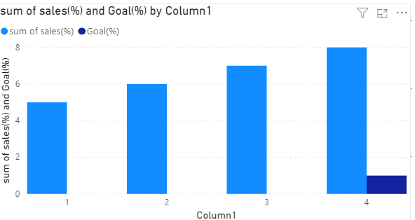
I suggest you use clustered column chart. And you can change your Goal(%) measure to
NEWGoal(%) = IF(MAX(Table[Column]) = "FY21Q2",[Goal(%)],0)
And you visual will be like:
If this post helps, then please consider Accept it as the solution to help the other members find it more quickly.
Best Regards,
Dedmon Dai
- Mark as New
- Bookmark
- Subscribe
- Mute
- Subscribe to RSS Feed
- Permalink
- Report Inappropriate Content
It showing error message as below
"Dax comparison operations do not support comparing values of type number with value of type text consider using the value or format function to convert one of the values."
- Mark as New
- Bookmark
- Subscribe
- Mute
- Subscribe to RSS Feed
- Permalink
- Report Inappropriate Content
HI @Anonymous
I would create two charts and place them side by side with no borders. first chart with Bluedata and second one with green data considering you already have the below calculated values.
1.sum of sales(%)
2.Goal(%)
- Mark as New
- Bookmark
- Subscribe
- Mute
- Subscribe to RSS Feed
- Permalink
- Report Inappropriate Content
We did like that but after we are facing issue to export the data.
Is it posibble to export the data in one excel to see both sales and goals data?
- Mark as New
- Bookmark
- Subscribe
- Mute
- Subscribe to RSS Feed
- Permalink
- Report Inappropriate Content
HI @Anonymous ,
See if this helps,
http://www.maxwikstrom.se/powerbi/how-to-add-total-values-in-bar-and-line-charts-in-power-bi/
https://community.powerbi.com/t5/Desktop/Grand-Total-in-Bar-Chart/td-p/612631
Regards,
Harsh Nathani
Did I answer your question? Mark my post as a solution! Appreciate with a Kudos!! (Click the Thumbs Up Button)
- Mark as New
- Bookmark
- Subscribe
- Mute
- Subscribe to RSS Feed
- Permalink
- Report Inappropriate Content
@Anonymous , create a measure that only shows a goal for the current period and sales which does not show for the current period and but them on the clustered bar visual
Helpful resources
| User | Count |
|---|---|
| 68 | |
| 63 | |
| 59 | |
| 54 | |
| 28 |
| User | Count |
|---|---|
| 183 | |
| 80 | |
| 62 | |
| 46 | |
| 38 |


