FabCon is coming to Atlanta
Join us at FabCon Atlanta from March 16 - 20, 2026, for the ultimate Fabric, Power BI, AI and SQL community-led event. Save $200 with code FABCOMM.
Register now!- Power BI forums
- Get Help with Power BI
- Desktop
- Service
- Report Server
- Power Query
- Mobile Apps
- Developer
- DAX Commands and Tips
- Custom Visuals Development Discussion
- Health and Life Sciences
- Power BI Spanish forums
- Translated Spanish Desktop
- Training and Consulting
- Instructor Led Training
- Dashboard in a Day for Women, by Women
- Galleries
- Data Stories Gallery
- Themes Gallery
- Contests Gallery
- QuickViz Gallery
- Quick Measures Gallery
- Visual Calculations Gallery
- Notebook Gallery
- Translytical Task Flow Gallery
- TMDL Gallery
- R Script Showcase
- Webinars and Video Gallery
- Ideas
- Custom Visuals Ideas (read-only)
- Issues
- Issues
- Events
- Upcoming Events
The Power BI Data Visualization World Championships is back! Get ahead of the game and start preparing now! Learn more
- Power BI forums
- Forums
- Get Help with Power BI
- Desktop
- How to sort for Top-n acount based on region & $ v...
- Subscribe to RSS Feed
- Mark Topic as New
- Mark Topic as Read
- Float this Topic for Current User
- Bookmark
- Subscribe
- Printer Friendly Page
- Mark as New
- Bookmark
- Subscribe
- Mute
- Subscribe to RSS Feed
- Permalink
- Report Inappropriate Content
How to sort for Top-n acount based on region & $ values
Hi Guys,
Can someone help me how i can sort the data based on the Rank of the customer & $ value.
Like i have 3 region X,Y,Z and based on the top 3 (highest sales i am getting the output) but it's not sorted.
I am looking like
Region X --> Account 1 --> $20
Account 2 --> $10
Account 3 -->$5
Region Y --> Account 1 --> $18
Account 2 --> $10
Account 3 -->$3
Region Z --> Account 1 --> $12
Account 2 --> $11
Account 3 -->$10
Rank is my measure. Please suggest how i can sort like above.
Thanks appreciate your help.
Solved! Go to Solution.
- Mark as New
- Bookmark
- Subscribe
- Mute
- Subscribe to RSS Feed
- Permalink
- Report Inappropriate Content
Hi @Anonymous ,
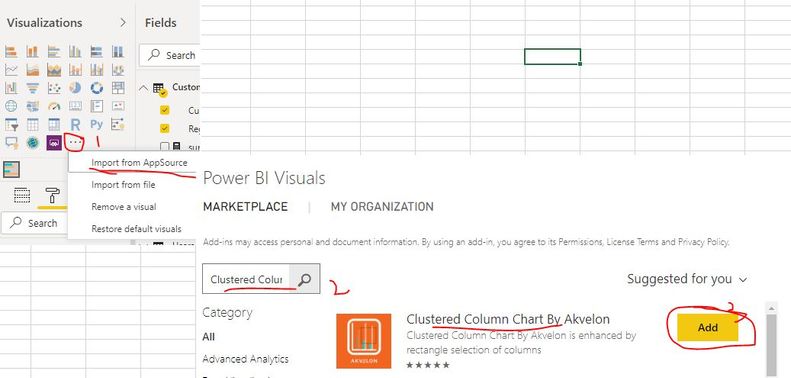
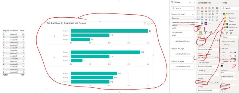
Please check if the chart in below screenshot is what you want? If yes, you can use the custom visual "Clustered Column Chart By Akvelon".

Best Regards
Rena
- Mark as New
- Bookmark
- Subscribe
- Mute
- Subscribe to RSS Feed
- Permalink
- Report Inappropriate Content
As of Now Matrix Support, only single sort is supported
After creating Stepped Layout, sort on the Measure and try
https://www.burningsuit.co.uk/blog/2019/04/7-secrets-of-the-matrix-visual/
- Mark as New
- Bookmark
- Subscribe
- Mute
- Subscribe to RSS Feed
- Permalink
- Report Inappropriate Content
it's not Matrix graph i am trying ,I am just trying to build the Top N account in bar graph like below.
- Mark as New
- Bookmark
- Subscribe
- Mute
- Subscribe to RSS Feed
- Permalink
- Report Inappropriate Content
Hi @Anonymous ,
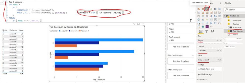
You can complete the following steps to achieve the requirement:
1. create measures to get the top three accounts per region
sumvalue = SUM ( 'Customers'[Value] )Top 3 account =
VAR rankC =
IF (
HASONEVALUE ( 'Customers'[Customer] ),
RANKX ( ALL ( 'Customers'[Customer] ), [sumvalue] )
)
RETURN
IF ( rankC <= 3, [sumvalue] )2. Create Clustered bar chart and drag the related fields (Axis: Region Legend: Customer Value: [Top 3 account]) onto visual
Best Regards
Rena
- Mark as New
- Bookmark
- Subscribe
- Mute
- Subscribe to RSS Feed
- Permalink
- Report Inappropriate Content
Thanks @Anonymous this result i got it can you sort like for X region it should come all 3 in sorted format based on the $ values.. and then Y for same and last Z.. Like below
- Mark as New
- Bookmark
- Subscribe
- Mute
- Subscribe to RSS Feed
- Permalink
- Report Inappropriate Content
Hi @Anonymous ,
Please check if the chart in below screenshot is what you want? If yes, you can use the custom visual "Clustered Column Chart By Akvelon".

Best Regards
Rena
- Mark as New
- Bookmark
- Subscribe
- Mute
- Subscribe to RSS Feed
- Permalink
- Report Inappropriate Content
Thanks It's working.
- Mark as New
- Bookmark
- Subscribe
- Mute
- Subscribe to RSS Feed
- Permalink
- Report Inappropriate Content
hi @Anonymous
your idea is good but when i am having different accounts name for each region it's not working. In each region it's showing all accounts. Please suggest if there is any way to remove other account which are not belongs to that region
Helpful resources

Power BI Monthly Update - November 2025
Check out the November 2025 Power BI update to learn about new features.

Fabric Data Days
Advance your Data & AI career with 50 days of live learning, contests, hands-on challenges, study groups & certifications and more!


