- Power BI forums
- Updates
- News & Announcements
- Get Help with Power BI
- Desktop
- Service
- Report Server
- Power Query
- Mobile Apps
- Developer
- DAX Commands and Tips
- Custom Visuals Development Discussion
- Health and Life Sciences
- Power BI Spanish forums
- Translated Spanish Desktop
- Power Platform Integration - Better Together!
- Power Platform Integrations (Read-only)
- Power Platform and Dynamics 365 Integrations (Read-only)
- Training and Consulting
- Instructor Led Training
- Dashboard in a Day for Women, by Women
- Galleries
- Community Connections & How-To Videos
- COVID-19 Data Stories Gallery
- Themes Gallery
- Data Stories Gallery
- R Script Showcase
- Webinars and Video Gallery
- Quick Measures Gallery
- 2021 MSBizAppsSummit Gallery
- 2020 MSBizAppsSummit Gallery
- 2019 MSBizAppsSummit Gallery
- Events
- Ideas
- Custom Visuals Ideas
- Issues
- Issues
- Events
- Upcoming Events
- Community Blog
- Power BI Community Blog
- Custom Visuals Community Blog
- Community Support
- Community Accounts & Registration
- Using the Community
- Community Feedback
Register now to learn Fabric in free live sessions led by the best Microsoft experts. From Apr 16 to May 9, in English and Spanish.
- Power BI forums
- Forums
- Get Help with Power BI
- Desktop
- Re: How to show data divided by future months
- Subscribe to RSS Feed
- Mark Topic as New
- Mark Topic as Read
- Float this Topic for Current User
- Bookmark
- Subscribe
- Printer Friendly Page
- Mark as New
- Bookmark
- Subscribe
- Mute
- Subscribe to RSS Feed
- Permalink
- Report Inappropriate Content
How to show data divided by future months
Hello everyone,
I usually use this community to find help and ideas for my Power BI dashboards but it's my first time posting, since I cannot get around a problem.
WHAT I HAVE:
I have data as shown below.
I have the first column "Entrada Data" and "Saída Data", then two calculated columns:
1. "MesesAvenças" which calculate the months elapsed between "Entrada Data" and "Saída Data", the DAX expression is:
2. "ValorMes" which simply DIVIDES the amount for that line (a column that is missing from the image below) by "MesesAvenças"
I also have a DATE TABLE created which spans all days from 01/01/2019 to 31/12/2022 which has a 1:* relationship to the table above (which has data that only spans from 01/01/2019 until 30/11/2021.
WHAT I WANT
Take has an example the last line.
We have:
| VALUE | ENTRADA DATA | SAÍDA DATA | MESESAVENÇAS | VALORMES |
| 217 | 01/06/2021 | 01/11/2021 | 5 | 43,4 |
As you can see, someone paid 217 for something that starts on the 01/06/2021 and spans until 01/11/2021 which is about 5 months.
So that brings the value per month to around 43,40.
So, what i want is to show the value paid per month, in a visual, distributed per month, like so:
| VALUETOTAL | JUNE | JULY | AUGUST | SEPTEMBER | OCTOBER |
| 217 | 43,4 | 43,4 | 43,4 | 43,4 | 43,4 |
Since i also have costumers that paid this month (NOVEMBER 2021) for 365 days, for example, that spans for future dates aswell.
Could you guys provide some insight on how to achieve this?
I can provide more data if needed.
Thanks in advance!
Solved! Go to Solution.
- Mark as New
- Bookmark
- Subscribe
- Mute
- Subscribe to RSS Feed
- Permalink
- Report Inappropriate Content
@Grazmeister , refer if this blog can help
Microsoft Power BI Learning Resources, 2023 !!
Learn Power BI - Full Course with Dec-2022, with Window, Index, Offset, 100+ Topics !!
Did I answer your question? Mark my post as a solution! Appreciate your Kudos !! Proud to be a Super User! !!
- Mark as New
- Bookmark
- Subscribe
- Mute
- Subscribe to RSS Feed
- Permalink
- Report Inappropriate Content
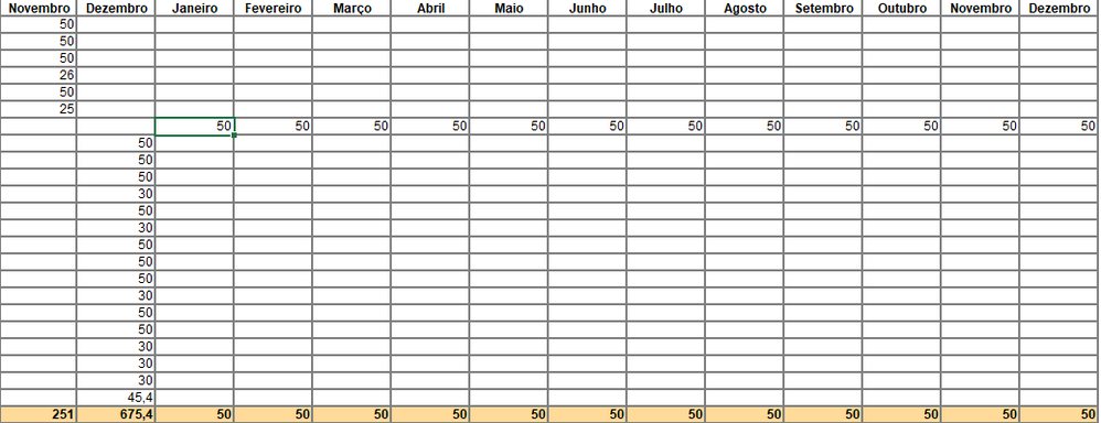
@amitchandak to provide better understanding I want something like this:
You can see the 600€ line divided by month (Janeiro = 01/2022, Fevereiro = 02/2022, etc)
- Mark as New
- Bookmark
- Subscribe
- Mute
- Subscribe to RSS Feed
- Permalink
- Report Inappropriate Content
@Grazmeister , refer if this blog can help
Microsoft Power BI Learning Resources, 2023 !!
Learn Power BI - Full Course with Dec-2022, with Window, Index, Offset, 100+ Topics !!
Did I answer your question? Mark my post as a solution! Appreciate your Kudos !! Proud to be a Super User! !!
- Mark as New
- Bookmark
- Subscribe
- Mute
- Subscribe to RSS Feed
- Permalink
- Report Inappropriate Content
Thanks, @amitchandak !
Your solution worked!
I needed to add an Index column so it could treat each line distinctively and needed to change the comparison of the end date (Saída Data) to "<" instead of "<=".
The formula which worked is this:
- Mark as New
- Bookmark
- Subscribe
- Mute
- Subscribe to RSS Feed
- Permalink
- Report Inappropriate Content
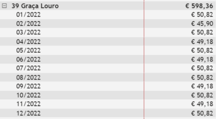
I got to play around your post a bit and managed to get the 600€ as this:
So, maybe it's just the days that are messing this up.
Thanks in advance.
- Mark as New
- Bookmark
- Subscribe
- Mute
- Subscribe to RSS Feed
- Permalink
- Report Inappropriate Content
Hello @amitchandak , thanks for stopping by.
Well, I followed the post you provided but i sadly doesn't meet what I need, or I didn't manage to get it properly working.
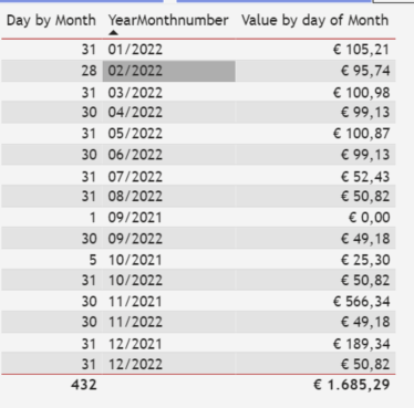
So after I adapted your formulas I end up getting this result:
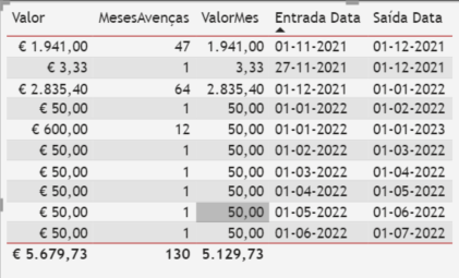
And the data I have is this:
As you can see, I need to show a visual with Month/Year (your first example) but with the amount paid divided by the duration of the stay.
As an example:
1. First line shows €1.941,00 paid in 11/2021 that's valid until the beggining of 12/2021 (this amount goes into the 11/2021 pot);
2. The second line likewise;
3. Third line, €2.835,40 paid in 12/2021 that's valid until the beggining of 01/2022 (this amount goes into the 12/2021 pot)
4. And so on.
5. The problem is the 5th line: someone paid 600€ for 12 months, starting in 01/2022 and ending at the beggining of 01/2023.
I need to show 50€ (=600/12) every month since it was paid (50€ in 01/2022, 50€ in 02/2022, etc.).
Maybe i'm missing something?
(I deleted the relationship between the DATE table and the FACT table since it messed the crossjoin DAX you so kindly provided.)
Thanks!
Helpful resources

Microsoft Fabric Learn Together
Covering the world! 9:00-10:30 AM Sydney, 4:00-5:30 PM CET (Paris/Berlin), 7:00-8:30 PM Mexico City

Power BI Monthly Update - April 2024
Check out the April 2024 Power BI update to learn about new features.

| User | Count |
|---|---|
| 108 | |
| 98 | |
| 81 | |
| 65 | |
| 62 |
| User | Count |
|---|---|
| 147 | |
| 116 | |
| 104 | |
| 88 | |
| 65 |


