Join us at the 2025 Microsoft Fabric Community Conference
Microsoft Fabric Community Conference 2025, March 31 - April 2, Las Vegas, Nevada. Use code FABINSIDER for a $400 discount.
Register now- Power BI forums
- Get Help with Power BI
- Desktop
- Service
- Report Server
- Power Query
- Mobile Apps
- Developer
- DAX Commands and Tips
- Custom Visuals Development Discussion
- Health and Life Sciences
- Power BI Spanish forums
- Translated Spanish Desktop
- Training and Consulting
- Instructor Led Training
- Dashboard in a Day for Women, by Women
- Galleries
- Webinars and Video Gallery
- Data Stories Gallery
- Themes Gallery
- Power BI DataViz World Championships Gallery
- Quick Measures Gallery
- R Script Showcase
- COVID-19 Data Stories Gallery
- Community Connections & How-To Videos
- 2021 MSBizAppsSummit Gallery
- 2020 MSBizAppsSummit Gallery
- 2019 MSBizAppsSummit Gallery
- Events
- Ideas
- Custom Visuals Ideas (read-only)
- Issues
- Issues
- Events
- Upcoming Events
The Power BI DataViz World Championships are on! With four chances to enter, you could win a spot in the LIVE Grand Finale in Las Vegas. Show off your skills.
- Power BI forums
- Forums
- Get Help with Power BI
- Desktop
- Re: How to display the comparison date on the bar ...
- Subscribe to RSS Feed
- Mark Topic as New
- Mark Topic as Read
- Float this Topic for Current User
- Bookmark
- Subscribe
- Printer Friendly Page
- Mark as New
- Bookmark
- Subscribe
- Mute
- Subscribe to RSS Feed
- Permalink
- Report Inappropriate Content
How to show comparing date in bar chart?
Hi everyone,
I am working on a simple data set, like that:
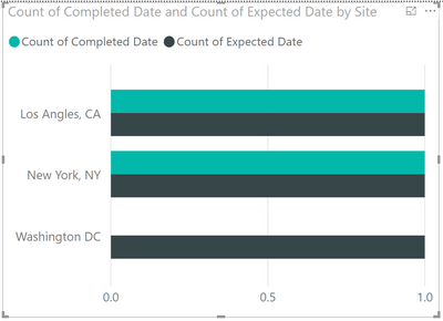
When I put them in a bar chart, it will show like:
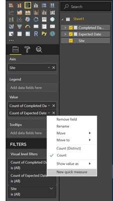
My setting is:
However, what I want is like this:
The issue is the date data was counted, but I cannot figure out how to discount it.
I will very much appreciate you if anyone can tell me how to do it. Thanks!
Solved! Go to Solution.
- Mark as New
- Bookmark
- Subscribe
- Mute
- Subscribe to RSS Feed
- Permalink
- Report Inappropriate Content
I would look through appSource visuals to see if something there meets your needs. Alternatively, you can trick an array into doing this by making a date table (unrelated to the data), a measure that compares the date with the completed/expected dates, and the conditional formatting in the background and font. See the following example, using the week column of a date table (you could use date, month, and so on) to get the result. It also uses the Show in Rows function of the array visual.
The measures used above are (replace BarChart with the actual name of the table)
If this works for you, mark it as the solution. Praise is also appreciated. Please let me know if you don't.
Best regards
Pat
Did I answer your question? Mark my post as a solution! Kudos are also appreciated!
To learn more about Power BI, follow me on Twitter or subscribe on YouTube.
@mahoneypa HoosierBI on YouTube
- Mark as New
- Bookmark
- Subscribe
- Mute
- Subscribe to RSS Feed
- Permalink
- Report Inappropriate Content
- Mark as New
- Bookmark
- Subscribe
- Mute
- Subscribe to RSS Feed
- Permalink
- Report Inappropriate Content
Thanks for your advice! And you really did a good job, but I think they are not the same thing.
- Mark as New
- Bookmark
- Subscribe
- Mute
- Subscribe to RSS Feed
- Permalink
- Report Inappropriate Content
Hi @wfeng ,
I just created a sample pbix file for you, please check whether it is what you want.
Best Regards
Rena
If this post helps, then please consider Accept it as the solution to help the other members find it more quickly.
- Mark as New
- Bookmark
- Subscribe
- Mute
- Subscribe to RSS Feed
- Permalink
- Report Inappropriate Content
Hi Rena,
Thank you for creating a sample report for me!
Your Gantt is interesting, and I think it could be helpful. Initially, I want a chart as your bar chart, but I met the same issue, the x-axis is always counted by power bi. I just want the date is shown on the x-axis, for example, 1/1/2020, 2/1/2020, and so on. Do you have any idea?
By the way, your data structure is different from mine. That's a running data set with huge volume, and updated every week. It could be terrible if it needs to change the data structure every time.
Please let me know if you figure out how to show date time on x-axis, I will very much appreciate it. Thanks again!
Best regards,
Weicong
- Mark as New
- Bookmark
- Subscribe
- Mute
- Subscribe to RSS Feed
- Permalink
- Report Inappropriate Content
Hi @wfeng ,
Sorry I haven't been able to find other suitable way to present your desired result except the previous method (change the table structure)...
@parry2k , @mahoneypat , Could you please help check this? You may have different idea on it... Thank you in advance.
Best Regards
Rena
If this post helps, then please consider Accept it as the solution to help the other members find it more quickly.
- Mark as New
- Bookmark
- Subscribe
- Mute
- Subscribe to RSS Feed
- Permalink
- Report Inappropriate Content
Hello Rena,
Never mind! Thanks for your help!
Best regards,
Weicong Feng
- Mark as New
- Bookmark
- Subscribe
- Mute
- Subscribe to RSS Feed
- Permalink
- Report Inappropriate Content
I would look through appSource visuals to see if something there meets your needs. Alternatively, you can trick an array into doing this by making a date table (unrelated to the data), a measure that compares the date with the completed/expected dates, and the conditional formatting in the background and font. See the following example, using the week column of a date table (you could use date, month, and so on) to get the result. It also uses the Show in Rows function of the array visual.
The measures used above are (replace BarChart with the actual name of the table)
If this works for you, mark it as the solution. Praise is also appreciated. Please let me know if you don't.
Best regards
Pat
Did I answer your question? Mark my post as a solution! Kudos are also appreciated!
To learn more about Power BI, follow me on Twitter or subscribe on YouTube.
@mahoneypa HoosierBI on YouTube
- Mark as New
- Bookmark
- Subscribe
- Mute
- Subscribe to RSS Feed
- Permalink
- Report Inappropriate Content
Hello Pat,
Thanks for your constructive advice! From your chart, it is almost what I need. However, I am still confusing that how to make Power BI show the 1, 2, ... 23 on the x-asix? I need to create a separate table which includes one date columns, and create 2 measures as you shown. But I have no idea about conditional formatting on background. Would you mind explaining more detail for me?
Best regards,
Weicong
- Mark as New
- Bookmark
- Subscribe
- Mute
- Subscribe to RSS Feed
- Permalink
- Report Inappropriate Content
Please see the attached pbix with the example. You will note that I made two measures - Expected. and Completed. to return a value of 1 if the Week in context (from the matrix columns) is <= the respective date (expected or completed). That value of 1 is returned to the cell and used to set conditional formatting or not (blanks are not formatted). Note that both the background color and font color have the same conditional formatting (so the 1 is not seen in the visual).
If this works for you, please mark it as the solution. Kudos are appreciated too. Please let me know if not.
Regards,
Pat
Did I answer your question? Mark my post as a solution! Kudos are also appreciated!
To learn more about Power BI, follow me on Twitter or subscribe on YouTube.
@mahoneypa HoosierBI on YouTube
- Mark as New
- Bookmark
- Subscribe
- Mute
- Subscribe to RSS Feed
- Permalink
- Report Inappropriate Content
Hello Pat,
Thanks for your detailed explanation! Your solution is good enough for me!
Best regards,
Weicong
Helpful resources

Join us at the Microsoft Fabric Community Conference
March 31 - April 2, 2025, in Las Vegas, Nevada. Use code MSCUST for a $150 discount!

Power BI Monthly Update - February 2025
Check out the February 2025 Power BI update to learn about new features.

| User | Count |
|---|---|
| 87 | |
| 81 | |
| 53 | |
| 38 | |
| 35 |


