A new Data Days event is coming soon!
This time we’re going bigger than ever. Fabric, Power BI, SQL, AI and more. We're covering it all. You won't want to miss it.
Learn more- Power BI forums
- Get Help with Power BI
- Desktop
- Service
- Report Server
- Power Query
- Mobile Apps
- Developer
- DAX Commands and Tips
- Custom Visuals Development Discussion
- Health and Life Sciences
- Power BI Spanish forums
- Translated Spanish Desktop
- Training and Consulting
- Instructor Led Training
- Dashboard in a Day for Women, by Women
- Galleries
- Data Stories Gallery
- Themes Gallery
- Contests Gallery
- QuickViz Gallery
- Quick Measures Gallery
- Visual Calculations Gallery
- Notebook Gallery
- Translytical Task Flow Gallery
- TMDL Gallery
- R Script Showcase
- Webinars and Video Gallery
- Ideas
- Custom Visuals Ideas (read-only)
- Issues
- Issues
- Events
- Upcoming Events
Level up your Power BI skills this month - build one visual each week and tell better stories with data! Get started
- Power BI forums
- Forums
- Get Help with Power BI
- Desktop
- How to properly exploit a split column?
- Subscribe to RSS Feed
- Mark Topic as New
- Mark Topic as Read
- Float this Topic for Current User
- Bookmark
- Subscribe
- Printer Friendly Page
- Mark as New
- Bookmark
- Subscribe
- Mute
- Subscribe to RSS Feed
- Permalink
- Report Inappropriate Content
How to properly exploit a split column?
Hello everyone,
In my Power BI report, I'm using the excel file from a Microsoft Forms form as a data source.
Some questions have multiple choices, which means the cells in these questions columns look like that:
- Choice 1;Choice 2;Choice 3
- Choice 2;Choice 4;Choice 5
- Choice 1;Choice 2; Choice 4
etc.
So I'm splitting the multiple choice columns in multiple columns, using the ";" character as a delimiter.
Then in my clustered bar graph, I'm adding all the columns in the Y axis, and the answers ID in the X axis.
It looks like it works correctly, except the chart is displaying only the results of the first column. All I can do is diplaying the results of the other columns, one by one, by clicking on that button of the chart :
But what I'm trying to do is to make all the results appear on the chart at the same time.
So what could I change to make that work?
Thanks by advance.
Solved! Go to Solution.
- Mark as New
- Bookmark
- Subscribe
- Mute
- Subscribe to RSS Feed
- Permalink
- Report Inappropriate Content
Hi @Anonymous ,
You might need to transform the data before adding it to the chart. Please try the following steps :
1) In Power Query, you will need to unpivot the "question" columns. Copy and paste the code below into a blank query.
let
    Source = Table.FromRows(Json.Document(Binary.Decompress(Binary.FromText("bVLJDcMwDFsl8DtAYh2JjyE6QJAB+mn76P6okdpwIPpHECRFCToO593swkK6EE1eEodEK1JboR6f7/P9mnyugBrg7M75cIS2HSheB0ncgDaw/yMZ/TiF5R55+QRFilTsvq03uAJQLXgV0cEukm1k3WVD/4AKPbJWwRtKBEq5+8gMDqjG9TQOAtgk2bkxrfZ9CnWrUn3e3q6obIVCheGTufP8AQ==", BinaryEncoding.Base64), Compression.Deflate)), let _t = ((type nullable text) meta [Serialized.Text = true]) in type table [ID = _t, #"Heure de début" = _t, #"Heure de fin" = _t, Question = _t]),
    #"Changed Type" = Table.TransformColumnTypes(Source,{{"ID", Int64.Type}, {"Heure de début", type text}, {"Heure de fin", type text}, {"Question", type text}}),
    #"Split Column by Delimiter" = Table.SplitColumn(#"Changed Type", "Question", Splitter.SplitTextByDelimiter(";", QuoteStyle.Csv), {"Question.1", "Question.2", "Question.3", "Question.4", "Question.5"}),
    #"Unpivoted Other Columns" = Table.UnpivotOtherColumns(#"Split Column by Delimiter", {"Heure de début", "Heure de fin", "ID"}, "Attribute", "Value"),
    #"Extracted Text Before Delimiter" = Table.TransformColumns(#"Unpivoted Other Columns", {{"Attribute", each Text.BeforeDelimiter(_, "."), type text}}),
    #"Filtered Rows" = Table.SelectRows(#"Extracted Text Before Delimiter", each ([Value] <> ""))
in
    #"Filtered Rows"
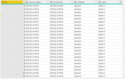
Your data should now be in this format :
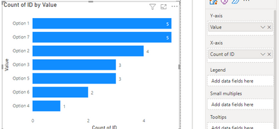
2) Load the data into report view. Add the "Value" column to the Y-axis and count of ID to the X axis of a clustered bar chart. You will get something like this :
This is only for a single question but you could tweak your code slightly to make this work for multiple questions as well.
Kind regards,
Rohit
Please mark this answer as the solution if it resolves your issue.
Appreciate your kudos!
- Mark as New
- Bookmark
- Subscribe
- Mute
- Subscribe to RSS Feed
- Permalink
- Report Inappropriate Content
@Anonymous , Try to use the next option expand
Can you share sample data and sample output in table format? Or a sample pbix after removing sensitive data.
- Mark as New
- Bookmark
- Subscribe
- Mute
- Subscribe to RSS Feed
- Permalink
- Report Inappropriate Content
@amitchandakthe next option isn't wroking neither, it is creating new values out by adding the result of 2, 3, 4...columns. It's complicated to describe but it's not displaying the value "choice 1" on the same column of the chart, whatever column of the dataset it comes from as I wish.
I can't send a .xlsx file on this forum, but here's a table like the one I'm trying to exploit :
IDHeure de débutHeure de finQuestion
| 1 | 8/25/22 14:38:20 | 8/25/22 14:38:26 | Option 1;Option 2;Option 3; |
| 2 | 8/25/22 14:38:27 | 8/25/22 14:38:30 | Option 1;Option 3;Option 5;Option 7; |
| 3 | 8/25/22 14:38:32 | 8/25/22 14:38:34 | Option 1; |
| 4 | 8/25/22 14:38:35 | 8/25/22 14:38:39 | Option 6;Option 5; |
| 5 | 8/25/22 14:38:40 | 8/25/22 14:38:45 | Option 1;Option 4;Option 6;Option 7; |
| 6 | 8/25/22 14:38:46 | 8/25/22 14:38:48 | Option 5; |
| 7 | 8/25/22 14:38:49 | 8/25/22 14:38:53 | Option 2;Option 7; |
| 8 | 8/25/22 14:38:55 | 8/25/22 14:38:59 | Option 2;Option 3;Option 7; |
| 9 | 8/25/22 14:39:01 | 8/25/22 14:39:03 | Option 7; |
| 10 | 8/25/22 14:39:05 | 8/25/22 14:39:08 | Option 1;Option 2; |
So it's all about the last column : I'm trying to make count every "Option" chosen by the user, so each expression appear as one row on the chart, but it's not working.
Helpful resources

Power BI Monthly Update - April 2026
Check out the April 2026 Power BI update to learn about new features.

Data Days 2026 coming soon!
Sign up to receive a private message when registration opens and key events begin.

New to Fabric Survey
If you have recently started exploring Fabric, we'd love to hear how it's going. Your feedback can help with product improvements.

| User | Count |
|---|---|
| 35 | |
| 32 | |
| 25 | |
| 22 | |
| 18 |
| User | Count |
|---|---|
| 66 | |
| 36 | |
| 32 | |
| 25 | |
| 23 |


