Join us at FabCon Vienna from September 15-18, 2025
The ultimate Fabric, Power BI, SQL, and AI community-led learning event. Save €200 with code FABCOMM.
Get registered- Power BI forums
- Get Help with Power BI
- Desktop
- Service
- Report Server
- Power Query
- Mobile Apps
- Developer
- DAX Commands and Tips
- Custom Visuals Development Discussion
- Health and Life Sciences
- Power BI Spanish forums
- Translated Spanish Desktop
- Training and Consulting
- Instructor Led Training
- Dashboard in a Day for Women, by Women
- Galleries
- Data Stories Gallery
- Themes Gallery
- Contests Gallery
- Quick Measures Gallery
- Notebook Gallery
- Translytical Task Flow Gallery
- TMDL Gallery
- R Script Showcase
- Webinars and Video Gallery
- Ideas
- Custom Visuals Ideas (read-only)
- Issues
- Issues
- Events
- Upcoming Events
Enhance your career with this limited time 50% discount on Fabric and Power BI exams. Ends September 15. Request your voucher.
- Power BI forums
- Forums
- Get Help with Power BI
- Desktop
- How to plot % value in bar chart instead of number...
- Subscribe to RSS Feed
- Mark Topic as New
- Mark Topic as Read
- Float this Topic for Current User
- Bookmark
- Subscribe
- Printer Friendly Page
- Mark as New
- Bookmark
- Subscribe
- Mute
- Subscribe to RSS Feed
- Permalink
- Report Inappropriate Content
How to plot % value in bar chart instead of numbers ?
Hi,
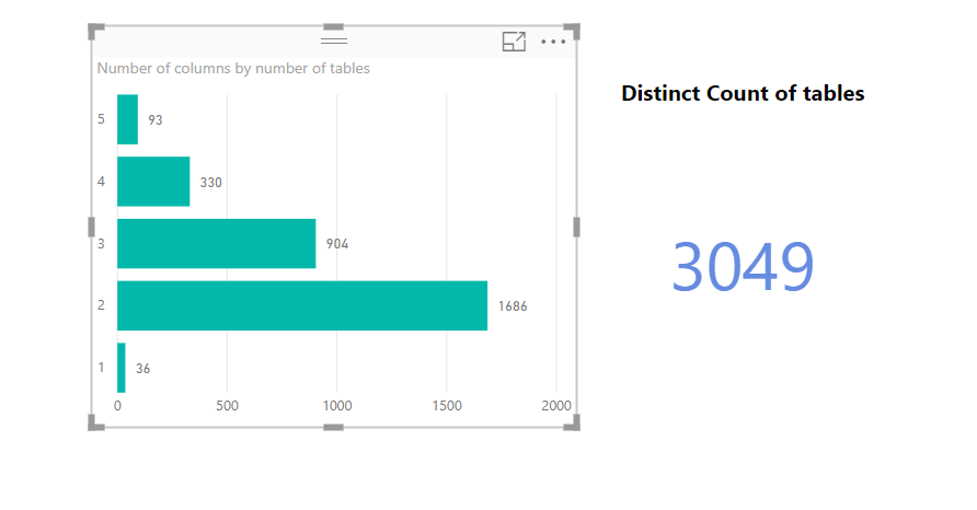
I want to plot the % value in the bar chart, instead of numbers. The % is calculated as
93 / 3046 = 3,05 %
330/ 3046 = 10,82%
and so on...
I have tried many DAX measures but did not get the expected result
Total table = DISTINCTCOUNT('Tables'[TableID]) = 3046
Number of columns in each table = 5 4 3 2 1
Number of tables with 5 columns = 93
% of tables having 5 columns = 93 / 3046 = 3.05 %
% of tables having 4 columns = 330 / 3046 = 10,82 %
Any suggestion would be much appreciated ?
Thanks !
Solved! Go to Solution.
- Mark as New
- Bookmark
- Subscribe
- Mute
- Subscribe to RSS Feed
- Permalink
- Report Inappropriate Content
In your Values area, whatever you have in there, use the little drop down arrow and choose "Show as" | "Percent of Grand Total"
Follow on LinkedIn
@ me in replies or I'll lose your thread!!!
Instead of a Kudo, please vote for this idea
Become an expert!: Enterprise DNA
External Tools: MSHGQM
YouTube Channel!: Microsoft Hates Greg
Latest book!: DAX For Humans
DAX is easy, CALCULATE makes DAX hard...
- Mark as New
- Bookmark
- Subscribe
- Mute
- Subscribe to RSS Feed
- Permalink
- Report Inappropriate Content
Thanks @Greg_Deckler, I was also wondering if there any seperate measure to represent that value ?
Helpful resources
| User | Count |
|---|---|
| 58 | |
| 56 | |
| 53 | |
| 49 | |
| 32 |
| User | Count |
|---|---|
| 172 | |
| 89 | |
| 70 | |
| 46 | |
| 45 |


