Fabric Data Days starts November 4th!
Advance your Data & AI career with 50 days of live learning, dataviz contests, hands-on challenges, study groups & certifications and more!
Get registered- Power BI forums
- Get Help with Power BI
- Desktop
- Service
- Report Server
- Power Query
- Mobile Apps
- Developer
- DAX Commands and Tips
- Custom Visuals Development Discussion
- Health and Life Sciences
- Power BI Spanish forums
- Translated Spanish Desktop
- Training and Consulting
- Instructor Led Training
- Dashboard in a Day for Women, by Women
- Galleries
- Data Stories Gallery
- Themes Gallery
- Contests Gallery
- QuickViz Gallery
- Quick Measures Gallery
- Visual Calculations Gallery
- Notebook Gallery
- Translytical Task Flow Gallery
- TMDL Gallery
- R Script Showcase
- Webinars and Video Gallery
- Ideas
- Custom Visuals Ideas (read-only)
- Issues
- Issues
- Events
- Upcoming Events
Get Fabric Certified for FREE during Fabric Data Days. Don't miss your chance! Request now
- Power BI forums
- Forums
- Get Help with Power BI
- Desktop
- How to plot line graphs in Power BI
- Subscribe to RSS Feed
- Mark Topic as New
- Mark Topic as Read
- Float this Topic for Current User
- Bookmark
- Subscribe
- Printer Friendly Page
- Mark as New
- Bookmark
- Subscribe
- Mute
- Subscribe to RSS Feed
- Permalink
- Report Inappropriate Content
How to plot line graphs in Power BI
I have a table with KPIs and I would like to create a line graph in order to spot a trend thought timeline.
The table is conformed by KPIs on the axis and Quarter data in the rest of the columns. Here is an example:
KPI Q1 Q2 Q3 Q4 Q5 Q6
Revenue 100 200 300 400 500 600
Right now, what I've done is create a slicer just to filter every KPI. When I try to create the line graph I only get 1 dot per Q and I don't understand why.
Could someone please support?
Thanks
- Mark as New
- Bookmark
- Subscribe
- Mute
- Subscribe to RSS Feed
- Permalink
- Report Inappropriate Content
Hi @Anonymous ,
What is your data model? Could please you describe your scene in more detail?
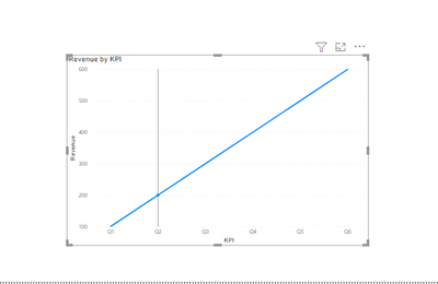
According to the data model you provide, it is not a dot in the line chart.
https://community.powerbi.com/t5/Desktop/How-to-Get-Your-Question-Answered-Quickly/m-p/1447523
Best Regards,
Liang
If this post helps, then please consider Accept it as the solution to help the other members find it more quickly.
- Mark as New
- Bookmark
- Subscribe
- Mute
- Subscribe to RSS Feed
- Permalink
- Report Inappropriate Content
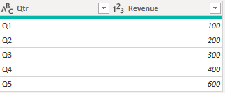
If your data is shaped like that, it's going to be hard to work with since columns are mostly independent objects in Power BI.
Shaped like this will be much easier to work with:
- Mark as New
- Bookmark
- Subscribe
- Mute
- Subscribe to RSS Feed
- Permalink
- Report Inappropriate Content
I have 20 years of data each with 1000 lines so it is not practical to put the years in a column. I have been unable to chart this in Power BI and similarly just get a dot. I have been successful in charting this data in Excel using a pivot table and changing rows and columns in the graph. This is a fatal flaw in Power BI and means that I cannot use it unless someone has a workaround
- Mark as New
- Bookmark
- Subscribe
- Mute
- Subscribe to RSS Feed
- Permalink
- Report Inappropriate Content
It's not practical to not reshape the data if you want to work with it easily. It's a simple unpivot operation in Power Query.
https://learn.microsoft.com/en-us/power-query/unpivot-column
Helpful resources

Fabric Data Days
Advance your Data & AI career with 50 days of live learning, contests, hands-on challenges, study groups & certifications and more!

Power BI Monthly Update - October 2025
Check out the October 2025 Power BI update to learn about new features.


