Fabric Data Days starts November 4th!
Advance your Data & AI career with 50 days of live learning, dataviz contests, hands-on challenges, study groups & certifications and more!
Get registered- Power BI forums
- Get Help with Power BI
- Desktop
- Service
- Report Server
- Power Query
- Mobile Apps
- Developer
- DAX Commands and Tips
- Custom Visuals Development Discussion
- Health and Life Sciences
- Power BI Spanish forums
- Translated Spanish Desktop
- Training and Consulting
- Instructor Led Training
- Dashboard in a Day for Women, by Women
- Galleries
- Data Stories Gallery
- Themes Gallery
- Contests Gallery
- QuickViz Gallery
- Quick Measures Gallery
- Visual Calculations Gallery
- Notebook Gallery
- Translytical Task Flow Gallery
- TMDL Gallery
- R Script Showcase
- Webinars and Video Gallery
- Ideas
- Custom Visuals Ideas (read-only)
- Issues
- Issues
- Events
- Upcoming Events
Get Fabric Certified for FREE during Fabric Data Days. Don't miss your chance! Request now
- Power BI forums
- Forums
- Get Help with Power BI
- Desktop
- Re: How to plot a clustered graph with Opened & Cl...
- Subscribe to RSS Feed
- Mark Topic as New
- Mark Topic as Read
- Float this Topic for Current User
- Bookmark
- Subscribe
- Printer Friendly Page
- Mark as New
- Bookmark
- Subscribe
- Mute
- Subscribe to RSS Feed
- Permalink
- Report Inappropriate Content
How to plot a clustered graph with Opened & Closed Dates from 2 different sheets
Hi, I have 2 reports - Opened on last 6 months & Closed on Last 6 months. There could be few incidents not in Opened sheet and vice versa. I want to plot both the values in one graph. Below i have already treid.
Unpivot column Opened & Closed in above sheets and append the 2 tables. Now created a relationship of the date with calender table and created below measures -
Solved! Go to Solution.
- Mark as New
- Bookmark
- Subscribe
- Mute
- Subscribe to RSS Feed
- Permalink
- Report Inappropriate Content
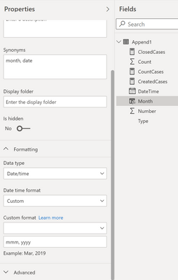
@Anonymous As you have stacked the two tables into one, you can create a date table as @amitchandak has pointed out or simply create calculated column that pulls out the month date for each of your datetimes, and use that as your axis.
Month =
DATE ( YEAR ( [DateTime] ), MONTH ( [DateTime] ), 1 )
This will turn all the dates in Feburary to the first of the month to aggegrate them into a single month. This will make sure it's sorted correctly and give you options to have the chart as a continuous axis (so it won't scroll like categorical).
If you do choose to make it categorical, then you can format the month correctly in the format of that column in the ribbon, or in the modeling view even choose a custom format, such a mmm 'yy.
Respectfully,
Zoe Douglas (DataZoe)
Follow me on LinkedIn at https://www.linkedin.com/in/zoedouglas-data
See my reports and blog at https://www.datazoepowerbi.com/
- Mark as New
- Bookmark
- Subscribe
- Mute
- Subscribe to RSS Feed
- Permalink
- Report Inappropriate Content
Hi @Anonymous ,
Did the above solution solve your problem?
Best Regards,
Jay
- Mark as New
- Bookmark
- Subscribe
- Mute
- Subscribe to RSS Feed
- Permalink
- Report Inappropriate Content
@Anonymous As you have stacked the two tables into one, you can create a date table as @amitchandak has pointed out or simply create calculated column that pulls out the month date for each of your datetimes, and use that as your axis.
Month =
DATE ( YEAR ( [DateTime] ), MONTH ( [DateTime] ), 1 )
This will turn all the dates in Feburary to the first of the month to aggegrate them into a single month. This will make sure it's sorted correctly and give you options to have the chart as a continuous axis (so it won't scroll like categorical).
If you do choose to make it categorical, then you can format the month correctly in the format of that column in the ribbon, or in the modeling view even choose a custom format, such a mmm 'yy.
Respectfully,
Zoe Douglas (DataZoe)
Follow me on LinkedIn at https://www.linkedin.com/in/zoedouglas-data
See my reports and blog at https://www.datazoepowerbi.com/
- Mark as New
- Bookmark
- Subscribe
- Mute
- Subscribe to RSS Feed
- Permalink
- Report Inappropriate Content
Many Thanks DataZoe 🙂
- Mark as New
- Bookmark
- Subscribe
- Mute
- Subscribe to RSS Feed
- Permalink
- Report Inappropriate Content
@Anonymous , check if these dates have timestamp. because in that case join will fail
you have to create date like
Date = [datetime].date
or
Date = date(year([datetime]),month([datetime]),day([datetime]))
and then join
refer to this video, I have shown how to check date has timestamp: https://www.youtube.com/watch?v=OBf0rjpp5Hw
Change measure like
CreatedCases = Calculate([CountCases], filter
( Append1,Append1[Type] ="Opened"))
ClosedCases = Calculate([CountCases],
filter
( Append1,
Append1[Type] ="Closed"))
- Mark as New
- Bookmark
- Subscribe
- Mute
- Subscribe to RSS Feed
- Permalink
- Report Inappropriate Content
Hi Amit,
Thanks for the advice. I tried above however it dint work. Somehow appending 2 tables created issues with the date field. I had to Split date column and convert it into numbers and then merge again to fix the issue. It worked with the same date column i had in my sheet.
Many thanks for your help, learnt something new.
Helpful resources

Fabric Data Days
Advance your Data & AI career with 50 days of live learning, contests, hands-on challenges, study groups & certifications and more!

Power BI Monthly Update - October 2025
Check out the October 2025 Power BI update to learn about new features.


