FabCon is coming to Atlanta
Join us at FabCon Atlanta from March 16 - 20, 2026, for the ultimate Fabric, Power BI, AI and SQL community-led event. Save $200 with code FABCOMM.
Register now!- Power BI forums
- Get Help with Power BI
- Desktop
- Service
- Report Server
- Power Query
- Mobile Apps
- Developer
- DAX Commands and Tips
- Custom Visuals Development Discussion
- Health and Life Sciences
- Power BI Spanish forums
- Translated Spanish Desktop
- Training and Consulting
- Instructor Led Training
- Dashboard in a Day for Women, by Women
- Galleries
- Data Stories Gallery
- Themes Gallery
- Contests Gallery
- QuickViz Gallery
- Quick Measures Gallery
- Visual Calculations Gallery
- Notebook Gallery
- Translytical Task Flow Gallery
- TMDL Gallery
- R Script Showcase
- Webinars and Video Gallery
- Ideas
- Custom Visuals Ideas (read-only)
- Issues
- Issues
- Events
- Upcoming Events
The Power BI Data Visualization World Championships is back! Get ahead of the game and start preparing now! Learn more
- Power BI forums
- Forums
- Get Help with Power BI
- Desktop
- How to make comparisons with float in DAX?
- Subscribe to RSS Feed
- Mark Topic as New
- Mark Topic as Read
- Float this Topic for Current User
- Bookmark
- Subscribe
- Printer Friendly Page
- Mark as New
- Bookmark
- Subscribe
- Mute
- Subscribe to RSS Feed
- Permalink
- Report Inappropriate Content
How to make comparisons with float in DAX?
Hi everyone, hope you are well 🙂
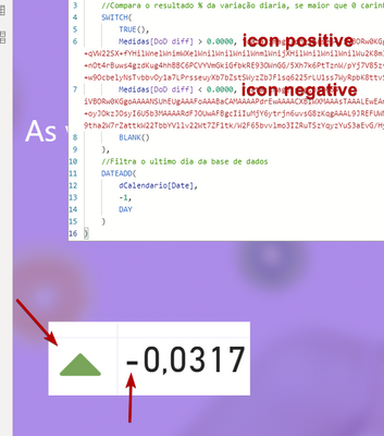
I'm trying to make a measurement that, depending on the daily variation, displays an icon for positive or negative.
But if the number the variation has decimal places (-0.05) does not work.
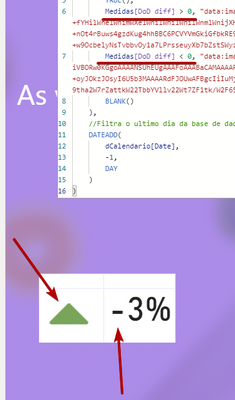
Even with the negative number in percentage this occurs.
Does anyone have any idea what to do in these cases?
thx
Solved! Go to Solution.
- Mark as New
- Bookmark
- Subscribe
- Mute
- Subscribe to RSS Feed
- Permalink
- Report Inappropriate Content
Hi, @Anonymous
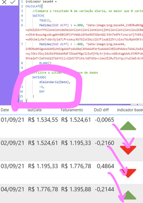
I checked your measure 'indicador base64' and found that you have offset the calendar table by one day.
DateADD(
    oCalendario[Date],
    -1,
    Day
)
You may need to remove this filter. The code in the SWITCH section is sufficient for your needs.
Best Regards,
Community Support Team _ Eason
- Mark as New
- Bookmark
- Subscribe
- Mute
- Subscribe to RSS Feed
- Permalink
- Report Inappropriate Content
Hi @Anonymous ,
Usually defining Indicators should be done on the Number and not on the percentage.
i.e. Control the display of Indicator using the Number by keeping the value as a number datatype and just for display make the number as percentage
May be this could solve this issue!!
- Mark as New
- Bookmark
- Subscribe
- Mute
- Subscribe to RSS Feed
- Permalink
- Report Inappropriate Content
- Mark as New
- Bookmark
- Subscribe
- Mute
- Subscribe to RSS Feed
- Permalink
- Report Inappropriate Content
Hi, @Anonymous
I checked your measure 'indicador base64' and found that you have offset the calendar table by one day.
DateADD(
    oCalendario[Date],
    -1,
    Day
)
You may need to remove this filter. The code in the SWITCH section is sufficient for your needs.
Best Regards,
Community Support Team _ Eason
- Mark as New
- Bookmark
- Subscribe
- Mute
- Subscribe to RSS Feed
- Permalink
- Report Inappropriate Content
Thx ❤️
- Mark as New
- Bookmark
- Subscribe
- Mute
- Subscribe to RSS Feed
- Permalink
- Report Inappropriate Content
If you notice in the first image my attempt is with decimal number
- Mark as New
- Bookmark
- Subscribe
- Mute
- Subscribe to RSS Feed
- Permalink
- Report Inappropriate Content
@Anonymous , Try to use unichar like this, see if that can help
/////Arrow
Arrow =
var _change =[Net Sales YTD]-[Net Sales LYTD]
return
SWITCH (
TRUE(),
_change > 0, UNICHAR(9650),
_change = 0, UNICHAR(9654),
_change < 0, UNICHAR(9660)
)
/////Arrow Color , use in conditional formatting using field value option
Arrow color =
var _change =[Net Sales YTD]-[Net Sales LYTD]
return
SWITCH (
TRUE(),
_change > 0, "green",
_change = 0, "blue",
_change < 0, "red"
)
UNICHAR - Tool for Custom Icon Formatting: https://www.youtube.com/watch?v=veCtfP8IhbI&list=PLPaNVDMhUXGaaqV92SBD5X2hk3TMNlHhb&index=50
- Mark as New
- Bookmark
- Subscribe
- Mute
- Subscribe to RSS Feed
- Permalink
- Report Inappropriate Content
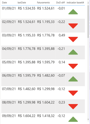
Thanks for replying, my icon works fine, my problem is with the values in the comparison. Note that the value is negative but the icon points to positive! I believe it is a problem with decimal numbers since this only happens when the value has places to the right (-0.05, -0.065, ...)
Helpful resources

Power BI Dataviz World Championships
The Power BI Data Visualization World Championships is back! Get ahead of the game and start preparing now!

| User | Count |
|---|---|
| 39 | |
| 38 | |
| 38 | |
| 28 | |
| 27 |
| User | Count |
|---|---|
| 124 | |
| 88 | |
| 73 | |
| 66 | |
| 65 |


