Huge last-minute discounts for FabCon Vienna from September 15-18, 2025
Supplies are limited. Contact info@espc.tech right away to save your spot before the conference sells out.
Get your discount- Power BI forums
- Get Help with Power BI
- Desktop
- Service
- Report Server
- Power Query
- Mobile Apps
- Developer
- DAX Commands and Tips
- Custom Visuals Development Discussion
- Health and Life Sciences
- Power BI Spanish forums
- Translated Spanish Desktop
- Training and Consulting
- Instructor Led Training
- Dashboard in a Day for Women, by Women
- Galleries
- Data Stories Gallery
- Themes Gallery
- Contests Gallery
- Quick Measures Gallery
- Notebook Gallery
- Translytical Task Flow Gallery
- TMDL Gallery
- R Script Showcase
- Webinars and Video Gallery
- Ideas
- Custom Visuals Ideas (read-only)
- Issues
- Issues
- Events
- Upcoming Events
Score big with last-minute savings on the final tickets to FabCon Vienna. Secure your discount
- Power BI forums
- Forums
- Get Help with Power BI
- Desktop
- How to make calculated columns (column headers) as...
- Subscribe to RSS Feed
- Mark Topic as New
- Mark Topic as Read
- Float this Topic for Current User
- Bookmark
- Subscribe
- Printer Friendly Page
- Mark as New
- Bookmark
- Subscribe
- Mute
- Subscribe to RSS Feed
- Permalink
- Report Inappropriate Content
How to make calculated columns (column headers) as slicer?
Hi,
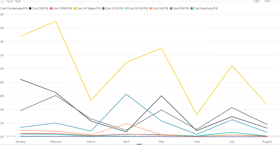
I have a simple request for my data. Basically for the graph below, I would like to have a slicer where I can choose which lines to appear; for example I just want Cost Condesate/PIB line only to show etc. These lines come from calculated columns from different tables. The idea is to have a slicer that has the options of the headers of these calculated columns where I can choose which calculcated colum data to appear or disappear from my graph.
The only solution I've tried so far is to merge the data from different tables and make custom columns instead of calculated columns in the Query editor ---> (Table A). Then, I duplicated the table and transposed to just get the column header in a new source ---> (Table B). I tried establishing a relationship between these two tables, but it will only allow me to make one relationship active between one column from Table A to Table B.
Any suggestion?
Solved! Go to Solution.
- Mark as New
- Bookmark
- Subscribe
- Mute
- Subscribe to RSS Feed
- Permalink
- Report Inappropriate Content
@Anonymous
Hi
if i understand you correctly, you may think it as a slicer for measures, below article might be helpful.
https://www.fourmoo.com/2017/11/21/power-bi-using-a-slicer-to-show-different-measures/
- Mark as New
- Bookmark
- Subscribe
- Mute
- Subscribe to RSS Feed
- Permalink
- Report Inappropriate Content
Thank you so much! It worked perfectly 🙂


