Join us at FabCon Vienna from September 15-18, 2025
The ultimate Fabric, Power BI, SQL, and AI community-led learning event. Save €200 with code FABCOMM.
Get registered- Power BI forums
- Get Help with Power BI
- Desktop
- Service
- Report Server
- Power Query
- Mobile Apps
- Developer
- DAX Commands and Tips
- Custom Visuals Development Discussion
- Health and Life Sciences
- Power BI Spanish forums
- Translated Spanish Desktop
- Training and Consulting
- Instructor Led Training
- Dashboard in a Day for Women, by Women
- Galleries
- Data Stories Gallery
- Themes Gallery
- Contests Gallery
- Quick Measures Gallery
- Notebook Gallery
- Translytical Task Flow Gallery
- TMDL Gallery
- R Script Showcase
- Webinars and Video Gallery
- Ideas
- Custom Visuals Ideas (read-only)
- Issues
- Issues
- Events
- Upcoming Events
Enhance your career with this limited time 50% discount on Fabric and Power BI exams. Ends September 15. Request your voucher.
- Power BI forums
- Forums
- Get Help with Power BI
- Desktop
- How to highlight SelectedValue in Line chart?
- Subscribe to RSS Feed
- Mark Topic as New
- Mark Topic as Read
- Float this Topic for Current User
- Bookmark
- Subscribe
- Printer Friendly Page
- Mark as New
- Bookmark
- Subscribe
- Mute
- Subscribe to RSS Feed
- Permalink
- Report Inappropriate Content
How to highlight SelectedValue in Line chart?
Hello community,
I have a line chart with [Date] and average of [Sales].
I want to highlight Selected value in line chart. But right now when I select any value , line chart disapears ( filters only selection ) and only shows selected value.
Can anyone help me?
- Mark as New
- Bookmark
- Subscribe
- Mute
- Subscribe to RSS Feed
- Permalink
- Report Inappropriate Content
Can't someone give me a little details how to do that?..
- Mark as New
- Bookmark
- Subscribe
- Mute
- Subscribe to RSS Feed
- Permalink
- Report Inappropriate Content
Hi @Akbarov ,
Power BI cannot highlight a value through the slicer in line chart.You can try changing colors dynamically using conditional formatting in a column chart.
1. create a disconnected table as slicer:
Table = CALENDAR(MIN(Sheet2[Date]),MAX(Sheet2[Date]))2. create a measure and apply to conditional formatting.
Measure = IF(MAX(Sheet2[Date])>=MIN('Table'[Date])&&MAX(Sheet2[Date])<=MAX('Table'[Date]),"red","black")
Best Regards,
Liang
If this post helps, then please consider Accept it as the solution to help the other members find it more quickly.
- Mark as New
- Bookmark
- Subscribe
- Mute
- Subscribe to RSS Feed
- Permalink
- Report Inappropriate Content
@Akbarov , for that you need to have a slicer of the independent table and then create a measure
if(max(Dimension[COlumn]) = selectedvalue(IndTable[Column]), "Red", blank())
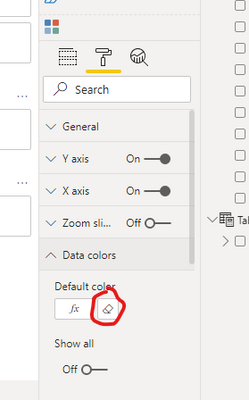
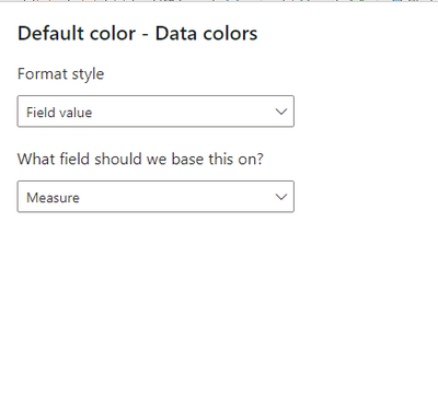
Create a bar visual and use that in conditional formatting using the field value option. Convert that to line


