Join us at FabCon Vienna from September 15-18, 2025
The ultimate Fabric, Power BI, SQL, and AI community-led learning event. Save €200 with code FABCOMM.
Get registered- Power BI forums
- Get Help with Power BI
- Desktop
- Service
- Report Server
- Power Query
- Mobile Apps
- Developer
- DAX Commands and Tips
- Custom Visuals Development Discussion
- Health and Life Sciences
- Power BI Spanish forums
- Translated Spanish Desktop
- Training and Consulting
- Instructor Led Training
- Dashboard in a Day for Women, by Women
- Galleries
- Data Stories Gallery
- Themes Gallery
- Contests Gallery
- Quick Measures Gallery
- Notebook Gallery
- Translytical Task Flow Gallery
- TMDL Gallery
- R Script Showcase
- Webinars and Video Gallery
- Ideas
- Custom Visuals Ideas (read-only)
- Issues
- Issues
- Events
- Upcoming Events
Enhance your career with this limited time 50% discount on Fabric and Power BI exams. Ends September 15. Request your voucher.
- Power BI forums
- Forums
- Get Help with Power BI
- Desktop
- How to get different background colour for each qu...
- Subscribe to RSS Feed
- Mark Topic as New
- Mark Topic as Read
- Float this Topic for Current User
- Bookmark
- Subscribe
- Printer Friendly Page
- Mark as New
- Bookmark
- Subscribe
- Mute
- Subscribe to RSS Feed
- Permalink
- Report Inappropriate Content
How to get different background colour for each quarters?
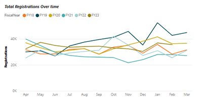
I need to acheive the following in a line graph,
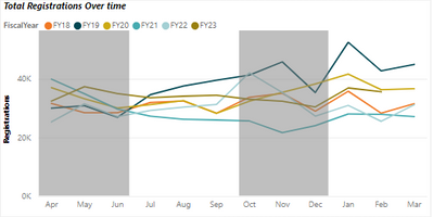
In my case, X-axis is FiscalMonth. Y-axis has a measure with years as legends. Here I need to represent 1st 3 months (Apr, may, June-Quarter1) background in one colour, next 3 months(July,Aug,Sep-Quarter2) in another colour, next 3 months(Oct,Nov,Dec-Quarter3) in same colour as Quarter1 and next 3 months(Jan,Feb,Mar-Quarter4) in same colour as Quarter2. I know that X-axis constant line can be used only if the X-axis is date or numeric data type, but in my case its string. Is there any other ways (Dax queries/calculated fields/formulae) to acheive the same? Please refer the below screenshots,
What I need is,
I have done this by placing a text box and filling it with grey, but it's static box which will not change if I apply any filter and the data in the graph changes.
I wnat the background to be dynamically adopting even if I apply a filter. Q1,Q2 should be in 1 color and Q2,Q4 should be in 1 colour.
Thanks in advance
Saranya
- Mark as New
- Bookmark
- Subscribe
- Mute
- Subscribe to RSS Feed
- Permalink
- Report Inappropriate Content
Hi @Anonymous ,
As far as I concerned, this is by design. Power BI is now unable to achieve what you need . You can vote the idea here: Multicolored background of a visual e.g Line Chart according to the values on Line and wait for users with the same needs as you to vote to help make it happen as soon as possible.
I ahve also found a similar post, please refer to it to see if it helps you.
Solved: Background colour in line charts - Microsoft Power BI Community
Best Regards
Community Support Team _ Polly
If this post helps, then please consider Accept it as the solution to help the other members find it more quickly.
Helpful resources
| User | Count |
|---|---|
| 62 | |
| 57 | |
| 54 | |
| 51 | |
| 33 |
| User | Count |
|---|---|
| 180 | |
| 88 | |
| 70 | |
| 46 | |
| 43 |


