FabCon is coming to Atlanta
Join us at FabCon Atlanta from March 16 - 20, 2026, for the ultimate Fabric, Power BI, AI and SQL community-led event. Save $200 with code FABCOMM.
Register now!- Power BI forums
- Get Help with Power BI
- Desktop
- Service
- Report Server
- Power Query
- Mobile Apps
- Developer
- DAX Commands and Tips
- Custom Visuals Development Discussion
- Health and Life Sciences
- Power BI Spanish forums
- Translated Spanish Desktop
- Training and Consulting
- Instructor Led Training
- Dashboard in a Day for Women, by Women
- Galleries
- Data Stories Gallery
- Themes Gallery
- Contests Gallery
- Quick Measures Gallery
- Notebook Gallery
- Translytical Task Flow Gallery
- TMDL Gallery
- R Script Showcase
- Webinars and Video Gallery
- Ideas
- Custom Visuals Ideas (read-only)
- Issues
- Issues
- Events
- Upcoming Events
Calling all Data Engineers! Fabric Data Engineer (Exam DP-700) live sessions are back! Starting October 16th. Sign up.
- Power BI forums
- Forums
- Get Help with Power BI
- Desktop
- How to get a MMM-formatted X-axis with week-level ...
- Subscribe to RSS Feed
- Mark Topic as New
- Mark Topic as Read
- Float this Topic for Current User
- Bookmark
- Subscribe
- Printer Friendly Page
- Mark as New
- Bookmark
- Subscribe
- Mute
- Subscribe to RSS Feed
- Permalink
- Report Inappropriate Content
How to get a MMM-formatted X-axis with week-level data granularity, without aggregating to month?
Hi all,
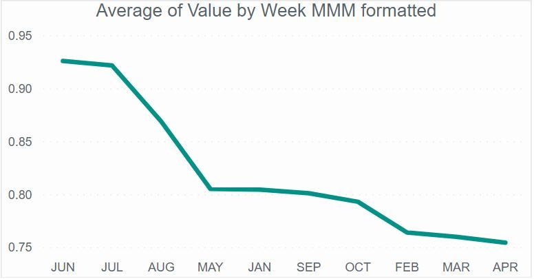
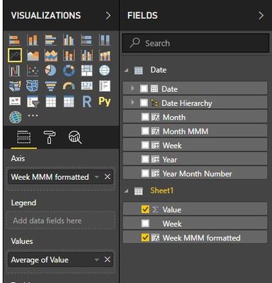
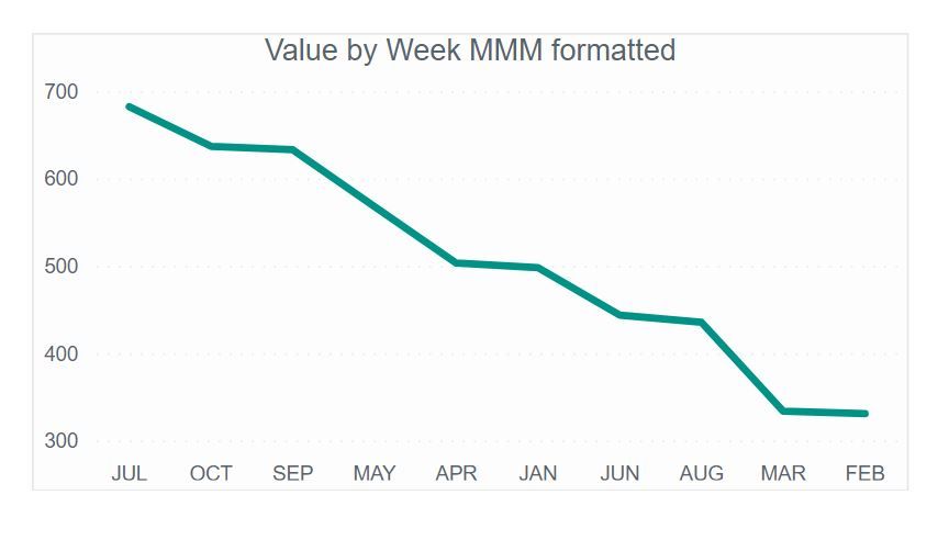
I've got a table with 2 columns, values and weekly dates. Plotting it into a line chart and removing the date hierarchy results in the following chart:
What I'd like to do is change the X-axis format to "MMM" instead of the current "Mmm YYYY", while retaining the weekly tooltips as in current example and while retaining the weekly character of the line.
Things I tried:
- Creating a custom date hierarchy of year-month-week-day.
- Creating a separate date DAX-based calendar table with week numbers and dates formatted in "MMM".
- Creating a separate Power Query based calendar table with week numbers and dates formatted in "MMM".
Challenges I run into:
- These solutions result in a monthly line in which the monthly data points are an average of the underlying weekly data points.
- The X-axis formatted as "MMM" is sorted alphabetically.
- Mark as New
- Bookmark
- Subscribe
- Mute
- Subscribe to RSS Feed
- Permalink
- Report Inappropriate Content
Hi MarkNoordraven,
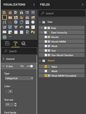
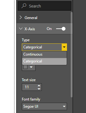
Click format-> X axis and change continuous to categorical type.
Regards,
Jimmy Tao
- Mark as New
- Bookmark
- Subscribe
- Mute
- Subscribe to RSS Feed
- Permalink
- Report Inappropriate Content
Hi Jimmy,
Thank you for your response.
The proposed solution doesn't appear to work for me unfortunately, because of these reasons:
- The line turns into a monthly line in which each point on the chart is an average of the underlying weeks in the month.
- The months are sorted in an inappropriate order.
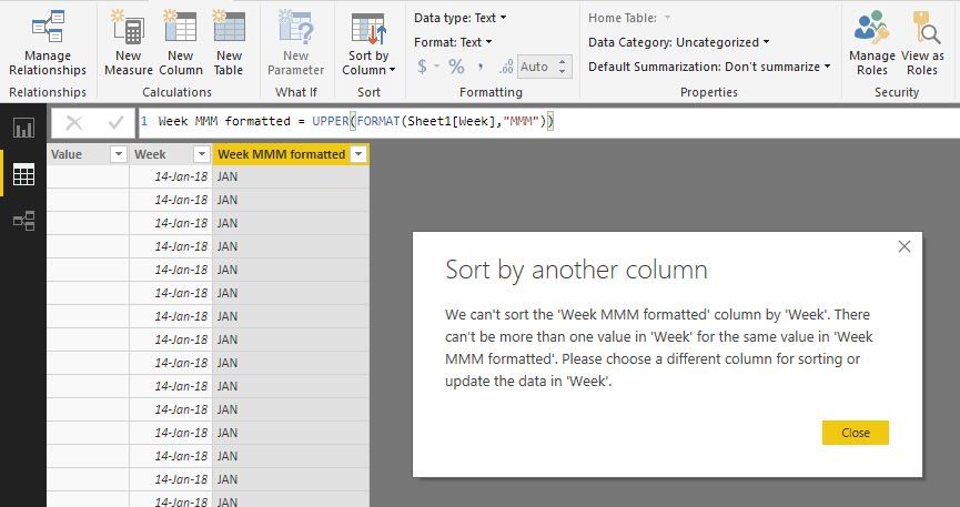
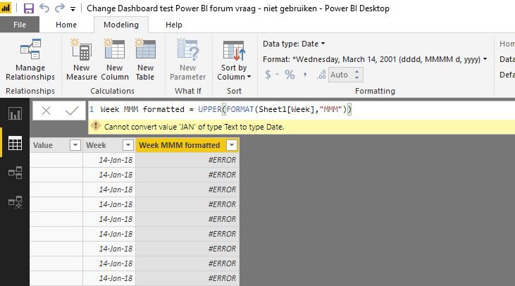
When I try to change the order in the Modeling tab, I get the following error:
- Mark as New
- Bookmark
- Subscribe
- Mute
- Subscribe to RSS Feed
- Permalink
- Report Inappropriate Content
Hi MarkNoordraven,
Change "Average of Value" to "Sum of Value" in the value field.
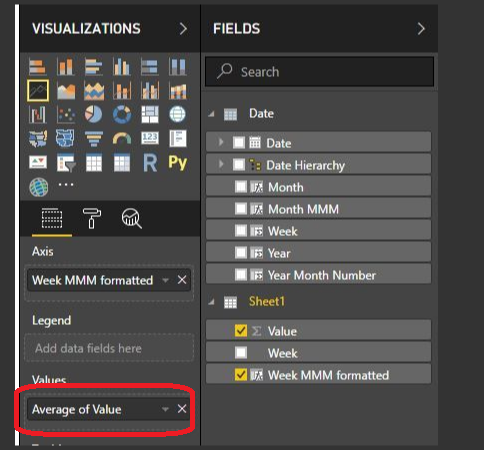
In addtion, the sort of date is decided by first alphanumeric when the value is text type, so you should change text type to date type.
Regards,
Jimmy Tao
- Mark as New
- Bookmark
- Subscribe
- Mute
- Subscribe to RSS Feed
- Permalink
- Report Inappropriate Content
Thank you Jimmy for looking into my question.
- It appears formatting into date results in an error.
- Summing Value seems to result in the months in the axis shifting around, but not yet following chronological order.
If it helps, please find below the .pbix file used in these examples: https://we.tl/t-VtukT8XB1x
Helpful resources

FabCon Global Hackathon
Join the Fabric FabCon Global Hackathon—running virtually through Nov 3. Open to all skill levels. $10,000 in prizes!

Power BI Monthly Update - September 2025
Check out the September 2025 Power BI update to learn about new features.


