Fabric Data Days starts November 4th!
Advance your Data & AI career with 50 days of live learning, dataviz contests, hands-on challenges, study groups & certifications and more!
Get registered- Power BI forums
- Get Help with Power BI
- Desktop
- Service
- Report Server
- Power Query
- Mobile Apps
- Developer
- DAX Commands and Tips
- Custom Visuals Development Discussion
- Health and Life Sciences
- Power BI Spanish forums
- Translated Spanish Desktop
- Training and Consulting
- Instructor Led Training
- Dashboard in a Day for Women, by Women
- Galleries
- Data Stories Gallery
- Themes Gallery
- Contests Gallery
- Quick Measures Gallery
- Visual Calculations Gallery
- Notebook Gallery
- Translytical Task Flow Gallery
- TMDL Gallery
- R Script Showcase
- Webinars and Video Gallery
- Ideas
- Custom Visuals Ideas (read-only)
- Issues
- Issues
- Events
- Upcoming Events
Join us at FabCon Atlanta from March 16 - 20, 2026, for the ultimate Fabric, Power BI, AI and SQL community-led event. Save $200 with code FABCOMM. Register now.
- Power BI forums
- Forums
- Get Help with Power BI
- Desktop
- How to format dynamic X axis in a Bar Chart
- Subscribe to RSS Feed
- Mark Topic as New
- Mark Topic as Read
- Float this Topic for Current User
- Bookmark
- Subscribe
- Printer Friendly Page
- Mark as New
- Bookmark
- Subscribe
- Mute
- Subscribe to RSS Feed
- Permalink
- Report Inappropriate Content
How to format dynamic X axis in a Bar Chart
Hi all, I have a table with demand values in different dates and need a bar chart that changes the labels in x axis based on the date selected in a filter. I have attached Sample data.
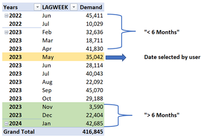
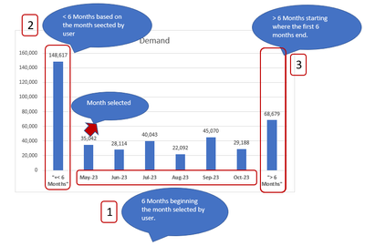
Let's say the user selects a date in May 2023, so the bar chart should show the next 6 months of data and also show grouped in a label "> Months" the demand values for months after Oct-2023 and also it should group the previous 6 months of demand data with a label "< 6 months". The x axis labels of the chart should change based on the date selected.
Details of the logic if May-2023 is selected in a filter:
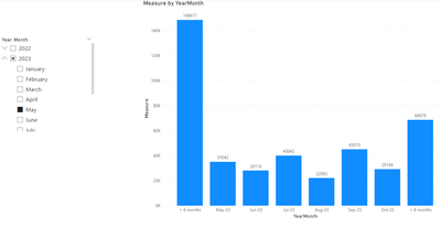
Expected result:
Is there a way to achieve it to have dynamic labels based on the selected date? I have tried with conditional columns but I am getting static results.
Thanks in advance,
Solved! Go to Solution.
- Mark as New
- Bookmark
- Subscribe
- Mute
- Subscribe to RSS Feed
- Permalink
- Report Inappropriate Content
Hi @JohanSmith7 ,
Please try:
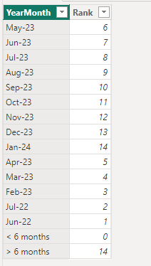
First create a new table for x-axis:
X-axis =
var _a = DISTINCT(SELECTCOLUMNS('Table',"YearMonth",FORMAT([Date],"MMM-YY"),"Rank",RANKX('Table',YEAR([Date])*100+MONTH([Date]),,ASC,Dense)))
var _b = COUNTROWS(_a)
return UNION(_a,{("> 6 months",_b),("< 6 months",0)})
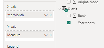
Then apply this measure to the chart:
Measure =
VAR _a =
    MIN ( 'Table'[Date] )
VAR _b =
    SELECTCOLUMNS (
        CALENDAR ( _a, EDATE ( _a, 5 ) ),
        "YearMonth", FORMAT ( [Date], "MMM-YY" )
    ) //6 months
VAR _c =
    CALCULATE (
        SUM ( 'Table'[Demand] ),
        FILTER (
            ALL ( 'Table' ),
            FORMAT ( [Date], "MMM-YY" ) = SELECTEDVALUE ( 'X-axis'[YearMonth] )
        )
    ) // calculate value for selected month
VAR _d =
    CALCULATE ( SUM ( 'Table'[Demand] ), FILTER ( ALL ( 'Table' ), [Date] < _a ) ) //calculate value for < 6months
VAR _e =
    CALCULATE (
        SUM ( 'Table'[Demand] ),
        FILTER ( ALL ( 'Table' ), [Date] > EOMONTH ( _a, 5 ) )
    ) //calculate value for > 6months
RETURN
    SWITCH (
        TRUE (),
        SELECTEDVALUE ( 'X-axis'[YearMonth] ) IN _b,
            CALCULATE (
                SUM ( 'Table'[Demand] ),
                FILTER (
                    ALL ( 'Table' ),
                    FORMAT ( [Date], "MMM-YY" ) = SELECTEDVALUE ( 'X-axis'[YearMonth] )
                )
            ),
        SELECTEDVALUE ( 'X-axis'[YearMonth] ) = "< 6 months", _d,
        SELECTEDVALUE ( 'X-axis'[YearMonth] ) = "> 6 months", _e
    )
Final output:
Best Regards,
Jianbo Li
If this post helps, then please consider Accept it as the solution to help the other members find it more quickly.
- Mark as New
- Bookmark
- Subscribe
- Mute
- Subscribe to RSS Feed
- Permalink
- Report Inappropriate Content
Hi @JohanSmith7 ,
The number of months between 2023-May and 2022-Jun is greater than 6.
How to determine the date <6 months, is it based on the number of dates in your data?
Sorry for that the information you have provided is not making the problem clear to me. Can you please share more details to help us clarify your scenario?
Best Regards,
Jianbo Li
If this post helps, then please consider Accept it as the solution to help the other members find it more quickly.
- Mark as New
- Bookmark
- Subscribe
- Mute
- Subscribe to RSS Feed
- Permalink
- Report Inappropriate Content
Hi @v-jianboli-msft, yes the dates "< 6 months" and "> 6 months" should be determined based on the dates y my data.
I only have one column with dates "LAGWEEK".
Every time the user selects a date, the chart should:
- Show 6 months of data beginning the month selected by the user.
- Show < 6 Months --> this should sum data before the date selected by user.
- Show > 6 Months--> this should sum data after the date selected. See the screenshot below:
Hopefully the previous details helps to clarify what the chart should show,
Regards,
Helpful resources

FabCon Global Hackathon
Join the Fabric FabCon Global Hackathon—running virtually through Nov 3. Open to all skill levels. $10,000 in prizes!

Power BI Monthly Update - October 2025
Check out the October 2025 Power BI update to learn about new features.

