FabCon is coming to Atlanta
Join us at FabCon Atlanta from March 16 - 20, 2026, for the ultimate Fabric, Power BI, AI and SQL community-led event. Save $200 with code FABCOMM.
Register now!- Power BI forums
- Get Help with Power BI
- Desktop
- Service
- Report Server
- Power Query
- Mobile Apps
- Developer
- DAX Commands and Tips
- Custom Visuals Development Discussion
- Health and Life Sciences
- Power BI Spanish forums
- Translated Spanish Desktop
- Training and Consulting
- Instructor Led Training
- Dashboard in a Day for Women, by Women
- Galleries
- Data Stories Gallery
- Themes Gallery
- Contests Gallery
- Quick Measures Gallery
- Notebook Gallery
- Translytical Task Flow Gallery
- TMDL Gallery
- R Script Showcase
- Webinars and Video Gallery
- Ideas
- Custom Visuals Ideas (read-only)
- Issues
- Issues
- Events
- Upcoming Events
To celebrate FabCon Vienna, we are offering 50% off select exams. Ends October 3rd. Request your discount now.
- Power BI forums
- Forums
- Get Help with Power BI
- Desktop
- How to forecast 2 comparing lines in 1 visual
- Subscribe to RSS Feed
- Mark Topic as New
- Mark Topic as Read
- Float this Topic for Current User
- Bookmark
- Subscribe
- Printer Friendly Page
- Mark as New
- Bookmark
- Subscribe
- Mute
- Subscribe to RSS Feed
- Permalink
- Report Inappropriate Content
How to forecast 2 comparing lines in 1 visual
Hi all,
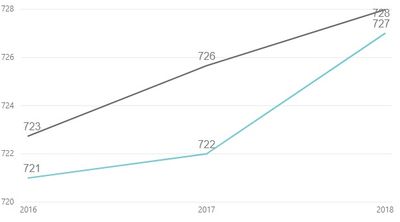
I am comparing scores from 2 different geographies in a line graph and would like to forcast them both in the same visual.
Is that possible? If so, can someone walk me through how?
If I have just one location, I am able to forecast it out, but I would like to be able to see both on the same visual.
This is what my graph looks like now:
Thanks!
- Mark as New
- Bookmark
- Subscribe
- Mute
- Subscribe to RSS Feed
- Permalink
- Report Inappropriate Content
Hi @kmurphyacyi ,
If we add a legend, the forecast function is inactive. Maybe it isn't a good idea to place more than one forecast in a visual. Because the forecast is a large range and many forecasts are overlapping each other. That would be a mess.
There could be two workarounds.
1. Working with a slicer, one forecast a time.
2. How would you like the forecast data to be? Maybe we can use a measure instead.
Best Regards,
If this post helps, then please consider Accept it as the solution to help the other members find it more quickly.
Helpful resources
| User | Count |
|---|---|
| 98 | |
| 76 | |
| 75 | |
| 49 | |
| 27 |


