- Power BI forums
- Updates
- News & Announcements
- Get Help with Power BI
- Desktop
- Service
- Report Server
- Power Query
- Mobile Apps
- Developer
- DAX Commands and Tips
- Custom Visuals Development Discussion
- Health and Life Sciences
- Power BI Spanish forums
- Translated Spanish Desktop
- Power Platform Integration - Better Together!
- Power Platform Integrations (Read-only)
- Power Platform and Dynamics 365 Integrations (Read-only)
- Training and Consulting
- Instructor Led Training
- Dashboard in a Day for Women, by Women
- Galleries
- Community Connections & How-To Videos
- COVID-19 Data Stories Gallery
- Themes Gallery
- Data Stories Gallery
- R Script Showcase
- Webinars and Video Gallery
- Quick Measures Gallery
- 2021 MSBizAppsSummit Gallery
- 2020 MSBizAppsSummit Gallery
- 2019 MSBizAppsSummit Gallery
- Events
- Ideas
- Custom Visuals Ideas
- Issues
- Issues
- Events
- Upcoming Events
- Community Blog
- Power BI Community Blog
- Custom Visuals Community Blog
- Community Support
- Community Accounts & Registration
- Using the Community
- Community Feedback
Earn a 50% discount on the DP-600 certification exam by completing the Fabric 30 Days to Learn It challenge.
- Power BI forums
- Forums
- Get Help with Power BI
- Desktop
- Re: How to fill value for empty date to keep conti...
- Subscribe to RSS Feed
- Mark Topic as New
- Mark Topic as Read
- Float this Topic for Current User
- Bookmark
- Subscribe
- Printer Friendly Page
- Mark as New
- Bookmark
- Subscribe
- Mute
- Subscribe to RSS Feed
- Permalink
- Report Inappropriate Content
How to fill value for empty date to keep continuous same period
I have a line chart and a matrix table, and want to keep the X axis align with table column header to compare data. So I have to fill values for empty date. But there is a problem. Hope someone can help. Thanks.
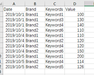
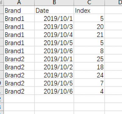
I have two sample data to compose two visuals:
the first table to compose line chart: sheet1:
the second table to compose the matrix table: sheet2:
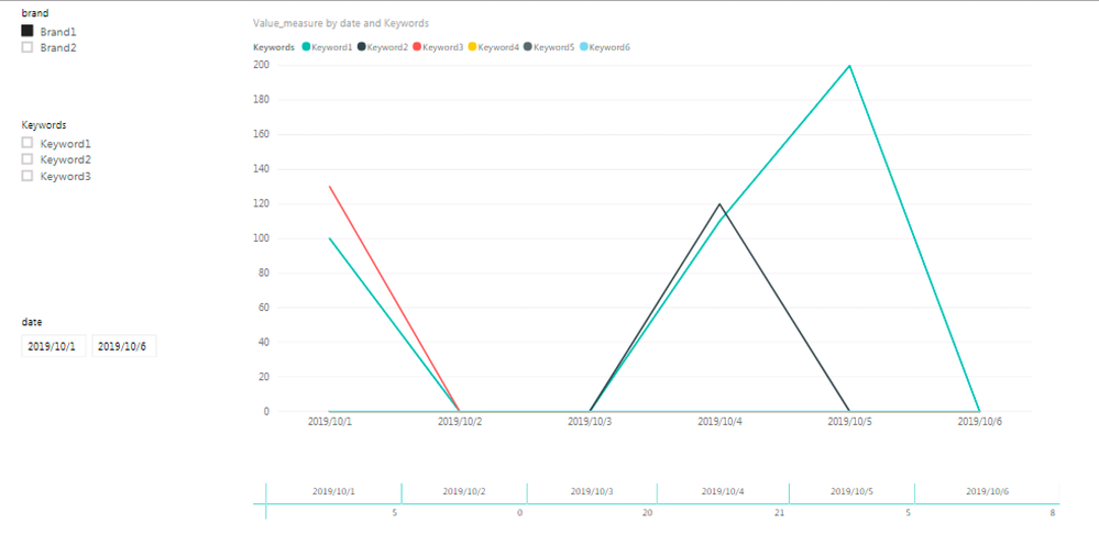
here is the final visuals:
Based on table 1, because not every day has full data for each brand/keyword. To keep two visuals align at X axis, I created measure for line value as below:
Value_measure = CALCULATE(IF(ISBLANK(CALCULATE(SUM(Sheet1[Value]),FILTER(ALLSELECTED(Sheet1[Brand]),1=1))),0,CALCULATE(SUM(Sheet1[Value]))))But the problem is:
Brand1 should only have keyword1,2,3; Brand2 should only have keyword 4,5,6.
But in the line chart, the "legand" shows 6 keywords if I selected Brand1 on left slicer. How should I only show filtered keywords in line chart?
The main purpose is only show last 6 days data, and compare two chart values.
Here is the sample data and PBI file:
https://pan.baidu.com/s/1fJY65WvpTVr23h9trR0ntA
Download code is "wy9h"
- Mark as New
- Bookmark
- Subscribe
- Mute
- Subscribe to RSS Feed
- Permalink
- Report Inappropriate Content
You should create a date table, for example, Date=calendar(min([datesyouhave),max([datesyouhave])) and make a relationship between that table and your fact table.
Let me know if it helped.
BR,
DR
- Mark as New
- Bookmark
- Subscribe
- Mute
- Subscribe to RSS Feed
- Permalink
- Report Inappropriate Content
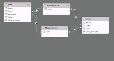
Thanks for reply. I already have two mapping tables for date and brand, to keep two charts interacted by slicers. But it doesn't help.
- Mark as New
- Bookmark
- Subscribe
- Mute
- Subscribe to RSS Feed
- Permalink
- Report Inappropriate Content
I might have miss understood your question, what do you need exactly?
- Mark as New
- Bookmark
- Subscribe
- Mute
- Subscribe to RSS Feed
- Permalink
- Report Inappropriate Content
Please see the final visual, using the "value_measure" I have filled the empty data in line chart.
But the problem is when I filter Brand1, line chart should only show 3 lines for keywords1,2,3. But now it shows 6 lines for keywords1,2,3,4,5,6.
What I want to achieve is when I select Brand1, only Keywords1,2,3 shows in line chart(with filled 0 value while keywords1,2,3 has no data on that day).
I hope someone can help to modify the "value_measure" to archieve it. Thank you for your help.
Helpful resources
| User | Count |
|---|---|
| 107 | |
| 89 | |
| 81 | |
| 76 | |
| 73 |
| User | Count |
|---|---|
| 112 | |
| 104 | |
| 96 | |
| 74 | |
| 66 |


