FabCon is coming to Atlanta
Join us at FabCon Atlanta from March 16 - 20, 2026, for the ultimate Fabric, Power BI, AI and SQL community-led event. Save $200 with code FABCOMM.
Register now!- Power BI forums
- Get Help with Power BI
- Desktop
- Service
- Report Server
- Power Query
- Mobile Apps
- Developer
- DAX Commands and Tips
- Custom Visuals Development Discussion
- Health and Life Sciences
- Power BI Spanish forums
- Translated Spanish Desktop
- Training and Consulting
- Instructor Led Training
- Dashboard in a Day for Women, by Women
- Galleries
- Data Stories Gallery
- Themes Gallery
- Contests Gallery
- QuickViz Gallery
- Quick Measures Gallery
- Visual Calculations Gallery
- Notebook Gallery
- Translytical Task Flow Gallery
- TMDL Gallery
- R Script Showcase
- Webinars and Video Gallery
- Ideas
- Custom Visuals Ideas (read-only)
- Issues
- Issues
- Events
- Upcoming Events
The Power BI Data Visualization World Championships is back! Get ahead of the game and start preparing now! Learn more
- Power BI forums
- Forums
- Get Help with Power BI
- Desktop
- How to exactly size a bubble in scatter chart?
- Subscribe to RSS Feed
- Mark Topic as New
- Mark Topic as Read
- Float this Topic for Current User
- Bookmark
- Subscribe
- Printer Friendly Page
- Mark as New
- Bookmark
- Subscribe
- Mute
- Subscribe to RSS Feed
- Permalink
- Report Inappropriate Content
How to exactly size a bubble in scatter chart?
Hello,
We have a chart with 4 numerical values where we must explicitly state size and/or color. Works for everything except bubble size:
(1) X-Axis - works fine - can define begin and end value.
(2) Y-Axis - works fine - can define begin and end value.
(3) Legend - works fine - can define colors based on specific values.
(4) Bubble size - DOES NOT WORK - while the bubble does size based on larger, smaller #s - you cannot define exact size - like you can on a line chart where you say 0 is begin value and 10 is end value. If 1 is the lowest and 10 is largest value for a bubble --for a given filter -- then 1 is small and 10 is big. If filter returns 10-20 - then the size of 10 matches prior size 1.
Thoughts on how to resolve this? Have tried various enhanced scatter charts, dot plots, etc - but nothing seems to work. Ideas for a workaround?
Appreciate your assistance.
Thanks,
Dan
Solved! Go to Solution.
- Mark as New
- Bookmark
- Subscribe
- Mute
- Subscribe to RSS Feed
- Permalink
- Report Inappropriate Content
Yeah, @dancarr22 not sure I see a way around this one. The minute you slice down to a specific value, you lose any kind of min/max reference. I can't see a way around that.
Follow on LinkedIn
@ me in replies or I'll lose your thread!!!
Instead of a Kudo, please vote for this idea
Become an expert!: Enterprise DNA
External Tools: MSHGQM
YouTube Channel!: Microsoft Hates Greg
Latest book!: DAX For Humans
DAX is easy, CALCULATE makes DAX hard...
- Mark as New
- Bookmark
- Subscribe
- Mute
- Subscribe to RSS Feed
- Permalink
- Report Inappropriate Content
Please refer this link:
https://community.powerbi.com/t5/Desktop/Controlling-the-bubble-size-in-a-scatter-chart/m-p/169927
Hope it helpful.
Proud to be a Super User! |  |
- Mark as New
- Bookmark
- Subscribe
- Mute
- Subscribe to RSS Feed
- Permalink
- Report Inappropriate Content
Thanks @rajendraongole1 and @Greg_Deckler but those solutions did not work.
The field which the bubble size is based on has 5 potential values: 1-5. That is it. If the dataset contains all 5 values: 1,2,3,4 and 5. Then everything sizes properly. 1 is small, 3 is medium and 5 is big. But, if the user filters the dataset so only 2-3 values appear - say 3 and 4 then the bubbles resize and 3 becomes small - since, due to the filters, that is now the smallest displayed value. But, we do not want that. 3 should be middle/average sized regardless if only 3 is in the dataset of 1-5 or 1-3.
Thanks,
Dan
- Mark as New
- Bookmark
- Subscribe
- Mute
- Subscribe to RSS Feed
- Permalink
- Report Inappropriate Content
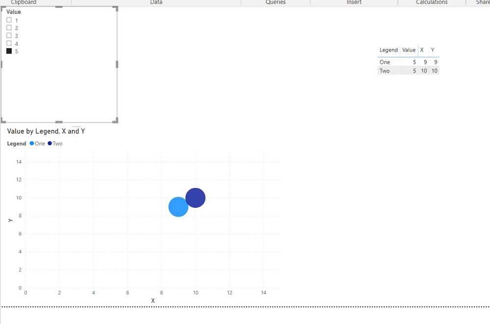
Hmm, I am not seeing this in my example. Please see attached PBIX. If I select 3 and 5 from the slicer and then add 1, all the bubbles remain the same sizes. @dancarr22
Follow on LinkedIn
@ me in replies or I'll lose your thread!!!
Instead of a Kudo, please vote for this idea
Become an expert!: Enterprise DNA
External Tools: MSHGQM
YouTube Channel!: Microsoft Hates Greg
Latest book!: DAX For Humans
DAX is easy, CALCULATE makes DAX hard...
- Mark as New
- Bookmark
- Subscribe
- Mute
- Subscribe to RSS Feed
- Permalink
- Report Inappropriate Content
@Greg_DecklerThanks for posting this! Can see that it sort of works - if you choose 2 at a time. But if you just select 1 then just select 5 you'll see that they become the same sized bubbles.
- Mark as New
- Bookmark
- Subscribe
- Mute
- Subscribe to RSS Feed
- Permalink
- Report Inappropriate Content
Yeah, @dancarr22 not sure I see a way around this one. The minute you slice down to a specific value, you lose any kind of min/max reference. I can't see a way around that.
Follow on LinkedIn
@ me in replies or I'll lose your thread!!!
Instead of a Kudo, please vote for this idea
Become an expert!: Enterprise DNA
External Tools: MSHGQM
YouTube Channel!: Microsoft Hates Greg
Latest book!: DAX For Humans
DAX is easy, CALCULATE makes DAX hard...
- Mark as New
- Bookmark
- Subscribe
- Mute
- Subscribe to RSS Feed
- Permalink
- Report Inappropriate Content
- Mark as New
- Bookmark
- Subscribe
- Mute
- Subscribe to RSS Feed
- Permalink
- Report Inappropriate Content
Hi @dancarr22
Instead of filtering, could you have the unselected items turn white and blend into the background? Essentially you create a measure which show as selected/unselected. If the measure is unselected, you can customize the color and label series to be white. That way all sizes are still incorporated.
- Mark as New
- Bookmark
- Subscribe
- Mute
- Subscribe to RSS Feed
- Permalink
- Report Inappropriate Content
@Anonymous
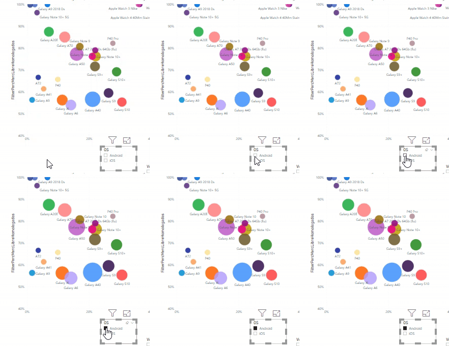
Can you elaborate a bit more your suggestion? I think I'm facing the same challenge as @dancarr22, since my bubble chart is showing bubbles that are classified under two different category values (A / B) , and if I apply a filter visual to show the ones whose category is A, I manage to remove the ones whose category is B, but some of the remaining bubbles grow automatically... I do not find the way to keep their original sizes:
Thanx!
- Mark as New
- Bookmark
- Subscribe
- Mute
- Subscribe to RSS Feed
- Permalink
- Report Inappropriate Content
Hi @efialttes
Unfortunately, I never came up with a good solution.
So we came up with a different graph type.
Curious if you come up with something!
Thanks,
Dan
- Mark as New
- Bookmark
- Subscribe
- Mute
- Subscribe to RSS Feed
- Permalink
- Report Inappropriate Content
Sure, put a constant value column in your Size. Then they are all the same? If you are trying to say that a 10 value has a 5 radius and a 1 value has a 1 radius and a 5 value has a 2 radius you can't do that to be best of my knowledge. What are you trying to achieve?
Follow on LinkedIn
@ me in replies or I'll lose your thread!!!
Instead of a Kudo, please vote for this idea
Become an expert!: Enterprise DNA
External Tools: MSHGQM
YouTube Channel!: Microsoft Hates Greg
Latest book!: DAX For Humans
DAX is easy, CALCULATE makes DAX hard...
Helpful resources

Power BI Dataviz World Championships
The Power BI Data Visualization World Championships is back! Get ahead of the game and start preparing now!

| User | Count |
|---|---|
| 38 | |
| 38 | |
| 36 | |
| 28 | |
| 28 |
| User | Count |
|---|---|
| 124 | |
| 89 | |
| 73 | |
| 66 | |
| 65 |


