FabCon is coming to Atlanta
Join us at FabCon Atlanta from March 16 - 20, 2026, for the ultimate Fabric, Power BI, AI and SQL community-led event. Save $200 with code FABCOMM.
Register now!- Power BI forums
- Get Help with Power BI
- Desktop
- Service
- Report Server
- Power Query
- Mobile Apps
- Developer
- DAX Commands and Tips
- Custom Visuals Development Discussion
- Health and Life Sciences
- Power BI Spanish forums
- Translated Spanish Desktop
- Training and Consulting
- Instructor Led Training
- Dashboard in a Day for Women, by Women
- Galleries
- Data Stories Gallery
- Themes Gallery
- Contests Gallery
- QuickViz Gallery
- Quick Measures Gallery
- Visual Calculations Gallery
- Notebook Gallery
- Translytical Task Flow Gallery
- TMDL Gallery
- R Script Showcase
- Webinars and Video Gallery
- Ideas
- Custom Visuals Ideas (read-only)
- Issues
- Issues
- Events
- Upcoming Events
The Power BI Data Visualization World Championships is back! Get ahead of the game and start preparing now! Learn more
- Power BI forums
- Forums
- Get Help with Power BI
- Desktop
- How to drill on datetime data without aggregating ...
- Subscribe to RSS Feed
- Mark Topic as New
- Mark Topic as Read
- Float this Topic for Current User
- Bookmark
- Subscribe
- Printer Friendly Page
- Mark as New
- Bookmark
- Subscribe
- Mute
- Subscribe to RSS Feed
- Permalink
- Report Inappropriate Content
How to drill on datetime data without aggregating into level above
I have some data with a DateTime column. What I need to be able to do is drill down to the second level. I've created my own hierarchy Year>month>day>hours>minutes>seconds.
The only problem is if I plot some data on a line chart, and I drill down to the day, hours, minutes or seconds level, the data is grouped by the whole amount.
For example, if I drill down to the Day7 level, it will give me the data for all Day7's across all months. Or if I drill down to hour4, it will aggregate across every hour4, across every day of every month of every year.
so this sample data has 2 days worth of data.
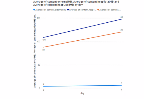
Below shows across 2 days:
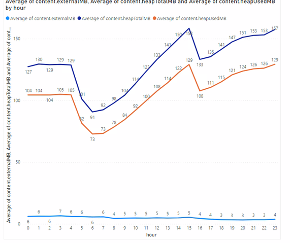
If I drill down a level, it gives me the hours:
But as you can see the hours have been aggregated across both days.
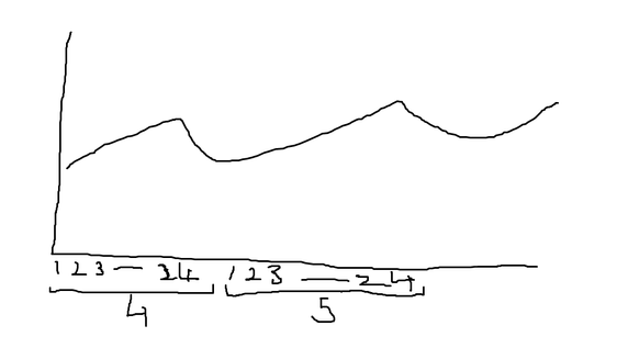
I wanted to see the trend across the 2 days, so expect the chart to look something like the following:
Apologies for the crude illustration, but how can something like this be achieved?
Solved! Go to Solution.
- Mark as New
- Bookmark
- Subscribe
- Mute
- Subscribe to RSS Feed
- Permalink
- Report Inappropriate Content
Managed to solve it. If anyone is interested, the data type for the day/month/hour/min/sec columns I changed to Text. This stopped the data grouping into the number buckets
- Mark as New
- Bookmark
- Subscribe
- Mute
- Subscribe to RSS Feed
- Permalink
- Report Inappropriate Content
Managed to solve it. If anyone is interested, the data type for the day/month/hour/min/sec columns I changed to Text. This stopped the data grouping into the number buckets
Helpful resources

Power BI Dataviz World Championships
The Power BI Data Visualization World Championships is back! Get ahead of the game and start preparing now!

Power BI Monthly Update - November 2025
Check out the November 2025 Power BI update to learn about new features.

| User | Count |
|---|---|
| 66 | |
| 47 | |
| 43 | |
| 26 | |
| 19 |
| User | Count |
|---|---|
| 196 | |
| 127 | |
| 102 | |
| 67 | |
| 49 |


