FabCon is coming to Atlanta
Join us at FabCon Atlanta from March 16 - 20, 2026, for the ultimate Fabric, Power BI, AI and SQL community-led event. Save $200 with code FABCOMM.
Register now!- Power BI forums
- Get Help with Power BI
- Desktop
- Service
- Report Server
- Power Query
- Mobile Apps
- Developer
- DAX Commands and Tips
- Custom Visuals Development Discussion
- Health and Life Sciences
- Power BI Spanish forums
- Translated Spanish Desktop
- Training and Consulting
- Instructor Led Training
- Dashboard in a Day for Women, by Women
- Galleries
- Data Stories Gallery
- Themes Gallery
- Contests Gallery
- Quick Measures Gallery
- Notebook Gallery
- Translytical Task Flow Gallery
- TMDL Gallery
- R Script Showcase
- Webinars and Video Gallery
- Ideas
- Custom Visuals Ideas (read-only)
- Issues
- Issues
- Events
- Upcoming Events
Calling all Data Engineers! Fabric Data Engineer (Exam DP-700) live sessions are back! Starting October 16th. Sign up.
- Power BI forums
- Forums
- Get Help with Power BI
- Desktop
- How to display multiple lines associated with one ...
- Subscribe to RSS Feed
- Mark Topic as New
- Mark Topic as Read
- Float this Topic for Current User
- Bookmark
- Subscribe
- Printer Friendly Page
- Mark as New
- Bookmark
- Subscribe
- Mute
- Subscribe to RSS Feed
- Permalink
- Report Inappropriate Content
How to display multiple lines associated with one legend color?
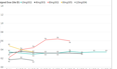
I am plotting athlete reaction time (y-axis) on different days (x-axis). I have 5 athletes and I want each to have their own line, as seen in the example, but I only want four line colors because two of the athletes are taking the same amount of vitamins (80mg). right now the legend is a combination of dose (mg) and ID#, but I really only want four in the legend with just dose. However, if I change my legend to dose, the chart summarizes the pink and yellow lines & only displays one line. Please help, how can I get 5 lines with only 4 in legend. [i realize i could manually change the yellow to pink, but I have about 20 of these charts and I do not want that manual work for each report, also do not want the 5 dots at top (only four).] Thank you!
Solved! Go to Solution.
- Mark as New
- Bookmark
- Subscribe
- Mute
- Subscribe to RSS Feed
- Permalink
- Report Inappropriate Content
Thank you so much for looking into this. As a note for other readers, I found that it might be possible with the ggplot2 package from R, but I have not yet tested. Again thank you, and we can close this question.
- Mark as New
- Bookmark
- Subscribe
- Mute
- Subscribe to RSS Feed
- Permalink
- Report Inappropriate Content
Hi @MaggiB,
In your scenario, there is no automatic way to change the line color, you have to manually change the yellow to pink. And unless you change the legend to does, you will have 5 dots at top.
Thanks,
Lydia Zhang
- Mark as New
- Bookmark
- Subscribe
- Mute
- Subscribe to RSS Feed
- Permalink
- Report Inappropriate Content
Is there a way to do it with R-programming?
- Mark as New
- Bookmark
- Subscribe
- Mute
- Subscribe to RSS Feed
- Permalink
- Report Inappropriate Content
Hi @MaggiB,
Based on my reserach, it is not possible to use R to create multiple lines that associate with only one legend.
Thanks,
Lydia Zhang
- Mark as New
- Bookmark
- Subscribe
- Mute
- Subscribe to RSS Feed
- Permalink
- Report Inappropriate Content
Thank you so much for looking into this. As a note for other readers, I found that it might be possible with the ggplot2 package from R, but I have not yet tested. Again thank you, and we can close this question.


