FabCon is coming to Atlanta
Join us at FabCon Atlanta from March 16 - 20, 2026, for the ultimate Fabric, Power BI, AI and SQL community-led event. Save $200 with code FABCOMM.
Register now!- Power BI forums
- Get Help with Power BI
- Desktop
- Service
- Report Server
- Power Query
- Mobile Apps
- Developer
- DAX Commands and Tips
- Custom Visuals Development Discussion
- Health and Life Sciences
- Power BI Spanish forums
- Translated Spanish Desktop
- Training and Consulting
- Instructor Led Training
- Dashboard in a Day for Women, by Women
- Galleries
- Data Stories Gallery
- Themes Gallery
- Contests Gallery
- QuickViz Gallery
- Quick Measures Gallery
- Visual Calculations Gallery
- Notebook Gallery
- Translytical Task Flow Gallery
- TMDL Gallery
- R Script Showcase
- Webinars and Video Gallery
- Ideas
- Custom Visuals Ideas (read-only)
- Issues
- Issues
- Events
- Upcoming Events
Get Fabric Certified for FREE during Fabric Data Days. Don't miss your chance! Request now
- Power BI forums
- Forums
- Get Help with Power BI
- Desktop
- How to create tool tip comparisons between two exa...
- Subscribe to RSS Feed
- Mark Topic as New
- Mark Topic as Read
- Float this Topic for Current User
- Bookmark
- Subscribe
- Printer Friendly Page
- Mark as New
- Bookmark
- Subscribe
- Mute
- Subscribe to RSS Feed
- Permalink
- Report Inappropriate Content
How to create tool tip comparisons between two exactly same columns
Hi,
My team mate has developed a dashboard where there are side by side brand comparison. so, he has duplicated brand column. So, there are brand1 and brand2 columns which has exactly same values. The left side cards has values based on brand1 slicer and right side cards have values based on brand2 slicer.

| week | Brand1 | Brand2 | Units Sold | Selling Price |
| 1 | B1 | B1 | 970 | $12 |
| 1 | B2 | B2 | 883 | $12 |
| 1 | B3 | B3 | 150 | $12 |
| 1 | B4 | B4 | 212 | $13 |
| 2 | B1 | B1 | 774 | $10 |
| 2 | B2 | B2 | 948 | $13 |
| 2 | B3 | B3 | 270 | $13 |
| 2 | B4 | B4 | 465 | $13 |
| 3 | B1 | B1 | 750 | $13 |
| 3 | B2 | B2 | 886 | $15 |
| 3 | B3 | B3 | 827 | $10 |
| 3 | B4 | B4 | 798 | $14 |
| 4 | B1 | B1 | 549 | $13 |
| 4 | B2 | B2 | 988 | $11 |
| 4 | B3 | B3 | 216 | $14 |
| 4 | B4 | B4 | 624 | $10 |
I am not getting any logic to do this. Could anyone please help me with the solution.
- Mark as New
- Bookmark
- Subscribe
- Mute
- Subscribe to RSS Feed
- Permalink
- Report Inappropriate Content
Hi, @Anonymous
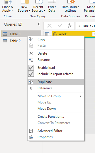
It seems that you need duplicate a new table first in query editor. Then create a relationship between tables.
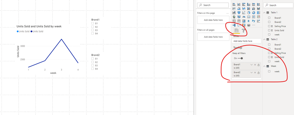
After that, you can create tooltip page as below:
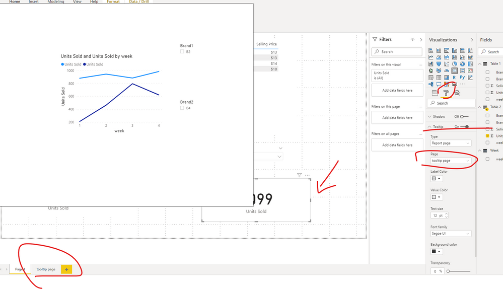
Make sure enable the option "Tooptip" . Take care not to use a page size that's too large—it can obscure the visuals on the source page.
Then you need to drag the tooltip fields to "tooltip pane" .
In the end ,you need to manually set a report tooltip for each card visual.
Please check the attached file for more details.
Best Regards,
Community Support Team _ Eason
If this post helps, then please consider Accept it as the solution to help the other members find it more quickly.
- Mark as New
- Bookmark
- Subscribe
- Mute
- Subscribe to RSS Feed
- Permalink
- Report Inappropriate Content
Hi , @Anonymous
Not very clear .
Are there other tables in your model? Do the fields in the visual come from the same table?
From your sample data, I only find one list of units sold and selling price in the same table.Do they correspond to brand1 or brand2?
Best Regards,
Community Support Team _ Eason
- Mark as New
- Bookmark
- Subscribe
- Mute
- Subscribe to RSS Feed
- Permalink
- Report Inappropriate Content
Yes, the fields come from the same table. Actually, brand2 is the replica of brand1. you can leave out the column brand2.
Basically, I want to compare Selling price and Units Sold of any two brands side by side.
- Mark as New
- Bookmark
- Subscribe
- Mute
- Subscribe to RSS Feed
- Permalink
- Report Inappropriate Content
@Anonymous , Not Very clear. You can ger week on week comparison and create tooltip page but this will depend on what is there on visual
For Week on Week refer
https://medium.com/@amitchandak.1978/power-bi-wtd-questions-time-intelligence-4-5-98c30fab69d3
https://community.powerbi.com/t5/Community-Blog/Week-Is-Not-So-Weak-WTD-Last-WTD-and-This-Week-vs-Last-Week/ba-p/1051123
Tooltip -https://docs.microsoft.com/en-us/power-bi/desktop-tooltips
- Mark as New
- Bookmark
- Subscribe
- Mute
- Subscribe to RSS Feed
- Permalink
- Report Inappropriate Content
@Anonymous - Sorry, are you talking about in a tooltip page having some kind of chart? I am not clear on what the chart needs to look like. It it we me, I would have a single brand column and 2 disconnected brand tables that I would use for my slicers I think. I would have a measure for Brand1 and a measure for Brand2. You could then use your week as the axis and have the Brand1 and Brand2 measures in your Values and that would allow you to see both compared in a graph.
Follow on LinkedIn
@ me in replies or I'll lose your thread!!!
Instead of a Kudo, please vote for this idea
Become an expert!: Enterprise DNA
External Tools: MSHGQM
YouTube Channel!: Microsoft Hates Greg
Latest book!: DAX For Humans
DAX is easy, CALCULATE makes DAX hard...
Helpful resources

Power BI Monthly Update - November 2025
Check out the November 2025 Power BI update to learn about new features.

Fabric Data Days
Advance your Data & AI career with 50 days of live learning, contests, hands-on challenges, study groups & certifications and more!

| User | Count |
|---|---|
| 103 | |
| 80 | |
| 64 | |
| 50 | |
| 45 |


