Join us at FabCon Vienna from September 15-18, 2025
The ultimate Fabric, Power BI, SQL, and AI community-led learning event. Save €200 with code FABCOMM.
Get registered- Power BI forums
- Get Help with Power BI
- Desktop
- Service
- Report Server
- Power Query
- Mobile Apps
- Developer
- DAX Commands and Tips
- Custom Visuals Development Discussion
- Health and Life Sciences
- Power BI Spanish forums
- Translated Spanish Desktop
- Training and Consulting
- Instructor Led Training
- Dashboard in a Day for Women, by Women
- Galleries
- Data Stories Gallery
- Themes Gallery
- Contests Gallery
- Quick Measures Gallery
- Notebook Gallery
- Translytical Task Flow Gallery
- TMDL Gallery
- R Script Showcase
- Webinars and Video Gallery
- Ideas
- Custom Visuals Ideas (read-only)
- Issues
- Issues
- Events
- Upcoming Events
Compete to become Power BI Data Viz World Champion! First round ends August 18th. Get started.
- Power BI forums
- Forums
- Get Help with Power BI
- Desktop
- How to create this chart in Power BI.
- Subscribe to RSS Feed
- Mark Topic as New
- Mark Topic as Read
- Float this Topic for Current User
- Bookmark
- Subscribe
- Printer Friendly Page
- Mark as New
- Bookmark
- Subscribe
- Mute
- Subscribe to RSS Feed
- Permalink
- Report Inappropriate Content
How to create this chart in Power BI.
Thanks Advanced,
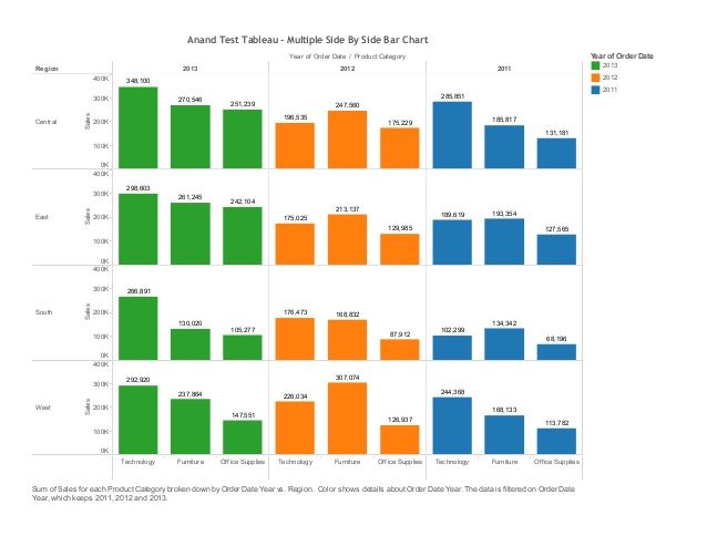
Anyone can help to create the chart in Power BI. This is chart available in Tableau. how can i do the same in Power BI
- Mark as New
- Bookmark
- Subscribe
- Mute
- Subscribe to RSS Feed
- Permalink
- Report Inappropriate Content
@Baskar,
There is no built-in side by side bar chart in Power BI Desktop, an idea about this issue has been submitted in this link, please vote it up.
Meanwhile, please check if the Infographic Designer custom visual meets your requirement.
Regards,
Lydia Zhang
If this post helps, then please consider Accept it as the solution to help the other members find it more quickly.
- Mark as New
- Bookmark
- Subscribe
- Mute
- Subscribe to RSS Feed
- Permalink
- Report Inappropriate Content
I need the same visual . Is it possible in infographic Designer ?
- Mark as New
- Bookmark
- Subscribe
- Mute
- Subscribe to RSS Feed
- Permalink
- Report Inappropriate Content
@Baskar,
The Column By section in infographic Designer acts as Legend. When using infographic Designer, you can create the visual like that in your original post, but it is not possible to create the same visual as that in your second screenshot.
Regards,
Lydia
If this post helps, then please consider Accept it as the solution to help the other members find it more quickly.
- Mark as New
- Bookmark
- Subscribe
- Mute
- Subscribe to RSS Feed
- Permalink
- Report Inappropriate Content
Hi,
Thanks for your response.
But in that custom visual i can't set legend. I want show the color variance at each level of bar chart in row wise.
the legend is coming from unused dimension the chart.
Here i can use only the used column as legend.
Helpful resources
| User | Count |
|---|---|
| 83 | |
| 82 | |
| 34 | |
| 33 | |
| 32 |
| User | Count |
|---|---|
| 93 | |
| 79 | |
| 62 | |
| 54 | |
| 51 |


