Become a Certified Power BI Data Analyst!
Join us for an expert-led overview of the tools and concepts you'll need to pass exam PL-300. The first session starts on June 11th. See you there!
Get registered- Power BI forums
- Get Help with Power BI
- Desktop
- Service
- Report Server
- Power Query
- Mobile Apps
- Developer
- DAX Commands and Tips
- Custom Visuals Development Discussion
- Health and Life Sciences
- Power BI Spanish forums
- Translated Spanish Desktop
- Training and Consulting
- Instructor Led Training
- Dashboard in a Day for Women, by Women
- Galleries
- Webinars and Video Gallery
- Data Stories Gallery
- Themes Gallery
- Contests Gallery
- Quick Measures Gallery
- Notebook Gallery
- Translytical Task Flow Gallery
- R Script Showcase
- Ideas
- Custom Visuals Ideas (read-only)
- Issues
- Issues
- Events
- Upcoming Events
Power BI is turning 10! Let’s celebrate together with dataviz contests, interactive sessions, and giveaways. Register now.
- Power BI forums
- Forums
- Get Help with Power BI
- Desktop
- How to create an organisational hierarchy chart wi...
- Subscribe to RSS Feed
- Mark Topic as New
- Mark Topic as Read
- Float this Topic for Current User
- Bookmark
- Subscribe
- Printer Friendly Page
- Mark as New
- Bookmark
- Subscribe
- Mute
- Subscribe to RSS Feed
- Permalink
- Report Inappropriate Content
How to create an organisational hierarchy chart with team label
Hi all,
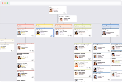
I need to automate an organisational heirarchy chart that consists of hundreds of staff. I need the chart/s to display not only name and role title, but also the team name if the position leads a team. And preferably a way to lift up Executive Assistants to beneath their boss (not same level as the management team). My data is coming from an Excel spreadsheet stored on SharePoint/OneDrive for Business, and is set up with a Parent ID column ready to go.
I've tried the Akvelon Hierarchy Chart, however it does not appear well with large amounts of staff. It becomes quite horizontal / flat (i.e. ugly and unreadable), rather than grouping teams vertically. And it is only limited to two data fields per box so it doesn't include team name on the chart (I've tried concatenating role title and team name when the role title is a lead, but this is not easily distinguished in the diagram).
My ideal world would be the org chart product offered by Pingboard, however we cannot afford this - this product does a great job of grouping an org chart into functional teams and lifting the Executive Assistant type roles up higher (screenshot below, taken from https://pingboard.com/org-chart-templates).
I've tried MAQ Software Organisational Chart however it is bugging out, and anyway doesn't display the data any better than Akvelon (still quite horizontal/flat).
Any ideas please on better ways to use Power BI to create good, professional org charts that include team breakdown?
Thanks in advance, Carla.
Solved! Go to Solution.
- Mark as New
- Bookmark
- Subscribe
- Mute
- Subscribe to RSS Feed
- Permalink
- Report Inappropriate Content
Hi @Anonymous ,
There is no great visualization for this however believe your best option is the Visio Custom visual check the links below with explanations and download options:
https://appsource.microsoft.com/en-us/product/power-bi-visuals/WA104381132?tab=Overview
http://sqljason.com/2017/06/visio-custom-visual-preview-for-power-bi-quick-look.html
Believe you can do what you are looking for.
Regards
Miguel Félix
Did I answer your question? Mark my post as a solution!
Proud to be a Super User!
Check out my blog: Power BI em Português- Mark as New
- Bookmark
- Subscribe
- Mute
- Subscribe to RSS Feed
- Permalink
- Report Inappropriate Content
There are other free custom visuals such as Org Chart Drag and Drop which does not require a license to just create org charts with your data.
There is a couple minute demo video of it here Power BI - Org Chart Drag and Drop Demo
- Mark as New
- Bookmark
- Subscribe
- Mute
- Subscribe to RSS Feed
- Permalink
- Report Inappropriate Content
Hi @Anonymous ,
There is no great visualization for this however believe your best option is the Visio Custom visual check the links below with explanations and download options:
https://appsource.microsoft.com/en-us/product/power-bi-visuals/WA104381132?tab=Overview
http://sqljason.com/2017/06/visio-custom-visual-preview-for-power-bi-quick-look.html
Believe you can do what you are looking for.
Regards
Miguel Félix
Did I answer your question? Mark my post as a solution!
Proud to be a Super User!
Check out my blog: Power BI em Português- Mark as New
- Bookmark
- Subscribe
- Mute
- Subscribe to RSS Feed
- Permalink
- Report Inappropriate Content
hello, is it okay? Can you share me how you created your organizational chart?
Helpful resources

Join our Fabric User Panel
This is your chance to engage directly with the engineering team behind Fabric and Power BI. Share your experiences and shape the future.

Power BI Monthly Update - June 2025
Check out the June 2025 Power BI update to learn about new features.

| User | Count |
|---|---|
| 84 | |
| 75 | |
| 68 | |
| 41 | |
| 35 |
| User | Count |
|---|---|
| 102 | |
| 56 | |
| 52 | |
| 46 | |
| 40 |

