Join us at FabCon Vienna from September 15-18, 2025
The ultimate Fabric, Power BI, SQL, and AI community-led learning event. Save €200 with code FABCOMM.
Get registered- Power BI forums
- Get Help with Power BI
- Desktop
- Service
- Report Server
- Power Query
- Mobile Apps
- Developer
- DAX Commands and Tips
- Custom Visuals Development Discussion
- Health and Life Sciences
- Power BI Spanish forums
- Translated Spanish Desktop
- Training and Consulting
- Instructor Led Training
- Dashboard in a Day for Women, by Women
- Galleries
- Data Stories Gallery
- Themes Gallery
- Contests Gallery
- Quick Measures Gallery
- Notebook Gallery
- Translytical Task Flow Gallery
- TMDL Gallery
- R Script Showcase
- Webinars and Video Gallery
- Ideas
- Custom Visuals Ideas (read-only)
- Issues
- Issues
- Events
- Upcoming Events
Compete to become Power BI Data Viz World Champion! First round ends August 18th. Get started.
- Power BI forums
- Forums
- Get Help with Power BI
- Desktop
- How to create a dynamic title/smart narrative tha...
- Subscribe to RSS Feed
- Mark Topic as New
- Mark Topic as Read
- Float this Topic for Current User
- Bookmark
- Subscribe
- Printer Friendly Page
- Mark as New
- Bookmark
- Subscribe
- Mute
- Subscribe to RSS Feed
- Permalink
- Report Inappropriate Content
How to create a dynamic title/smart narrative that can detect all factors that effecting a visual
Hi all
I have a tab that comntains only one visuual "Stacked Column Chart" and 6 slicers that effecting it.
of course for most of the users follwing the contecxt will be challenging so I was wondering , is it possibe to build a dynamic lable for the visual.
It wil be great if the title can show either the choosen values in slicers or at least the used slicers the influence .
Also can I add a smart narrative that can show this in a formatted user freindly way
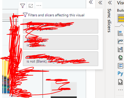
something simmillar to what filter ocon show on the top of each visual
Thanks in advance
REgards
Solved! Go to Solution.
- Mark as New
- Bookmark
- Subscribe
- Mute
- Subscribe to RSS Feed
- Permalink
- Report Inappropriate Content
Hi , @Nazdac911
Understanding the filter context applied to a measure in a Power BI report can be a challenging task. Filters can be applied at the report, page, and visual levels. Every visual element in a report can filter other visuals in the same page. Determining the exact filter in complex reports can be an expensive but necessary task during report validation or debugging. For example, the following screenshot shows the DumpFilters measure applied to a Tooltip in a clustered column chart.
For this , you can refer to :
Displaying filter context in Power BI Tooltips - SQLBI
Thank you for your time and sharing, and thank you for your support and understanding of PowerBI!
Best Regards,
Aniya Zhang
If this post helps, then please consider Accept it as the solution to help the other members find it more quickly


