FabCon is coming to Atlanta
Join us at FabCon Atlanta from March 16 - 20, 2026, for the ultimate Fabric, Power BI, AI and SQL community-led event. Save $200 with code FABCOMM.
Register now!- Power BI forums
- Get Help with Power BI
- Desktop
- Service
- Report Server
- Power Query
- Mobile Apps
- Developer
- DAX Commands and Tips
- Custom Visuals Development Discussion
- Health and Life Sciences
- Power BI Spanish forums
- Translated Spanish Desktop
- Training and Consulting
- Instructor Led Training
- Dashboard in a Day for Women, by Women
- Galleries
- Data Stories Gallery
- Themes Gallery
- Contests Gallery
- QuickViz Gallery
- Quick Measures Gallery
- Visual Calculations Gallery
- Notebook Gallery
- Translytical Task Flow Gallery
- TMDL Gallery
- R Script Showcase
- Webinars and Video Gallery
- Ideas
- Custom Visuals Ideas (read-only)
- Issues
- Issues
- Events
- Upcoming Events
Get Fabric Certified for FREE during Fabric Data Days. Don't miss your chance! Request now
- Power BI forums
- Forums
- Get Help with Power BI
- Desktop
- How to create a chart showing positive and negativ...
- Subscribe to RSS Feed
- Mark Topic as New
- Mark Topic as Read
- Float this Topic for Current User
- Bookmark
- Subscribe
- Printer Friendly Page
- Mark as New
- Bookmark
- Subscribe
- Mute
- Subscribe to RSS Feed
- Permalink
- Report Inappropriate Content
How to create a chart showing positive and negative values as in the attachment
Hi,
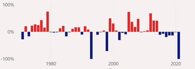
How is the following type of chart acheived? Also, can it be made to stand on end ie. rotated 90 degrees to an upright position?
MAny thanks.
Solved! Go to Solution.
- Mark as New
- Bookmark
- Subscribe
- Mute
- Subscribe to RSS Feed
- Permalink
- Report Inappropriate Content
Click on the Chart, go to Format your Visual in the Visualizations pane. Search for "Columns" attribute and then click on "fx" to apply conditional formatting in your Chart.
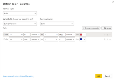
There on, use the following rules,
You need to select "Rules" as your Format Style, and in the the field column, select the "Measure" or the Aggregate Column value (in my case, it is Sum of Revenue) that you are using on your Y-Axis.
Now, create the rules as you would like to see the colors (I copied the colors from your chart and made the rule accordingly. You may copy the rules as I applied above to get the desired result)
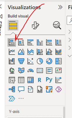
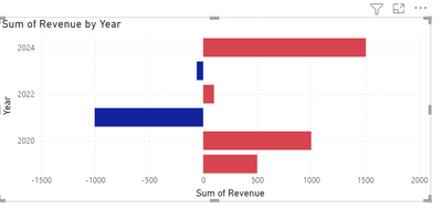
As for rotating it 90 degrees, do you mean to say changing the Chart's direction to horizontal bars? You can easily do it by changing the chart type to Stacked Bar Chart. Click on this chart as depicted in the image below,
You will get a result similar to this,
- Mark as New
- Bookmark
- Subscribe
- Mute
- Subscribe to RSS Feed
- Permalink
- Report Inappropriate Content
Thank you. Very much sppreciate your response.
- Mark as New
- Bookmark
- Subscribe
- Mute
- Subscribe to RSS Feed
- Permalink
- Report Inappropriate Content
Click on the Chart, go to Format your Visual in the Visualizations pane. Search for "Columns" attribute and then click on "fx" to apply conditional formatting in your Chart.
There on, use the following rules,
You need to select "Rules" as your Format Style, and in the the field column, select the "Measure" or the Aggregate Column value (in my case, it is Sum of Revenue) that you are using on your Y-Axis.
Now, create the rules as you would like to see the colors (I copied the colors from your chart and made the rule accordingly. You may copy the rules as I applied above to get the desired result)
As for rotating it 90 degrees, do you mean to say changing the Chart's direction to horizontal bars? You can easily do it by changing the chart type to Stacked Bar Chart. Click on this chart as depicted in the image below,
You will get a result similar to this,
- Mark as New
- Bookmark
- Subscribe
- Mute
- Subscribe to RSS Feed
- Permalink
- Report Inappropriate Content
Hi ,
Is there a way to compare with dynamic value ?
For example I want to compare the average sales vs total average sales
Helpful resources

Power BI Monthly Update - November 2025
Check out the November 2025 Power BI update to learn about new features.

Fabric Data Days
Advance your Data & AI career with 50 days of live learning, contests, hands-on challenges, study groups & certifications and more!


