FabCon is coming to Atlanta
Join us at FabCon Atlanta from March 16 - 20, 2026, for the ultimate Fabric, Power BI, AI and SQL community-led event. Save $200 with code FABCOMM.
Register now!- Power BI forums
- Get Help with Power BI
- Desktop
- Service
- Report Server
- Power Query
- Mobile Apps
- Developer
- DAX Commands and Tips
- Custom Visuals Development Discussion
- Health and Life Sciences
- Power BI Spanish forums
- Translated Spanish Desktop
- Training and Consulting
- Instructor Led Training
- Dashboard in a Day for Women, by Women
- Galleries
- Data Stories Gallery
- Themes Gallery
- Contests Gallery
- QuickViz Gallery
- Quick Measures Gallery
- Visual Calculations Gallery
- Notebook Gallery
- Translytical Task Flow Gallery
- TMDL Gallery
- R Script Showcase
- Webinars and Video Gallery
- Ideas
- Custom Visuals Ideas (read-only)
- Issues
- Issues
- Events
- Upcoming Events
The Power BI Data Visualization World Championships is back! Get ahead of the game and start preparing now! Learn more
- Power BI forums
- Forums
- Get Help with Power BI
- Desktop
- How to combine 3 chart into 1 ?
- Subscribe to RSS Feed
- Mark Topic as New
- Mark Topic as Read
- Float this Topic for Current User
- Bookmark
- Subscribe
- Printer Friendly Page
- Mark as New
- Bookmark
- Subscribe
- Mute
- Subscribe to RSS Feed
- Permalink
- Report Inappropriate Content
How to combine 3 chart into 1 ?
Hi All
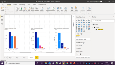
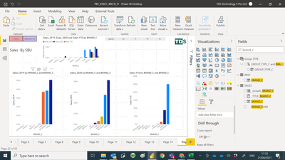
I have 3 chart , the purpose of the 3 chart , it allow me to know the trend sales by brand. For example YTD the rank no 1 brand is Beckhoff , and during 2020 and 2019 Beckhoff sales is rank number 2.
Now i like to know how to plot this chart in one chart. Reasons is more easy to create. Since 3 in 1.
Below link is my PBI file :-
https://www.dropbox.com/s/wemhzeuqlcreymu/PBT_V2021_398_%20TI_SI_SAMPLE.pbix?dl=0
Paul
- Mark as New
- Bookmark
- Subscribe
- Mute
- Subscribe to RSS Feed
- Permalink
- Report Inappropriate Content
Hi @admin11 ,
The file was deleted. You may consider to create 3 measures for 2019, 2020, YTD values. Put the measures in Values and use BRAND_C as Axis.
Best Regards,
Jay
- Mark as New
- Bookmark
- Subscribe
- Mute
- Subscribe to RSS Feed
- Permalink
- Report Inappropriate Content
@Anonymous
will you be able to share with me it is possible to do it ?
- Mark as New
- Bookmark
- Subscribe
- Mute
- Subscribe to RSS Feed
- Permalink
- Report Inappropriate Content
@Anonymous
Thank you for sharing .
I have try the top chart base on your advise. i still cannot get it .
My PBI file :-
https://www.dropbox.com/s/5buf2tq896soh5e/PBT_V2021_400%20SI_TI.pbix?dl=0
- Mark as New
- Bookmark
- Subscribe
- Mute
- Subscribe to RSS Feed
- Permalink
- Report Inappropriate Content
Hi @admin11 -
Building on what @DouweMeer said, you can also try these. In both cases you would use [SALES_] as the value, not the separate measures you have for each year:
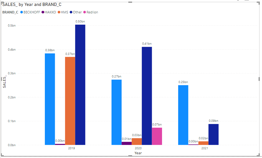
Clustered Column chart with Axis = Year and Legend = BRAND_C
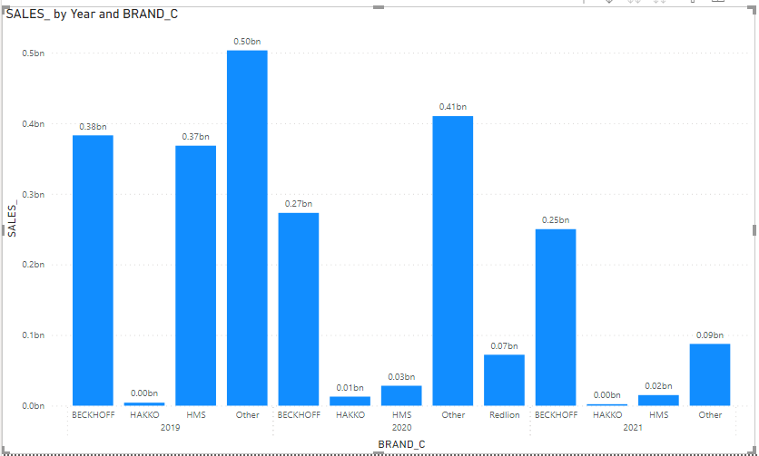
Clustered Column Chart with Year and BRAND_C as 'hierarchy" axes (no legend)
Hope this helps
David
- Mark as New
- Bookmark
- Subscribe
- Mute
- Subscribe to RSS Feed
- Permalink
- Report Inappropriate Content
Noticed it wasn't solved yet. He needs to have to sort on the legend behave differently. Now, I don't know whether it works dynamically, but perhaps use the 'sort by column' function to make the legend sort different than alphabetically. You could perhaps create a sort per context by pre-calculating the results in a custom column and make it work by that.
Doubt the functionality though when it can't be done dynamically as you would need different figures through the years if they are not consistent.
- Mark as New
- Bookmark
- Subscribe
- Mute
- Subscribe to RSS Feed
- Permalink
- Report Inappropriate Content
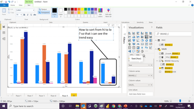
Your proposal is great , but i need to sort from high sales on the left . if you notice from the image i posted when i first post this , all the 3 chart are sort from high to low. so very easy for me to notice that brand the sales drop from top 1 to 2.
- Mark as New
- Bookmark
- Subscribe
- Mute
- Subscribe to RSS Feed
- Permalink
- Report Inappropriate Content
Theoretically you could do a line chart with the years on the x-axis and the brand in the legend as well. But those are not columns :). Lines would be good if you have multiple year.
Your choice :). But you don't have to follow thesse of course.
- Mark as New
- Bookmark
- Subscribe
- Mute
- Subscribe to RSS Feed
- Permalink
- Report Inappropriate Content
- Mark as New
- Bookmark
- Subscribe
- Mute
- Subscribe to RSS Feed
- Permalink
- Report Inappropriate Content
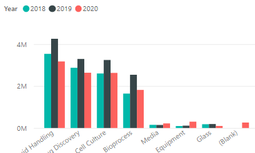
Like so?
Just ditch the year in the measure I guess and then use the clustered column chart.
Haven't checked on your pbi file as I don't have access to dropbox here :).
Helpful resources

Power BI Dataviz World Championships
The Power BI Data Visualization World Championships is back! Get ahead of the game and start preparing now!

Power BI Monthly Update - November 2025
Check out the November 2025 Power BI update to learn about new features.

| User | Count |
|---|---|
| 59 | |
| 46 | |
| 42 | |
| 23 | |
| 18 |
| User | Count |
|---|---|
| 193 | |
| 123 | |
| 99 | |
| 67 | |
| 49 |
