Join us at the 2025 Microsoft Fabric Community Conference
March 31 - April 2, 2025, in Las Vegas, Nevada. Use code MSCUST for a $150 discount! Early bird discount ends December 31.
Register Now- Power BI forums
- Get Help with Power BI
- Desktop
- Service
- Report Server
- Power Query
- Mobile Apps
- Developer
- DAX Commands and Tips
- Custom Visuals Development Discussion
- Health and Life Sciences
- Power BI Spanish forums
- Translated Spanish Desktop
- Training and Consulting
- Instructor Led Training
- Dashboard in a Day for Women, by Women
- Galleries
- Community Connections & How-To Videos
- COVID-19 Data Stories Gallery
- Themes Gallery
- Data Stories Gallery
- R Script Showcase
- Webinars and Video Gallery
- Quick Measures Gallery
- 2021 MSBizAppsSummit Gallery
- 2020 MSBizAppsSummit Gallery
- 2019 MSBizAppsSummit Gallery
- Events
- Ideas
- Custom Visuals Ideas
- Issues
- Issues
- Events
- Upcoming Events
Be one of the first to start using Fabric Databases. View on-demand sessions with database experts and the Microsoft product team to learn just how easy it is to get started. Watch now
- Power BI forums
- Forums
- Get Help with Power BI
- Desktop
- Re: How to change the category width of the Y-Axis...
- Subscribe to RSS Feed
- Mark Topic as New
- Mark Topic as Read
- Float this Topic for Current User
- Bookmark
- Subscribe
- Printer Friendly Page
- Mark as New
- Bookmark
- Subscribe
- Mute
- Subscribe to RSS Feed
- Permalink
- Report Inappropriate Content
How to change the category width of the Y-Axis to show a whole category name?
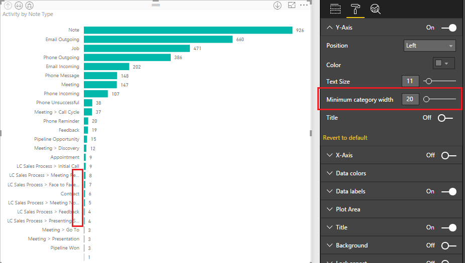
As you can see, the bar chart cannot show the whole long category names, and the Minimum category width option works on height instead of width (a bug?)
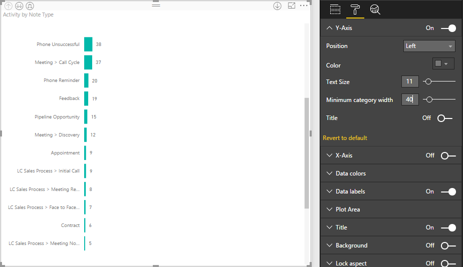
After change Minimum category width from 20 to 40:
Is it possible to change the category width of the Y-Axis to show a whole category name?
Thanks.
- Mark as New
- Bookmark
- Subscribe
- Mute
- Subscribe to RSS Feed
- Permalink
- Report Inappropriate Content
There is now a "Maximum Size" slider which changes the amount of space available for Y Axis labels (using version 2.63 here)
- Mark as New
- Bookmark
- Subscribe
- Mute
- Subscribe to RSS Feed
- Permalink
- Report Inappropriate Content
- Mark as New
- Bookmark
- Subscribe
- Mute
- Subscribe to RSS Feed
- Permalink
- Report Inappropriate Content
I wish this could be done with all the visuals.. It is an important feature.
- Mark as New
- Bookmark
- Subscribe
- Mute
- Subscribe to RSS Feed
- Permalink
- Report Inappropriate Content
Hi @j_w,
Minimum category width means the midth od a category. For the "Note" category(shown in first in your screenshot), change value 20 to 40. the height of a bar is bigger, so there is a slicer button in the screenshot. In same size screen of repot, it displays less categories.
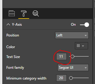
For your requirement, you can set the text size smaller, it will shown more long cagegory name.
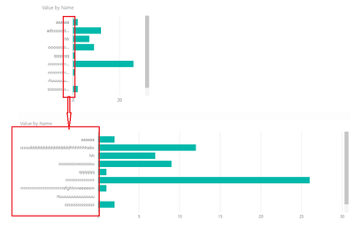
Beside, you can all drag the report width size, it can display totally. Please see the following screenshot, the first is my report by defult, the second one shows the total name after I drag.
Please feel free to ask if you have any other issue.
Best Regards,
Angelia
- Mark as New
- Bookmark
- Subscribe
- Mute
- Subscribe to RSS Feed
- Permalink
- Report Inappropriate Content
Thanks for your suggestions, but my report is full of visuals now, so there is little space to drag the bar visual larger.
And the Text size is already small enough, making it smaller will bring negative user experience.
It would be better to be able to set the Text width in Format tab 🙂
- Mark as New
- Bookmark
- Subscribe
- Mute
- Subscribe to RSS Feed
- Permalink
- Report Inappropriate Content
Hi @j_w,
I really understand you. But now it hard to meet your requirement. Thanks for your supporting the Power BI product.
Best Regards,
Angelia
- Mark as New
- Bookmark
- Subscribe
- Mute
- Subscribe to RSS Feed
- Permalink
- Report Inappropriate Content
This really needs to be a feature. Tableau has the ability to drag axis title width separately from the whole visualization. I have this same problem all the time, and even if I extend the graph the whole width of the report, the names don't all show, and I'm wasting all this space on really long bars. If you can't add the feature to adjust title width separately, then can you at least enable text wrapping for titles that are too long?
Helpful resources

Join us at the Microsoft Fabric Community Conference
March 31 - April 2, 2025, in Las Vegas, Nevada. Use code MSCUST for a $150 discount!

We want your feedback!
Your insights matter. That’s why we created a quick survey to learn about your experience finding answers to technical questions.

Microsoft Fabric Community Conference 2025
Arun Ulag shares exciting details about the Microsoft Fabric Conference 2025, which will be held in Las Vegas, NV.

| User | Count |
|---|---|
| 123 | |
| 85 | |
| 85 | |
| 70 | |
| 51 |
| User | Count |
|---|---|
| 205 | |
| 157 | |
| 97 | |
| 79 | |
| 69 |


