Fabric Data Days starts November 4th!
Advance your Data & AI career with 50 days of live learning, dataviz contests, hands-on challenges, study groups & certifications and more!
Get registered- Power BI forums
- Get Help with Power BI
- Desktop
- Service
- Report Server
- Power Query
- Mobile Apps
- Developer
- DAX Commands and Tips
- Custom Visuals Development Discussion
- Health and Life Sciences
- Power BI Spanish forums
- Translated Spanish Desktop
- Training and Consulting
- Instructor Led Training
- Dashboard in a Day for Women, by Women
- Galleries
- Data Stories Gallery
- Themes Gallery
- Contests Gallery
- QuickViz Gallery
- Quick Measures Gallery
- Visual Calculations Gallery
- Notebook Gallery
- Translytical Task Flow Gallery
- TMDL Gallery
- R Script Showcase
- Webinars and Video Gallery
- Ideas
- Custom Visuals Ideas (read-only)
- Issues
- Issues
- Events
- Upcoming Events
Get Fabric Certified for FREE during Fabric Data Days. Don't miss your chance! Request now
- Power BI forums
- Forums
- Get Help with Power BI
- Desktop
- Re: How to change between pie-charts with the chan...
- Subscribe to RSS Feed
- Mark Topic as New
- Mark Topic as Read
- Float this Topic for Current User
- Bookmark
- Subscribe
- Printer Friendly Page
- Mark as New
- Bookmark
- Subscribe
- Mute
- Subscribe to RSS Feed
- Permalink
- Report Inappropriate Content
How to change between pie-charts with the change in user selection
I have a dataset like this,
| Emp Code | Name | Competency | Practice |
| 1 | Matt | Data | AI |
| 2 | Avery | Data | AI |
| 3 | Aryub | Data | Analytics |
| 4 | Jacob | Cloud | AWS |
| 5 | Zara | Data | Engineering |
| 6 | Ali | Cloud | DevOps |
| 7 | John | Cloud | DevOps |
| 8 | Alisha | Marketing | Services |
| 9 | Novak | Marketing | Advertisement |
| 10 | Alex | HR | HRBP |
| 11 | Emma | HR | Recruitment |
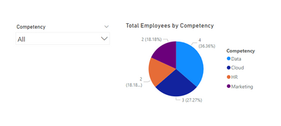
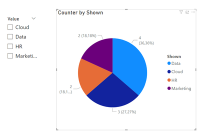
I have one slicer which allows the user to select between different competencies. I also have a pie-chart that displays Total Employees per Competency., as shown in the following image,
What I need is,
- If the user has not selected any competency, Pie-chart should display Total Employees per Competency
- If the user has selected any competency, Pie-chart should display Total Employees per Practice
Is it possible to do in the Power BI?
One solution I know of is to use buttons and bookmarks to navigate between different bookmarks, with each bookmark having a pie-chart against each competency selection. But I can't use this approach because of two reasons, 1) I can't place Buttons in a drop down slicer, which is a requirement for me. 2) Bookmarks can't be dynamic (so for example, if a new Competency comes in the data later on, that wil not be added automatically)
Can anyone help in this? Thanks
If you would like to download the Example Power BI Workbook, you may do so here: https://drive.google.com/file/d/1DnTGDlaiTqL5GsuAw6DHko0GqHCS3d3h/view?usp=sharing
Solved! Go to Solution.
- Mark as New
- Bookmark
- Subscribe
- Mute
- Subscribe to RSS Feed
- Permalink
- Report Inappropriate Content
Hi @HassanAshas,
Probably an easier and more elegant solution exists, but that's not my way so I found the one that follows below.
Step 1.
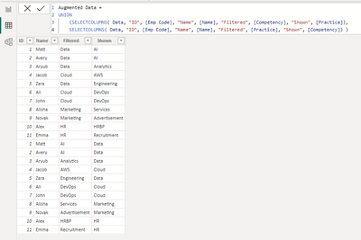
We create 2 additional tables.
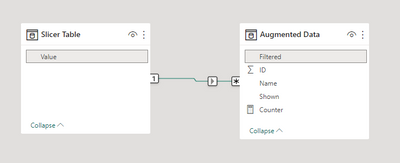
The first one ('Slicer Table') will be used in a slicer, the second one ('Augmented data') will be our working table from now on.
Step 2.
We create a link between them.
Step 3.
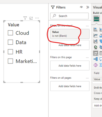
We add a slicer and filter out BLANK in it.
Step 4.
We create a measure like this...
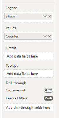
...and add it to the Values field of our Pie Chart where the Legend field is populated with 'Augmented data' [Shown].
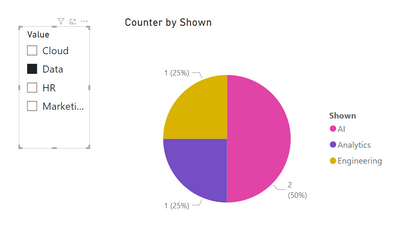
And it works:
Here's the file with my experiments - https://www.dropbox.com/s/x3svyohot0ympza/Pie%20Chart%20-%202%20Columns.pbix?dl=0
Let me know if it works for you or should you need some additional clarifications.
- Mark as New
- Bookmark
- Subscribe
- Mute
- Subscribe to RSS Feed
- Permalink
- Report Inappropriate Content
Hi again,
The idea that there must be a more elegant solution to your problem (comparing to x2 of the fact table) was preying on my mind for some time. Then I gave up, but recently, while solving another problem, I've come up with another solution. I am not quite sure that it will work perfectly with big data - up to you to try.
The 1st step is to create a table with the unique values from the columns [Competency] and [Practice]:
Content =
UNION (
    SELECTCOLUMNS ( VALUES ( Data[Competency] ), "Value", [Competency] ),
    SELECTCOLUMNS ( VALUES ( Data[Practice] ), "Value", [Practice] ) )
The 2nd step is to create a measure:
CountOfItems =
VAR CurrentValue = MIN ( 'Content'[Value] )
RETURN IF ( ISFILTERED ( Data[Competency] ),
            COUNTX ( FILTER ( Data, Data[Practice] = CurrentValue ), [Name] ),
            COUNTX ( FILTER ( Data, Data[Competency] = CurrentValue ), [Name] ) )
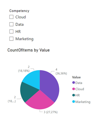
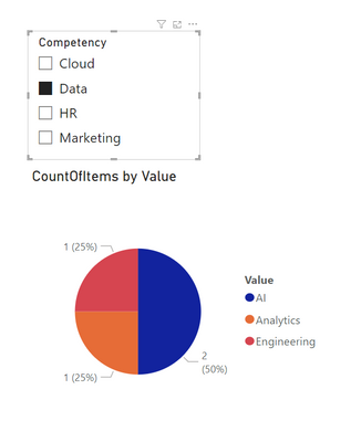
The 3rd, and the final, step is to add those newly created items to the pie chart and enjoy the result:
Here's my updated PBIX - https://www.dropbox.com/s/tvkvgide1g07fax/Pie%20Chart%20-%202%20Columns%20-%20v2.pbix?dl=0
Cheers!
Best Regards,
Alexander
- Mark as New
- Bookmark
- Subscribe
- Mute
- Subscribe to RSS Feed
- Permalink
- Report Inappropriate Content
Hi @HassanAshas,
Probably an easier and more elegant solution exists, but that's not my way so I found the one that follows below.
Step 1.
We create 2 additional tables.
The first one ('Slicer Table') will be used in a slicer, the second one ('Augmented data') will be our working table from now on.
Step 2.
We create a link between them.
Step 3.
We add a slicer and filter out BLANK in it.
Step 4.
We create a measure like this...
...and add it to the Values field of our Pie Chart where the Legend field is populated with 'Augmented data' [Shown].
And it works:
Here's the file with my experiments - https://www.dropbox.com/s/x3svyohot0ympza/Pie%20Chart%20-%202%20Columns.pbix?dl=0
Let me know if it works for you or should you need some additional clarifications.
- Mark as New
- Bookmark
- Subscribe
- Mute
- Subscribe to RSS Feed
- Permalink
- Report Inappropriate Content
Haha, this definitely works but surely not something I can try with a much larger dataset (which is what's the case for me :P)
It would be very troublesome to duplicate the whole of fact table xD, and I wonder whether it will work for three or four levels? Thinking about it. (In my original problem, I don't have only "Competency" and "Practice". I have two levels above it too and one level below as well 😛 so basically its like Company -> Competency -> Practice -> Sub-Practices)
But honestly, I have tried all I could and only found that it is not possible to implement this (as of now at least).
I greatly appreciate you responding and putting so much time in trying to solve this, by the way. Thank you so much! This is the closest solution we can get to this problem, perhaps.
- Mark as New
- Bookmark
- Subscribe
- Mute
- Subscribe to RSS Feed
- Permalink
- Report Inappropriate Content
Hi again,
The idea that there must be a more elegant solution to your problem (comparing to x2 of the fact table) was preying on my mind for some time. Then I gave up, but recently, while solving another problem, I've come up with another solution. I am not quite sure that it will work perfectly with big data - up to you to try.
The 1st step is to create a table with the unique values from the columns [Competency] and [Practice]:
Content =
UNION (
    SELECTCOLUMNS ( VALUES ( Data[Competency] ), "Value", [Competency] ),
    SELECTCOLUMNS ( VALUES ( Data[Practice] ), "Value", [Practice] ) )
The 2nd step is to create a measure:
CountOfItems =
VAR CurrentValue = MIN ( 'Content'[Value] )
RETURN IF ( ISFILTERED ( Data[Competency] ),
            COUNTX ( FILTER ( Data, Data[Practice] = CurrentValue ), [Name] ),
            COUNTX ( FILTER ( Data, Data[Competency] = CurrentValue ), [Name] ) )
The 3rd, and the final, step is to add those newly created items to the pie chart and enjoy the result:
Here's my updated PBIX - https://www.dropbox.com/s/tvkvgide1g07fax/Pie%20Chart%20-%202%20Columns%20-%20v2.pbix?dl=0
Cheers!
Best Regards,
Alexander
Helpful resources

Fabric Data Days
Advance your Data & AI career with 50 days of live learning, contests, hands-on challenges, study groups & certifications and more!

Power BI Monthly Update - October 2025
Check out the October 2025 Power BI update to learn about new features.

