Join us at the 2025 Microsoft Fabric Community Conference
March 31 - April 2, 2025, in Las Vegas, Nevada. Use code MSCUST for a $150 discount! Early bird discount ends December 31.
Register Now- Power BI forums
- Get Help with Power BI
- Desktop
- Service
- Report Server
- Power Query
- Mobile Apps
- Developer
- DAX Commands and Tips
- Custom Visuals Development Discussion
- Health and Life Sciences
- Power BI Spanish forums
- Translated Spanish Desktop
- Training and Consulting
- Instructor Led Training
- Dashboard in a Day for Women, by Women
- Galleries
- Community Connections & How-To Videos
- COVID-19 Data Stories Gallery
- Themes Gallery
- Data Stories Gallery
- R Script Showcase
- Webinars and Video Gallery
- Quick Measures Gallery
- 2021 MSBizAppsSummit Gallery
- 2020 MSBizAppsSummit Gallery
- 2019 MSBizAppsSummit Gallery
- Events
- Ideas
- Custom Visuals Ideas
- Issues
- Issues
- Events
- Upcoming Events
Be one of the first to start using Fabric Databases. View on-demand sessions with database experts and the Microsoft product team to learn just how easy it is to get started. Watch now
- Power BI forums
- Forums
- Get Help with Power BI
- Desktop
- Re: How to apply conditional color formatting in l...
- Subscribe to RSS Feed
- Mark Topic as New
- Mark Topic as Read
- Float this Topic for Current User
- Bookmark
- Subscribe
- Printer Friendly Page
- Mark as New
- Bookmark
- Subscribe
- Mute
- Subscribe to RSS Feed
- Permalink
- Report Inappropriate Content
How to apply conditional color formatting in line chart based on fields from legend
Hi,
We have a "date","Product type" as slicers, also we have a linechart; in x axis we have "monthyear", y axis "budget" and legend as "Product type info.Here we have multiple product types are assigned to one group, so some of the data in slicer we have like Product B1,B2 and product D1,D2 like that . As per requirement when i place product type as legend in line chart below is the sample data looks like in line chart with legend.
I have tried to apply color condtional formatting based on legend like
If product A then line chart should show budget data as red color, if its multiple product types like Product B1 and B2 then line chart should show budget in blue color, if product type like Product C then line chart should show budget data as green color and finally if its multiple product types like Product D1 and D2 then line chart should show as Yellow color.
Here based on slicer selection data product type data will change. As line chart currently not supporting conditionl formatting, we are tried below methods to achive expected results but conditional color formatting is not working as expected.
1) Added line chart without legend as one visual and created separate barchart as custom legend for products A,B,C,D and used below measure for formating in custom legend and finally combined both charts as one visual to show as line chart display.
2) Added conditional formatting in bar chart as below and applied field value formatting by measure and later it converted to line chart
Measure=switch(true(),max(producttype)="A" || values(producttype)="A","red",
max(producttype)="B", || values(producttype)="B","blue",
max(producttype)="C",|| values(producttype)="C","green",
max(producttype)="D",|| values(producttype)="D","yellow",
"")
In above cases, child or multiple product types appear based on data so based on "slicer selection and also as per legend" all product types colors should change dynamically for budget data.
Please let me know your suggestions and possible solutions to achive the expected results for applying conditional color formatting in line chart based on fields from legend and also displaying legend in line chart.
Thanks for your help in advance.
Thank you,
Mahi
Solved! Go to Solution.
- Mark as New
- Bookmark
- Subscribe
- Mute
- Subscribe to RSS Feed
- Permalink
- Report Inappropriate Content
Hi, @Mahi1827
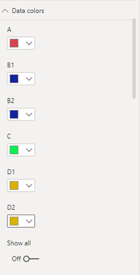
You could customize the data color in the data color property, and you can turn on the series label
Best Regards,
Community Support Team _ Zeon Zheng
If this post helps, then please consider Accept it as the solution to help the other members find it more quickly.
- Mark as New
- Bookmark
- Subscribe
- Mute
- Subscribe to RSS Feed
- Permalink
- Report Inappropriate Content
multiple lines = automatically means you need multiple independent columns or measures. They can then have their individual colors.
Helpful resources

Join us at the Microsoft Fabric Community Conference
March 31 - April 2, 2025, in Las Vegas, Nevada. Use code MSCUST for a $150 discount!

We want your feedback!
Your insights matter. That’s why we created a quick survey to learn about your experience finding answers to technical questions.

Microsoft Fabric Community Conference 2025
Arun Ulag shares exciting details about the Microsoft Fabric Conference 2025, which will be held in Las Vegas, NV.

| User | Count |
|---|---|
| 123 | |
| 86 | |
| 73 | |
| 57 | |
| 52 |
| User | Count |
|---|---|
| 197 | |
| 133 | |
| 107 | |
| 69 | |
| 65 |


