Party with Power BI’s own Guy in a Cube
Power BI is turning 10! Tune in for a special live episode on July 24 with behind-the-scenes stories, product evolution highlights, and a sneak peek at what’s in store for the future.
Save the date- Power BI forums
- Get Help with Power BI
- Desktop
- Service
- Report Server
- Power Query
- Mobile Apps
- Developer
- DAX Commands and Tips
- Custom Visuals Development Discussion
- Health and Life Sciences
- Power BI Spanish forums
- Translated Spanish Desktop
- Training and Consulting
- Instructor Led Training
- Dashboard in a Day for Women, by Women
- Galleries
- Data Stories Gallery
- Themes Gallery
- Contests Gallery
- Quick Measures Gallery
- Notebook Gallery
- Translytical Task Flow Gallery
- TMDL Gallery
- R Script Showcase
- Webinars and Video Gallery
- Ideas
- Custom Visuals Ideas (read-only)
- Issues
- Issues
- Events
- Upcoming Events
Enhance your career with this limited time 50% discount on Fabric and Power BI exams. Ends August 31st. Request your voucher.
- Power BI forums
- Forums
- Get Help with Power BI
- Desktop
- How to add a logarithmic trend line
- Subscribe to RSS Feed
- Mark Topic as New
- Mark Topic as Read
- Float this Topic for Current User
- Bookmark
- Subscribe
- Printer Friendly Page
- Mark as New
- Bookmark
- Subscribe
- Mute
- Subscribe to RSS Feed
- Permalink
- Report Inappropriate Content
How to add a logarithmic trend line
I am trying to add a logarithmic trend line like the one available in Excel:
I have seen that Power BI only has the option of linear trend lines. Could someone tell me how to do it? Thank you
Solved! Go to Solution.
- Mark as New
- Bookmark
- Subscribe
- Mute
- Subscribe to RSS Feed
- Permalink
- Report Inappropriate Content
@Anonymous
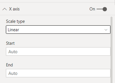
1. in this case you would need to change one of the axises to log instead of linear. You can change the axis as below
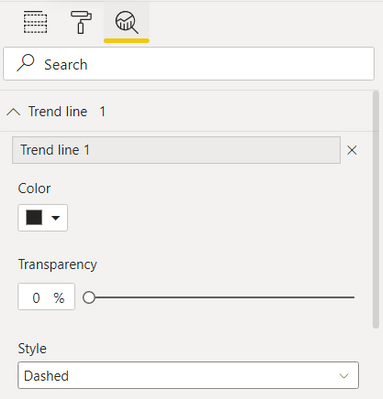
2. you can then add a trend line in the analytics tab. Your trendline will show data as per the axis type you have selected in the first step like log or linear.
I hope it resolve your issue. thanks
Did I answer your question? Mark my post as a solution!
Appreciate your Kudos
Proud to be a Super User!
Follow me on linkedin
- Mark as New
- Bookmark
- Subscribe
- Mute
- Subscribe to RSS Feed
- Permalink
- Report Inappropriate Content
This is not a solution, this is a work-around. Rarely do business users like to see logarithmic axis in my experience. Curved line is obviously more intuitive. Add a total option to ribbon charts too.
- Mark as New
- Bookmark
- Subscribe
- Mute
- Subscribe to RSS Feed
- Permalink
- Report Inappropriate Content
@Anonymous
1. in this case you would need to change one of the axises to log instead of linear. You can change the axis as below
2. you can then add a trend line in the analytics tab. Your trendline will show data as per the axis type you have selected in the first step like log or linear.
I hope it resolve your issue. thanks
Did I answer your question? Mark my post as a solution!
Appreciate your Kudos
Proud to be a Super User!
Follow me on linkedin
Helpful resources
| User | Count |
|---|---|
| 76 | |
| 74 | |
| 45 | |
| 31 | |
| 27 |
| User | Count |
|---|---|
| 99 | |
| 91 | |
| 51 | |
| 48 | |
| 47 |


