FabCon is coming to Atlanta
Join us at FabCon Atlanta from March 16 - 20, 2026, for the ultimate Fabric, Power BI, AI and SQL community-led event. Save $200 with code FABCOMM.
Register now!- Power BI forums
- Get Help with Power BI
- Desktop
- Service
- Report Server
- Power Query
- Mobile Apps
- Developer
- DAX Commands and Tips
- Custom Visuals Development Discussion
- Health and Life Sciences
- Power BI Spanish forums
- Translated Spanish Desktop
- Training and Consulting
- Instructor Led Training
- Dashboard in a Day for Women, by Women
- Galleries
- Data Stories Gallery
- Themes Gallery
- Contests Gallery
- QuickViz Gallery
- Quick Measures Gallery
- Visual Calculations Gallery
- Notebook Gallery
- Translytical Task Flow Gallery
- TMDL Gallery
- R Script Showcase
- Webinars and Video Gallery
- Ideas
- Custom Visuals Ideas (read-only)
- Issues
- Issues
- Events
- Upcoming Events
The Power BI Data Visualization World Championships is back! Get ahead of the game and start preparing now! Learn more
- Power BI forums
- Forums
- Get Help with Power BI
- Desktop
- How to Sort By Rank on PBI Visuals
- Subscribe to RSS Feed
- Mark Topic as New
- Mark Topic as Read
- Float this Topic for Current User
- Bookmark
- Subscribe
- Printer Friendly Page
- Mark as New
- Bookmark
- Subscribe
- Mute
- Subscribe to RSS Feed
- Permalink
- Report Inappropriate Content
How to Sort By Rank on PBI Visuals
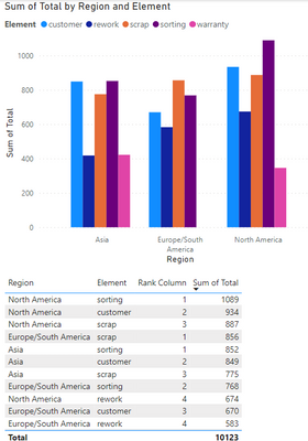
I am able to achieve sort on Table/Grid visual
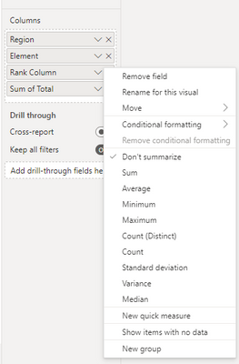
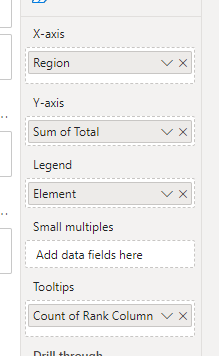
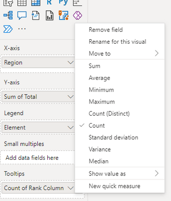
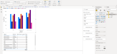
When i switch to Bar/Line chart and place rank in "Tooltip" section - it converts the "Rank" column as "Count of Rank" or not allowing me to remove "Do not summarize" for this scenario - why ?
Any reason to fix this ? Please advise.
Example for Table :
Example : for Visuals
- Mark as New
- Bookmark
- Subscribe
- Mute
- Subscribe to RSS Feed
- Permalink
- Report Inappropriate Content
Hi @Anonymous ,
The Bar/Line chart visual is used for displaying summarize data. You can image the Bar/Line chart Axis property is the column group of the matrix, Legend property is the Row group of the matrix. If there were more than one record for the same intersection of the column and row groups, we need to aggregate the values. So there are many aggregate functions for summarize the data instead of "Do not Summarize".
The "Default Summarization: Do Not Summarize" option apply to the field itself. Once we place the filed into visuals, it will depend on the visual design to use this. In chart visual, "Do Not Summarize" is not available but in a table visual, it can support.
In your scenario, if your sample data contain one record for each Axis values, use the SUM()/MAX()/MIN() function will also display the raw data. But if there are duplicate record for each Axis, SUM will aggregate the values.
Best Regards,
Jianbo Li
If this post helps, then please consider Accept it as the solution to help the other members find it more quickly.
- Mark as New
- Bookmark
- Subscribe
- Mute
- Subscribe to RSS Feed
- Permalink
- Report Inappropriate Content
Hi @Anonymous ,
According to my knowledge, Table visual and Bar/Line chart are not the same. Since you have to choose the right aggregation for your values when you use Bar/Line chart, in other words your data can't be displayed in this way by don't summarize, so when you add the Rank field to tooltips, you have to choose the right aggregation for it too, you can consider aggregation like sum\max or recreate a measure for it.
Best Regards,
Jianbo Li
If this post helps, then please consider Accept it as the solution to help the other members find it more quickly.
- Mark as New
- Bookmark
- Subscribe
- Mute
- Subscribe to RSS Feed
- Permalink
- Report Inappropriate Content
So, is it safe to say - it's a limitation in Power BI to allow "Do not summarize" on columns in grid vs not possible with visuals ?
- Mark as New
- Bookmark
- Subscribe
- Mute
- Subscribe to RSS Feed
- Permalink
- Report Inappropriate Content
Apologies - by mistake clicked "Accept as solution"
I have tried with both String & Number - same issues exist for both data type
- Mark as New
- Bookmark
- Subscribe
- Mute
- Subscribe to RSS Feed
- Permalink
- Report Inappropriate Content
Hey @Anonymous ,
which format does the column have?
This usually happens when the values are saved as string and not as number.
If you need any help please let me know.
If I answered your question I would be happy if you could mark my post as a solution ✔️ and give it a thumbs up 👍
Best regards
Denis
Blog: WhatTheFact.bi
Follow me: twitter.com/DenSelimovic
Helpful resources

Power BI Monthly Update - November 2025
Check out the November 2025 Power BI update to learn about new features.

Fabric Data Days
Advance your Data & AI career with 50 days of live learning, contests, hands-on challenges, study groups & certifications and more!

| User | Count |
|---|---|
| 58 | |
| 45 | |
| 42 | |
| 20 | |
| 18 |
