Join us at FabCon Vienna from September 15-18, 2025
The ultimate Fabric, Power BI, SQL, and AI community-led learning event. Save €200 with code FABCOMM.
Get registered- Power BI forums
- Get Help with Power BI
- Desktop
- Service
- Report Server
- Power Query
- Mobile Apps
- Developer
- DAX Commands and Tips
- Custom Visuals Development Discussion
- Health and Life Sciences
- Power BI Spanish forums
- Translated Spanish Desktop
- Training and Consulting
- Instructor Led Training
- Dashboard in a Day for Women, by Women
- Galleries
- Data Stories Gallery
- Themes Gallery
- Contests Gallery
- Quick Measures Gallery
- Notebook Gallery
- Translytical Task Flow Gallery
- TMDL Gallery
- R Script Showcase
- Webinars and Video Gallery
- Ideas
- Custom Visuals Ideas (read-only)
- Issues
- Issues
- Events
- Upcoming Events
Enhance your career with this limited time 50% discount on Fabric and Power BI exams. Ends September 15. Request your voucher.
- Power BI forums
- Forums
- Get Help with Power BI
- Desktop
- How to Set a KPI on a Calculated Table
- Subscribe to RSS Feed
- Mark Topic as New
- Mark Topic as Read
- Float this Topic for Current User
- Bookmark
- Subscribe
- Printer Friendly Page
- Mark as New
- Bookmark
- Subscribe
- Mute
- Subscribe to RSS Feed
- Permalink
- Report Inappropriate Content
How to Set a KPI on a Calculated Table
Hi,
I got the following data:
(Column 4, And Column 5 are Calcualted Columns)
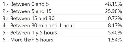
So, in order to sumarize it , I create a table as following

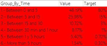
I wanted to create a table like the following, by now I don't know how to get this done....
My Final Goal is to get a table/report where if the value has met the target, then colour the raw on green else color a shape on green, else if the value has not met the target, then colour the raw on red or else color a shape on red
Does anyone knows how to set it?
- Mark as New
- Bookmark
- Subscribe
- Mute
- Subscribe to RSS Feed
- Permalink
- Report Inappropriate Content
HI @Shionfox,
I'd like to suggest you create a calculated column with unichar function to display kpi icon in visual.
Reference link:
DAX UNICHAR Function in Power BI
For formatting backcolor based on value, you can take a look at conditional formatting feature.
Conditional formatting in tables
Regards,
Xiaoxin Sheng
Helpful resources
| User | Count |
|---|---|
| 58 | |
| 56 | |
| 55 | |
| 50 | |
| 32 |
| User | Count |
|---|---|
| 172 | |
| 89 | |
| 70 | |
| 46 | |
| 45 |


