Join us at FabCon Vienna from September 15-18, 2025
The ultimate Fabric, Power BI, SQL, and AI community-led learning event. Save €200 with code FABCOMM.
Get registered- Power BI forums
- Get Help with Power BI
- Desktop
- Service
- Report Server
- Power Query
- Mobile Apps
- Developer
- DAX Commands and Tips
- Custom Visuals Development Discussion
- Health and Life Sciences
- Power BI Spanish forums
- Translated Spanish Desktop
- Training and Consulting
- Instructor Led Training
- Dashboard in a Day for Women, by Women
- Galleries
- Data Stories Gallery
- Themes Gallery
- Contests Gallery
- Quick Measures Gallery
- Notebook Gallery
- Translytical Task Flow Gallery
- TMDL Gallery
- R Script Showcase
- Webinars and Video Gallery
- Ideas
- Custom Visuals Ideas (read-only)
- Issues
- Issues
- Events
- Upcoming Events
Enhance your career with this limited time 50% discount on Fabric and Power BI exams. Ends September 15. Request your voucher.
- Power BI forums
- Forums
- Get Help with Power BI
- Desktop
- How to Plot Active Transactions by Month
- Subscribe to RSS Feed
- Mark Topic as New
- Mark Topic as Read
- Float this Topic for Current User
- Bookmark
- Subscribe
- Printer Friendly Page
- Mark as New
- Bookmark
- Subscribe
- Mute
- Subscribe to RSS Feed
- Permalink
- Report Inappropriate Content
How to Plot Active Transactions by Month
I am relatively new to Power BI and I've been searching for ways to solve this particular scenario.
Essentially I have transactions in a fact table that can span X month. For instance a transaction can start in March and complete in May. I have the start date/end date in my fact table and I am trying to plot by month the number of active transactions. As such, say the transaction started in March and completed May 15, it would be included as an active transaction in my plot for March, April and May. It seems simple enough, can't seem to figure out how to implement that in Power BI.
Any help is greatly appreciated.
Solved! Go to Solution.
- Mark as New
- Bookmark
- Subscribe
- Mute
- Subscribe to RSS Feed
- Permalink
- Report Inappropriate Content
Hi @Jeromec ,
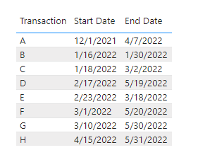
I have built a data sample for test.
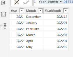
1. Firstly you need a new table with all year-month period between Start Date and End Date
Year Month =
DISTINCT (
    SELECTCOLUMNS (
        CALENDAR ( MIN ( 'Table'[Start Date] ), MAX ( 'Table'[End Date] ) ),
        "YearMonth",
            YEAR ( [Date] ) * 100
                + MONTH ( [Date] ),
        "Year", YEAR ( [Date] ),
        "Month", FORMAT ( [Date], "mmmm" )
    )
)
2. Create a count measure:
Count of each month =
CALCULATE (
    COUNTROWS ( 'Table' ),
    FILTER (
        'Table',
        YEAR ( [Start Date] ) * 100
            + MONTH ( [Start Date] )
            <= MAX ( 'Dates Table'[YearMonth] )
            && YEAR ( [End Date] ) * 100
                + MONTH ( [End Date] )
                >= MAX ( 'Dates Table'[YearMonth] )
    )
)
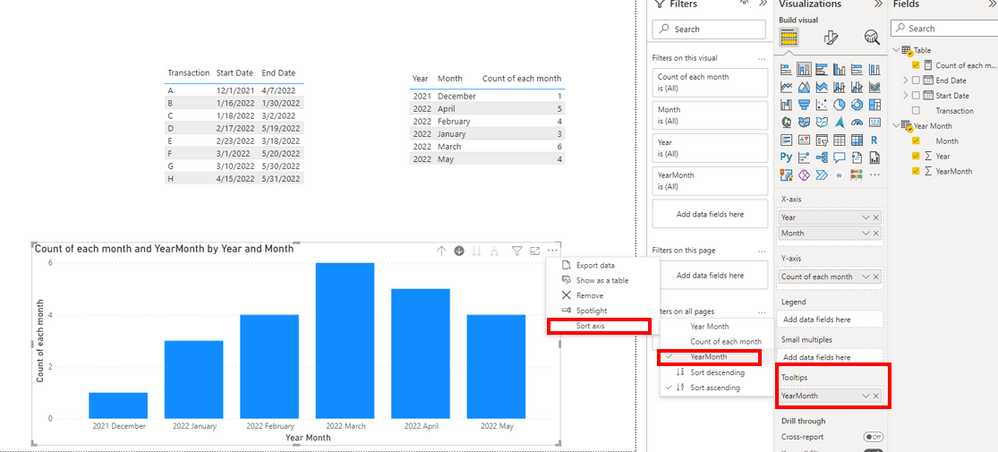
3. Create a Stacked column chart, and in order to get the correct sorting, please drag the YearMonth field to the Tooltips pane, below is the final output:
Or if you are still confused about it, please provide me with more details about your table and your problem or share me with your pbix file after removing sensitive data.
Refer to:
How to Get Your Question Answered Quickly - Microsoft Power BI Community
How to provide sample data in the Power BI Forum - Microsoft Power BI Community
Best Regards,
Eyelyn Qin
If this post helps, then please consider Accept it as the solution to help the other members find it more quickly.
- Mark as New
- Bookmark
- Subscribe
- Mute
- Subscribe to RSS Feed
- Permalink
- Report Inappropriate Content
Thank You Evelyn - Apologies about the delay, I got sidetracked with another issue as part of this project, now just getting back to the original issue. I will review and let you know once I've implemented it for my particular situation.
- Mark as New
- Bookmark
- Subscribe
- Mute
- Subscribe to RSS Feed
- Permalink
- Report Inappropriate Content
Hi,
Share data in a format that can be pasted in an MS Excel file.
Regards,
Ashish Mathur
http://www.ashishmathur.com
https://www.linkedin.com/in/excelenthusiasts/
- Mark as New
- Bookmark
- Subscribe
- Mute
- Subscribe to RSS Feed
- Permalink
- Report Inappropriate Content
Hi @Jeromec ,
I have built a data sample for test.
1. Firstly you need a new table with all year-month period between Start Date and End Date
Year Month =
DISTINCT (
    SELECTCOLUMNS (
        CALENDAR ( MIN ( 'Table'[Start Date] ), MAX ( 'Table'[End Date] ) ),
        "YearMonth",
            YEAR ( [Date] ) * 100
                + MONTH ( [Date] ),
        "Year", YEAR ( [Date] ),
        "Month", FORMAT ( [Date], "mmmm" )
    )
)
2. Create a count measure:
Count of each month =
CALCULATE (
    COUNTROWS ( 'Table' ),
    FILTER (
        'Table',
        YEAR ( [Start Date] ) * 100
            + MONTH ( [Start Date] )
            <= MAX ( 'Dates Table'[YearMonth] )
            && YEAR ( [End Date] ) * 100
                + MONTH ( [End Date] )
                >= MAX ( 'Dates Table'[YearMonth] )
    )
)
3. Create a Stacked column chart, and in order to get the correct sorting, please drag the YearMonth field to the Tooltips pane, below is the final output:
Or if you are still confused about it, please provide me with more details about your table and your problem or share me with your pbix file after removing sensitive data.
Refer to:
How to Get Your Question Answered Quickly - Microsoft Power BI Community
How to provide sample data in the Power BI Forum - Microsoft Power BI Community
Best Regards,
Eyelyn Qin
If this post helps, then please consider Accept it as the solution to help the other members find it more quickly.


