FabCon is coming to Atlanta
Join us at FabCon Atlanta from March 16 - 20, 2026, for the ultimate Fabric, Power BI, AI and SQL community-led event. Save $200 with code FABCOMM.
Register now!- Power BI forums
- Get Help with Power BI
- Desktop
- Service
- Report Server
- Power Query
- Mobile Apps
- Developer
- DAX Commands and Tips
- Custom Visuals Development Discussion
- Health and Life Sciences
- Power BI Spanish forums
- Translated Spanish Desktop
- Training and Consulting
- Instructor Led Training
- Dashboard in a Day for Women, by Women
- Galleries
- Data Stories Gallery
- Themes Gallery
- Contests Gallery
- QuickViz Gallery
- Quick Measures Gallery
- Visual Calculations Gallery
- Notebook Gallery
- Translytical Task Flow Gallery
- TMDL Gallery
- R Script Showcase
- Webinars and Video Gallery
- Ideas
- Custom Visuals Ideas (read-only)
- Issues
- Issues
- Events
- Upcoming Events
View all the Fabric Data Days sessions on demand. View schedule
- Power BI forums
- Forums
- Get Help with Power BI
- Desktop
- How to: Line and clustered column chart - From Exc...
- Subscribe to RSS Feed
- Mark Topic as New
- Mark Topic as Read
- Float this Topic for Current User
- Bookmark
- Subscribe
- Printer Friendly Page
- Mark as New
- Bookmark
- Subscribe
- Mute
- Subscribe to RSS Feed
- Permalink
- Report Inappropriate Content
How to: Line and clustered column chart - From Excel to BI
Hi datanauts,
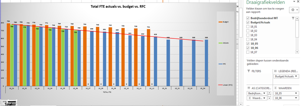
I'm trying to replicate the excel graph posted underneath in Power BI. It shows the actuals we have right now, the budget and the rolling forecast.
The data I have to reproduce this graph is as followed: 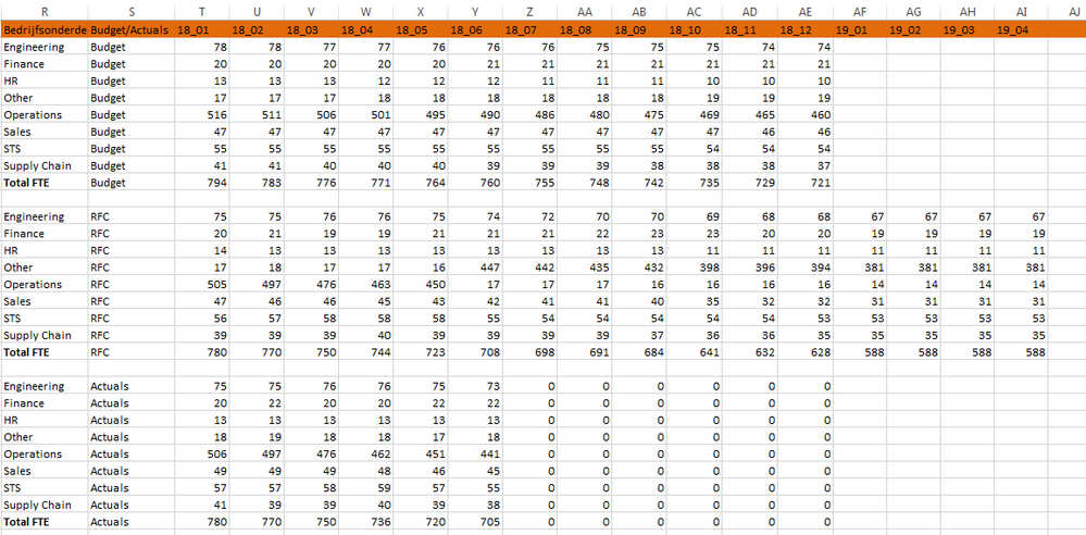
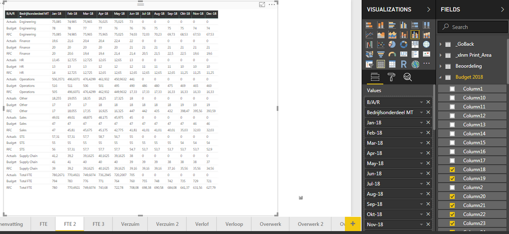
First thing I've tried was to build a matrix, showing the right numbers. However, it looks really messy:
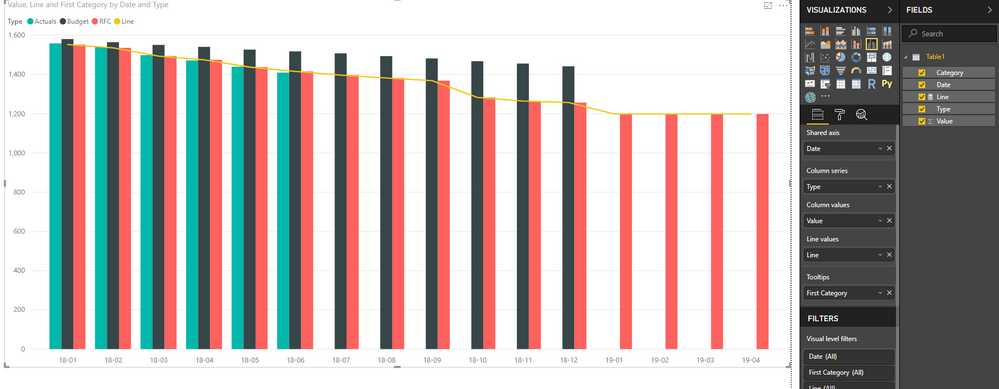
However, when I try to replicate the upmost picture in Power BI in a line and clustered column chart, I get stuck real quick:
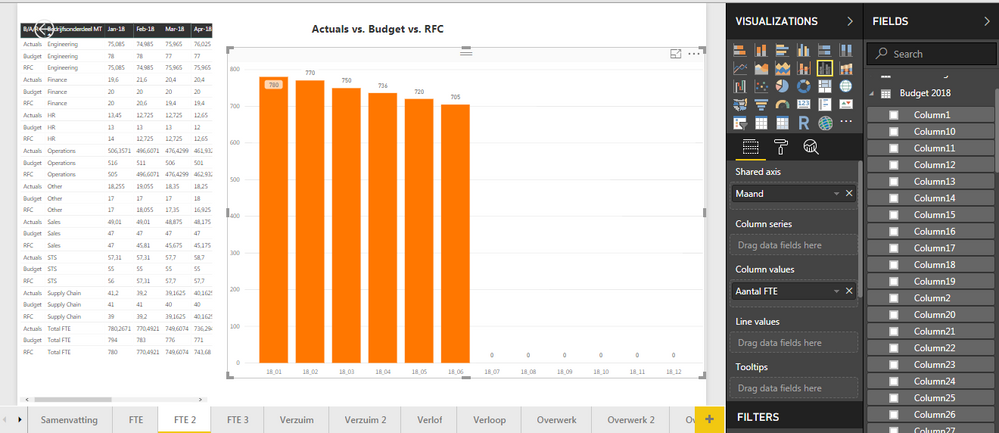
Putting the months (which I'm taking out of a different query than the data showed in the second picture) works out fine, just as well as putting in the actuals (different query as well). However, all the right data is already provided, but it feels like I just need to 'rearrange' it the right way, in order to be able to build the chart I'm looking for.
Any help?
Thanks in advance!
Solved! Go to Solution.
- Mark as New
- Bookmark
- Subscribe
- Mute
- Subscribe to RSS Feed
- Permalink
- Report Inappropriate Content
Hi @Stevenrizado,
Please refer to below sample file if it suitable for your requirement:
I apply unpivot column on date columns.
Unpivot Data Using Excel Power Query
Regards,
Xiaoxin Sheng
- Mark as New
- Bookmark
- Subscribe
- Mute
- Subscribe to RSS Feed
- Permalink
- Report Inappropriate Content
Hi @Stevenrizado,
Please refer to below sample file if it suitable for your requirement:
I apply unpivot column on date columns.
Unpivot Data Using Excel Power Query
Regards,
Xiaoxin Sheng
Helpful resources

Power BI Monthly Update - November 2025
Check out the November 2025 Power BI update to learn about new features.

Fabric Data Days
Advance your Data & AI career with 50 days of live learning, contests, hands-on challenges, study groups & certifications and more!

