Get Fabric certified for FREE!
Don't miss your chance to take the Fabric Data Engineer (DP-600) exam for FREE! Find out how by attending the DP-600 session on April 23rd (pacific time), live or on-demand.
Learn more- Power BI forums
- Get Help with Power BI
- Desktop
- Service
- Report Server
- Power Query
- Mobile Apps
- Developer
- DAX Commands and Tips
- Custom Visuals Development Discussion
- Health and Life Sciences
- Power BI Spanish forums
- Translated Spanish Desktop
- Training and Consulting
- Instructor Led Training
- Dashboard in a Day for Women, by Women
- Galleries
- Data Stories Gallery
- Themes Gallery
- Contests Gallery
- QuickViz Gallery
- Quick Measures Gallery
- Visual Calculations Gallery
- Notebook Gallery
- Translytical Task Flow Gallery
- TMDL Gallery
- R Script Showcase
- Webinars and Video Gallery
- Ideas
- Custom Visuals Ideas (read-only)
- Issues
- Issues
- Events
- Upcoming Events
Join the FabCon + SQLCon recap series. Up next: Power BI, Real-Time Intelligence, IQ and AI, and Data Factory take center stage. All sessions are available on-demand after the live show. Register now
- Power BI forums
- Forums
- Get Help with Power BI
- Desktop
- How to Create a Simple Cumulative Line Chart
- Subscribe to RSS Feed
- Mark Topic as New
- Mark Topic as Read
- Float this Topic for Current User
- Bookmark
- Subscribe
- Printer Friendly Page
- Mark as New
- Bookmark
- Subscribe
- Mute
- Subscribe to RSS Feed
- Permalink
- Report Inappropriate Content
How to Create a Simple Cumulative Line Chart
Hi All
I am new to the forum and PowerBI in all honesty
I am wanting to create a simple cumulative line chart for my data
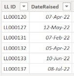
I have a table of 6 records (as below) captured over several months. Some months with more than one record
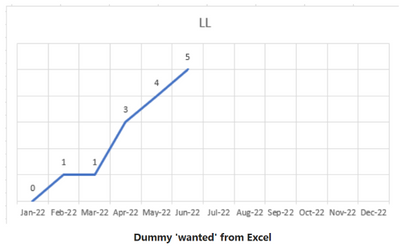
I want to show a chart x-axis months and y-axis count of the records captured and watch it grow.
I have no idea where to start.
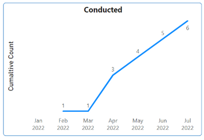
What I am hoping to achieve is something like I created in Excel below to dummy up the look
Thanks in advance
Solved! Go to Solution.
- Mark as New
- Bookmark
- Subscribe
- Mute
- Subscribe to RSS Feed
- Permalink
- Report Inappropriate Content
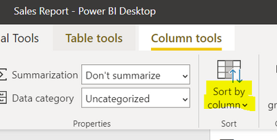
Hi @Anonymous , Apologises a step I didnt mention is you'll need to sort the month year column by monthyearno. When you click on Month Year a Column tools bar should appear at the top:
You can sort the axis of the visual by selecting the more options button in the top right of the visual.
If this answer solves your problem please mark it as a solution!
- Mark as New
- Bookmark
- Subscribe
- Mute
- Subscribe to RSS Feed
- Permalink
- Report Inappropriate Content
Hi @Anonymous ,
Please see the sample pbix here: https://www.dropbox.com/s/i8htrv2v6zij8r2/cumaltive%20total.pbix?dl=0
Basic approach for this is:
- Create a date table to use as the x-axis
- Create a measure to cumaltive count ID's to use as the y-axis
If this answer solves your problem please mark it as a solution!
- Mark as New
- Bookmark
- Subscribe
- Mute
- Subscribe to RSS Feed
- Permalink
- Report Inappropriate Content
Hi @johncolley
Many thanks for the prompt reply.
It looks like I am nearly there following your example.
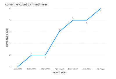
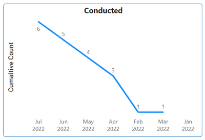
I replicated the columns and measures and as you can see the chart is getting there.
I am not sure why the chart is reversed though and the x-axis out of order.
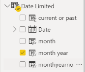
I created the 'Date' table ('Date Limited' in my case)
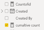
And created the measures in the ID (LL List in my case) table
Any thoughts on the chart order by chance?
I have compared mine to your example and it all seems in order.
Of note, I am in Australia and the date format is typically dd-mm-yy, or variations of that syntax. Not sure if that is a factor
Cheers again
- Mark as New
- Bookmark
- Subscribe
- Mute
- Subscribe to RSS Feed
- Permalink
- Report Inappropriate Content
Hi @Anonymous , Apologises a step I didnt mention is you'll need to sort the month year column by monthyearno. When you click on Month Year a Column tools bar should appear at the top:
You can sort the axis of the visual by selecting the more options button in the top right of the visual.
If this answer solves your problem please mark it as a solution!
- Mark as New
- Bookmark
- Subscribe
- Mute
- Subscribe to RSS Feed
- Permalink
- Report Inappropriate Content
Helpful resources

Power BI Monthly Update - April 2026
Check out the April 2026 Power BI update to learn about new features.

New to Fabric Survey
If you have recently started exploring Fabric, we'd love to hear how it's going. Your feedback can help with product improvements.

Power BI DataViz World Championships - June 2026
A new Power BI DataViz World Championship is coming this June! Don't miss out on submitting your entry.

| User | Count |
|---|---|
| 48 | |
| 40 | |
| 38 | |
| 20 | |
| 16 |
| User | Count |
|---|---|
| 68 | |
| 67 | |
| 30 | |
| 26 | |
| 26 |
